Comments:


Always fun
It always amazing to see the second dial appear ! 5204r is perfect in every way.


For sure a great watch. Rattrapante and PC, we don't see that everyday. [nt]
No message body
To me it is not harmony
In my view, watch seems to be designed without harmony.
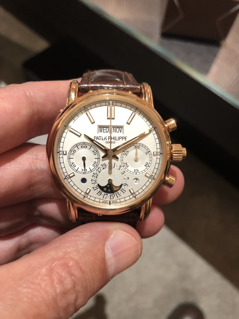
1. The hour markers on the upper half vs those in the lower half..the upper hour-markers are very long, virtually creeping into the dial while the lower half markers are tiny (of course to allow for the sub dials)and the difference in the two halves is thus creating a very unbalanced effect on the dial.
2. The pushers are rather too big for the 40mm case and sticking out a long way
3.The dates 27 and 5 are made smaller to allow for the sub registers. Again disharmony for me. Also the date is the most used function and it would have made eminent sense to have creates a digital indication (which , some how does not seem to be patek design philosophy). The date sub register is thus looking cluttered.
4. The date- pointer hand is lost while passing on top of the moonphase disk owing to the dark back ground of the sky. Pointer hand on the dates 11 to 21 will actually obscure the moonphase partly.
5. Both the chrono seconds hands are of same color. Ideally the second chrono hand which catches-up ought to have been of a different color to allow easy differentiation. This is to not take away the credit from a beautifully designed caliber. It is the dial design that spoils it for me
An excellent analysis.
This watch one of the very best movements in the business. Indeed, I believe it is the most beautiful split-seconds calibre ever manufactured. However, the dial and case are lacking. In addition to the points you made above, the fonts on the dial are unappealing and the lugs are too fussy. Personally, I would get a 5370 in order to obtain the same calibre with a superior dial and case.
Moon in lower hemisphere
Now..here are some critical comments after so many standard comments praising this reference after it was released. There is one more unusual feature and that is..moon phase aperture..what is the reason the moon is in lower hemisphere. I also do not like the little chin reducing the railroad track at the bottom. Overall, I can say that Patek designers need to work on principles of aesthetics, proportions, graphics and fonts.
Agreed, I can't get used to seeing the moon phase aperture "upside down" it just looks wrong to me... [nt]
No message body
Congrats on another amazing and most sophisticated piece! I like your technique of showing us your collection by escalation!😉😍 [nt]
No message body
Nobody has mentioned that cute little chin yet.
Seriously, my only problem with this watch is the lugs. Otherwise, I find all the aforementioned mess strangely harmonious, so overall, all the more credit to PP to pull this one out.
Fantastic specimen ! Thank you showing it , but no movement shots ??? Enjoy . [nt]
No message body
Tough crowd here! My own view, based on the original P, is this reference stuns in person.
Absolutely beautiful on the wrist and exceedingly wearable. Of the two - 5204 vs 5370 - I can’t draw many similarities. Cosmetics, complications, presence, “wearability.” I find them nearly incomparable despite a shared movement. The 5370P on the wrist wears so differently, and despite my affection, it continues to see meaningfully less wrist time than does the 5204P...