
Jaeger Lecoultre 2015 SIHH: Master Calendar Meteorite in stainless steel or rose gold.Live!


With a piece of meteorite:

And on blue straw:

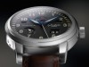
One of the most appealing watch from SIHH2015,

This watch has allure.....
There is something fascinating with the moon, indeed.
But I am always tired to set the exact moonphase...
I may have a solution, on which JLC worked, lately. I will tell you more about that, but it is a smart application they are still improving.
Best,
Nicolas
Interesting....
Yes, but you will see, JLC has maybe found the right solution for that... [nt]

I really like the Meteorite dial! :)
Q? Do you know if JLC will go for mixed blue/red (as in the first shot) or all blue (as in the last shot)?
Thank you for sharing, my friend!
Best
Blomman
I didn't answer to Massi on that detail, but I will answer to both of you.
The definitive version is on the last picture: All blue!
Best,
Nicolas
I love the uniqueness of each meteorite dial... anyone like another! [nt]

Hmmh.. This really could be my piece of cake for this year !.. Promising, and personally..
.. I would/will go for the clear grey, and yes - liking the blue date pointer ;
For me a very interesting modern incarnation as a heir of my Master Moon,
but with that "stellar" touch !
If this Q is allowed here : Is there anything known about the suggested retail prize range
for this edition, and will it be a LE ?
- if no answer yet possible, I'll put my Qs on hold, until more is known..

Thanks for this interesting share again !
Best, hs
It will not be a LE. As for price ranges, I don't know for the moment.
But I will keep you updated as soon as I have this information.
Best, HS.
Nicolas

The only thing I'd like to see...
is the steel version on a Navy strap, to enhance the moonphase, and the rose on a gray strap to match the meteorite.
-Dean

Beautiful shots!!! Nicolas.

Great special iteration of the Master Calendar
I felt the original Master Calendar was a bit misproportioned, with the main problem being the placement of the day and month apertures being too far apart and perhaps a bit too small (and the crown being too diminutive relative to the case size and thickness). I know the Meteorite version retains the same layout and proportions, but those defects don't bother me as much on this version. I'm typically not a fan of special substance dials, but I very much like what JLC has done here. I look forward to seeing them in person.
Thank you, Nicolas, for the pics and write-up.
Cheers,
John
The stainless steel shouldn't cost an arm. Will keep you updated on the price. [nt]

MUST...HAVE...THIS...JLC!!!!
-MW
Really original!
Great shots! Contrast of indices to face looks better on the gold than the steel. Both l


Wow the rose gold / dark grey dial combo is killer!
Nico, I echo your point about 39mm case size - I think 39mm is just nice for most wrists, with max of 40mm.
Seeing the wrist-shot makes me think....
that the day/month apertures should be in a gray or black with white font, for more subtlety.
-Dean