Comments:


Poetry of the Omega Soccertimer 145.019
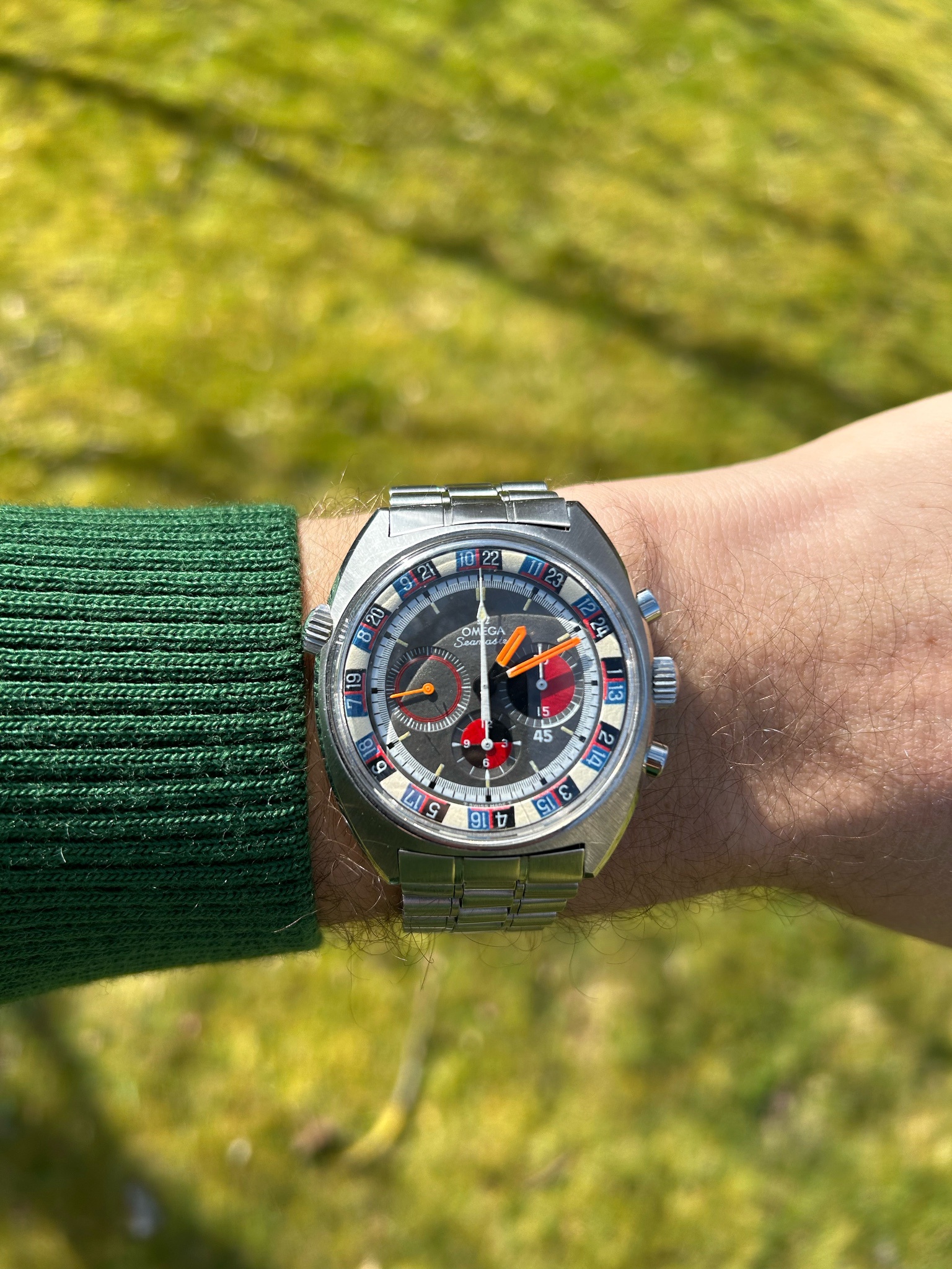
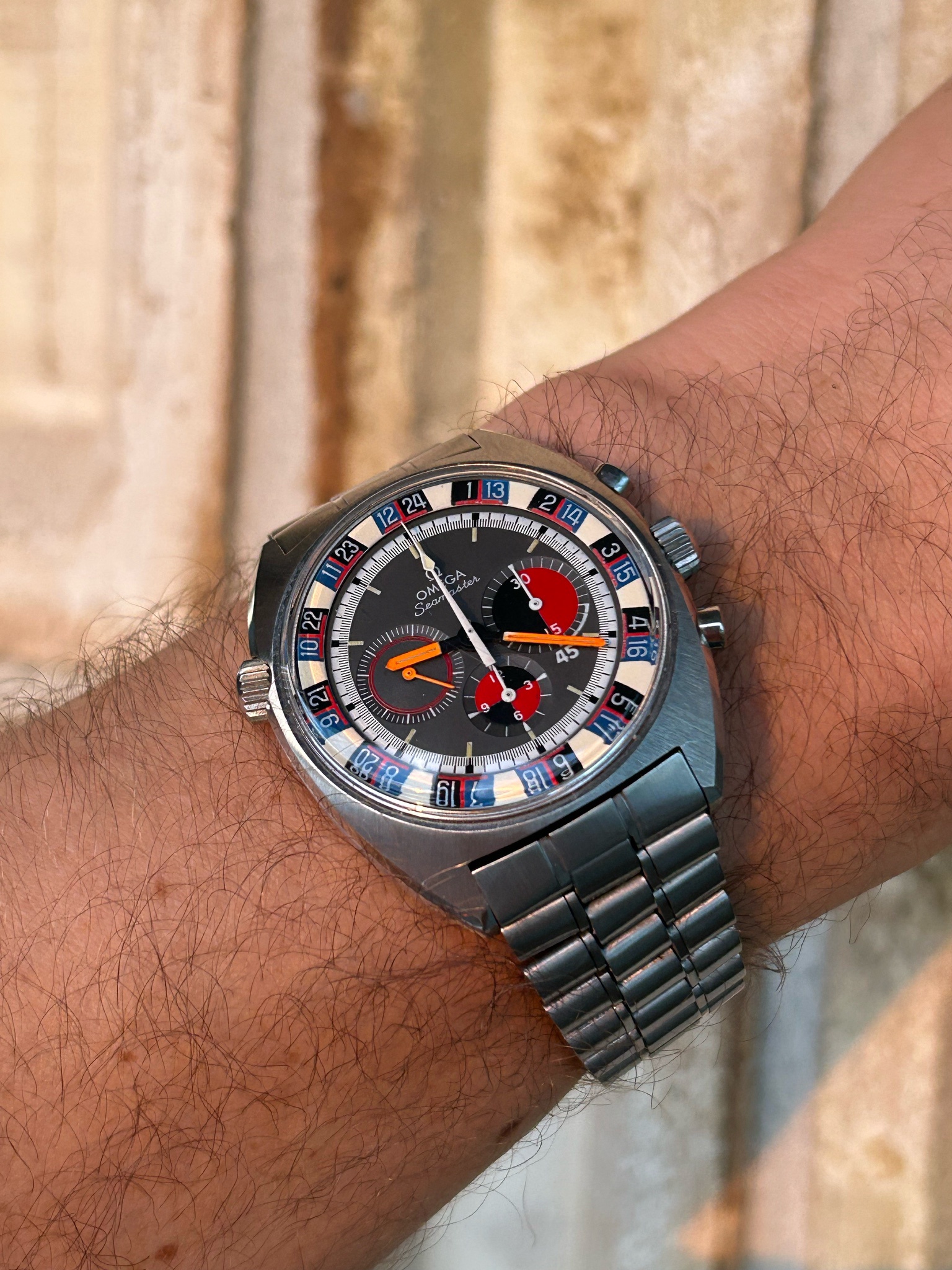
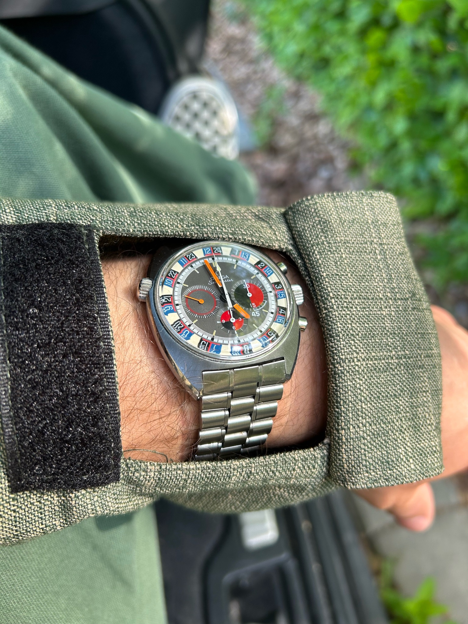
I was in my mid-20s when I first saw it: the Omega Soccertimer 145.019 with Roulette bezel.
It was one of those moments when you think to yourself: "this watch will be mine". And indeed, three of them did enter the collection.
Whether it was back then, or now, looking at it stirs a total conflict of emotions. This is probably the only combination that works when putting together different types of polishing, discordant colours and atypical case geometry. Not to mention that its powered by the manual wind cal. 861 which is the simpler successor to the cal.321. Sometimes, actually most of the time, I feel like it was through happy coincidence that the result was so aesthetically pleasing and functionally successful.
Taking a closer look, one notices radial brushed polishing, mirror polishing and a hint of satin polishing. The cushion-like case does indeed lend itself well to this mix. Now, be ready; in terms of colour, this is where bad taste could have had a big victory. But, not this time. Here we have a matt grey dial, with black and red colouring, white font, patinated lume, and a bezel with black, blue, red and patinated white, without forgetting the neon orange minute and hour hands. That's around 8 different colours on a single dial of 12 square centimetres. Are you ok ?
Taking a step back from this chaos, the totality is harmonious, stimulating, atypical and eccentric. I'm really pleased about this piece and how it lifts the whole collection. Only owning high-horology can seem too simple; that the prices justifies the beauty and balance... My 145.019 is like the small impurity around which the harmonious snowflake crystalises.
No wonder it grabbed more attention than my high-horology pieces at Watches & Wonders.
Looks like you found a great one
The condition looks excellent and the orange accents complete what is a lovely dial, congrats!
First, your on point given it’s the week of the World Cup !
It has been some time since I’ve seen one of these, several years at least. A vintage dealer in Tokyo had a very nice one, great condition. Such a cool Omega, of which there are many from decades ago.
And as you highlight, there’s so much going on colour and finish wise. It’s amazing it works, but it does.
Enjoy it.
It’s on the agenda !
It’s been 10 years I think since I’ve been in Denmark (and Sweden) and I’ve been talking about needing to return.
I LOVE THIS WATCH!!!
I have always loved it from the moment I saw it, which makes me ask the question. Why do I still not own one? You know something is truly perfect. When you can’t answer the question why is it perfect? But this one is! …congratulations. I’m so happy for you.
I love this reference.
My bracelet is far too stretched and needs tightening, so I have it on a strap.


There have been modern Omegas with the roulette style rehaut, but they are either more restrained and not as bold in the case of the bullhead or just for looks and not functional as a second time zone like on the Seamaster Soccer Timer.
Modern watches:
Wow, what a terrifically written post and an even more terrific vintage Omega. I've never seen one before and am instantly smitten! Thanks for posting.
Waooo - sorry Amanico, but just for the avoidance of doubt…
…do I understand correctly that this particular SoccerTimer is THE one that you are chasing ? Please could you tell me the story and how do you recognise it ? !