
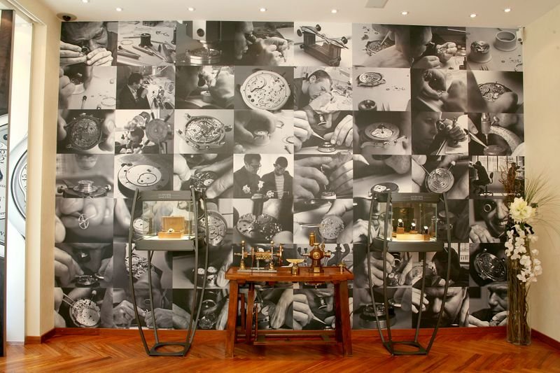
Inside Look at Boutique FPJ Geneva
Images of the Dead Second halt traffic. I like the YG RDM Clock right above the entrance and
the rotor used on the entrance door.

Inside you will find the perfect setting to view the Journe collection.

Wonderful display cases - some filled with the new Black Label Series.
The biggest problem here is the watches sell out so quickly.

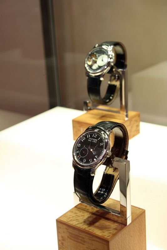
Black Label CS - Now you see it, now you don't.

This message has been edited by bs22fly on 2007-05-22 12:04:47
Boy.....
You left out the ever important bar and couch relaxiation area.....
Just a fantastic place to sit, contemplate and question how you will come up with the $$ to buy your next Journe!
Thanks for the shots Brad! Hey, I would love to know if the Door Handle is 18kt RG and what the "retail" would be for one for the house!
All the best!
asg
Yes.. who could forget the bar!


An Oh So Slight Shift for Journe?
The black label CS raises in my mind an interesting point for M. Journe: He has always insisted on the notion of improved chronometry as a guiding principal, and unquestionably he still does. Yet with the black label CS, there seems more than a hint of the watch as object d’arte: The dial is difficult to read, and so obviously so under many conditions that the watch raises itself more as object than a timekeeper (not that we need timekeepers, but the point still stands).
I find it interesting because in discussions with M. Journe about the ‘art’ of his work, he has insisted on chronometry and its mechanics above the aesthetics, yet that is not what I see in this watch. I have always thought that Journe possesses an integrated vision of form and function that is organic to his work. Yet the black label seems to push the pieces just a tad in the direction of object over functional object.
Any additional photographs of the black label pieces, Brad?
Douglas
Why Black Label?
I can never forget the first time being drawn to FP's writst the first time I saw him wearing an Octa Calendrier with the black dial.
More photo's of the black label pieces to come! Stay tuned.
um....
Personally.....To me, find black dials with white writing to be highly legble watches. I dont personally think that a watch having a black dial is not traditional, or functional.
not to pick on any one watch of Journe's designs....but wouldnt you agree that the Tokyo TI with RG color numerals and the Mother of pearl pieces are more objects of art than watches with a sober black dial?
then again...any watch with a completely gold movement is hard not to call a little blingy, or artsy wouldn't you think?
What's the difference what dial is placed on the watch if it remains true to its function? You have to stare at it all the time. If you dont like it, dont buy it. If what you say is true, or even close to factual, then journe should only make skeleton dialed watches so that you could see the harmony of the movement design at work....oh wait, skeleton watches are artsy...oh well.....
I think you are way off on your analysis...but, to each his own....
Best regards,
asg
Fair Enough
Fair enough. Don’t mean to imply that there has not been an aesthetic consideration to all the Journe pieces—he is, after all, French. My point is that the focus has always been upon chronometry, in everything M. Journe talks about. It seems, then, to me that a direct correlation is the ability to measure and read time easily (and time functions such as dates, signs of the zodiac, etc.) easily. The black label CS strikes me as somewhat of a departure (maybe even slight) in this since the black face coupled with the blue-steeled hands make the reading of the time much more difficult. And, while I agree that the Ti/RG CS from the Tokyo boutique as well as the Vagabondage are examples of a ‘tougher read,’ neither, to my eye, are quite as hard as the black label CS.
In no way do I mean this critically. Some watches appear to tilt more to objects d’arte than others (e.g., Breguet’s La Tradition). I think M. Journe has accomplished a wonderful balance between craft and art from the beginning. But. . .I am still fascinated that with his long focus on chronometry (and maybe I’m wrong and that’s not about legibility) there would be a piece maybe more striking as an object than as a device to show us time.
Best,
Douglas
I dont remember....
I would be suprised if the CS had blued steel hands.
asg
Look At The Last Picture in The Post That Initiates The String [nt] [nt]
Lighting
Depending on how the light hits the hands the Black Label CS dial becomes easier to read.

wow
