Review
Mark in Paris offers his initial impressions of the Patek Philippe 6000G with its new blue dial, a reference that has significantly evolved his perspective on the model. He highlights the striking combination of the 37mm grey gold case, rounded bezel, and the deep metallic blue dial, emphasizing its unique character within the Calatrava collection.


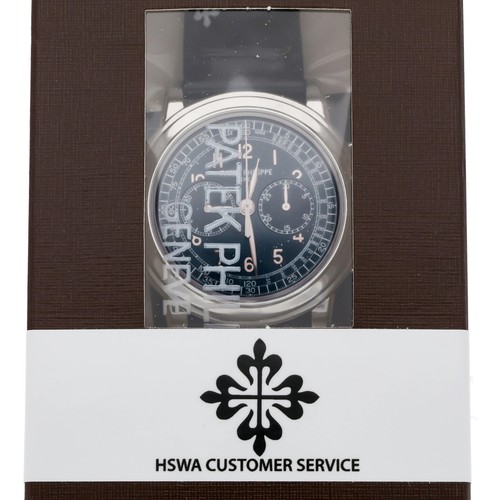
The Patek Philippe reference 5070, part of the Complications collection, marked a significant return for the brand to large-format chronographs. Introduced in 1998, it was the first non-perpetual calendar chronograph produced by Patek Philippe since the reference 1463, which ceased production in the early 1960s. Its design drew inspiration from a unique Patek Philippe aviator's watch from the 1940s, characterized by its prominent case and dial layout, yet reinterpreted for a contemporary audience. This reference established a new aesthetic direction for the brand's chronographs, moving towards more substantial case dimensions.
The watch features a 42mm case, initially offered in 18k yellow gold, housing the manual-winding Caliber CH 27-70. This movement, based on a Nouvelle Lémania ébauche, was extensively finished and modified by Patek Philippe, meeting the brand's stringent quality standards. It provides a power reserve of approximately 55 hours. The dial, in this specific configuration, is black, protected by a sapphire crystal, and the watch is water-resistant to 30 meters. The fixed bezel frames the dial, and the watch is typically fitted with a leather strap.
Reference 5070 appeals to collectors interested in modern Patek Philippe chronographs that combine traditional movement architecture with a more contemporary case size. Its limited production run and the subsequent introduction of variants in other precious metals contribute to its collectibility. The reference represents a distinct period in Patek Philippe's chronograph history, bridging vintage inspirations with a new era of larger watch designs.
I have always liked the 6000 dial layout but this new color combination is superb. I really like the blue face on dark blue strap combination, it really makes the white numerals and hands pop. The previous model with the gray dial and brown strap was nice but this is better in my opinion. Although it is hard to tell from pictures and I must see it in the metal to be sure. Thank you Mark for the pics and your first impression review. I think I would like to add a Calatrava sometime in the future
...if you're looking for a "sportier" Calatrava. As you said, the "live" experience is worth trying and it should look a little bit darker than my first pictures. Bring back your opinion if you ever try one! Very appealing. Cheers, Mark
Although 37mm could be a little too small for my wrist. Best regards Georg
All previous white gold versions were nice, but not really "wow!". With the rose gold version Patek gave it a lot of the missing wow factor and created a very, very credible looking classic watch. With this blue dialled one they have created the perfect causal-classic looking watch in a perfect size of 37 mm. If you have a look at the watch right head on, when it is held in the watch holder rings that the ADs are using, the bezel looks fantasticly big and wide and makes the watch look like an ol
Small size, beautiful and elegantly shaped case, with that more animated dial... Concerning the legibility, I didn't notice any problem as the white hands are contrasting really well over the blue dial. However I noticed the small second hand is really tiny. But you're right saying a watch is much more than reading time :) Thanks for your thoughts on that reference Moritz! Cheers, Mark
This thread is active on the Patek Philippe forum with 30 replies. Share your knowledge with fellow collectors.
Join the Discussion →