
patrickh
2461

PP 5320G: what to think about this creative PC?
As for many of you, Thierry STERN had surprised us (positively) with a total new approach for this PC.
He realized a new concept, less classic as the current PC line, but with integration of past referencies.
Here is a "close" wristshot.
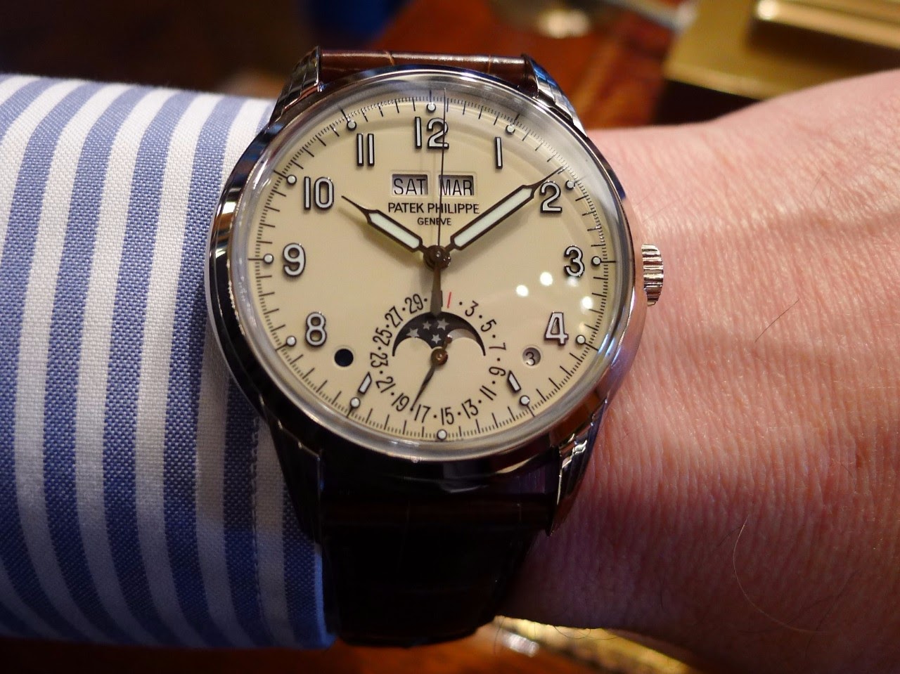
At first look, we could notice the syringe hands, the ivory (creme) dial and luminova indexes.
At second look, we could number the colors (around 8):
- ivory for dial (vintage look spirit)
- white for sub dials
- blue for moon sub-dial font and day/night indicator
- black for printings
- red for Day 1
- silver for moon and stars
- gold for indexes
- green luminova
Not a classical conception, but why not?
New concept I said.
Now the lugs:

Very nice designed.
Integrated in a full block of Gold with the main case. A good thing I appreciate a lot.
Add a vintage spirit to this PC.
Another WS not so closed to get the real view on wrist:
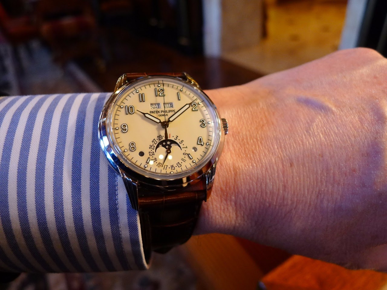
PP 5320G has a nice presence on wrist.
Then, I note that the printing for numbers are different according scales:
Have a look to number 3: 2 typographies are used for Hours and Leap year or for the Date.
My conclusion: A very interesting new offer by PP for a PC.
I like the idea.
Should be designed for younger collectors?
Being maybe too classic, I prefer a combination with less colors on the dial and would expect to discover in the future a new version which please me more, Maybe the Pt version.
Time will tell.
What are your thoughts about this PP5320G?
Best,
Patrickh
Available on the marketplace
2,850 Patek Philippe listings are live on the eBay market and 1721 collector listings on the WatchProSite marketplace.


New Release
Discover Patek Philippe's 2017 Baselworld novelties: 24 new references blending tradition with modern design, including the 5320G, 5168G, and 5372P.
124 replies80365 views

New Release
Explore Patek Philippe's 2022 collection, featuring the new 5326G, green-dialed 5270P, and limited Rare Handcrafts. Get insights and pricing.
143 replies43511 views

Complications
Explore the Patek Philippe 5320G vs. 5140P Perpetual Calendar debate. Collectors discuss design, wearability, and value in this in-depth WatchProSite article.
115 replies38083 views

Review
Mark in Paris reviews the Patek Philippe 5320G Perpetual Calendar from Baselworld 2017. Explore its new case design and stylistic evolution.
51 replies32903 views

Vintage
Explore the evolution of Patek Philippe moonphase displays from vintage enamel discs to modern frosted styles. Horology_Ancienne details key references like 2499, 3970, and 5970, revealing the brand's artistry.
69 replies24785 views

Collection
Explore a collector's unexpected encounter with the Patek Philippe Ref. 5320G and the community's debate on its design, readability, and market reception.
67 replies16105 views
PP 5320G: what to think about this creative PC?
As for many of you, Thierry STERN had surprised us (positively) with a total new approach for this PC. He realized a new concept, less classic as the current PC line, but with integration of past referencies. Here is a "close" wristshot. At first look, we...

Probably my favourite Patek this year.
I am just waiting for the platinum version - hopefully with grey or salmon dial. Best Kari
Thanks Kari. My favorite Patek this year is 5170P (next post)
Regarding the Pt 5320 in the future: grey or blue dial for me. Salmon is very nice but I finally sold a VC Historique Chronograph in Pt with salmon dial as too boring with time. My 2 cents, Patrickh

Date window problem
Coloring seems to ruin the holistic look and feel of continuity. Perhaps one day Patek will make things right.

Not for me. It just doesn't sing to me.
It shouts Sekonda more than Patek to me and it's such a good job we don't all like the same watches. I just couldn't live with a modern watch which is trying to be something different and those hands don't belong on a watch from 2017. For those that love ...
Don't love it
Of course, can't really know till see in metal, but feels forced retro, especially the hands. And too large at 40mm. Patek seems fresh out of ideas.


Hi Pateichk, this 5320 is a very nice PC !
Would love to see it in the metal ! Cheers, Gordon
The sweep second is a really nice addition for a PC: more vibrant dial IMHO.
Wait to read your feelings on wrist, Gordon. Cheers, Patrickh
Hi Patrickh, I tried the 5320 on at a Patek event in Hong Kong this week and my feelings are:
1) relatively good fit on my small wrist 2) great design when seen in the metal 3) LOVE the lugs with three layers ! So elegant ! The only issue for me is the cream colored dial which may take a bit of time for me to get used to. Overall IMO it is a winne...
Dear Gordon your WS are really nice
and this model fits well on your wrist, IMHO. The 3 layers are more discreet at a normal distance when you have a look at your watch on the wrist. For me, I do not like cream and white colors together and prefer to wait for another version later (Pt?). Th...
Hi Patrickh, glad to hear that you think 5320 fits my wrist. Are you being a Vlad like Nicolas in...
poisoning me ? LOL ! Cream color dial may match better with rose / yellow gold. What do you think? Cheers, Gordon
Have a look at 5227 collection in WG, YG and RG with cream dial
and you will have your answer ;-)) I wait myself for the Pt version with potentially another dial color. Cheers, Patrickh
yes Patrickh, the cream dial goes better with...
yellow and rose gold ! Thanks, I think I will wait then ! Cheers, Gordon
It's a mixed bag.
Things I like: -The layout of central seconds, aperture windows for month and day, and subdial for date. It is a nod to the 3448 which is the cleanest perpetual calendar dial I've ever seen, and one of my favorite Pateks. I've dreamed of owning one but it...


It is a modern Patek
The case making is modern, some parts are modern in the movement (silicon), the sapphire is modern and the case size is modern. The look is certainly classic and traditional but still, to me it is a very "mixed bag". I am not sure weather I like the compo...
Thank you Moritz for highlighting its Modern attributes
A new PC PP offer. Best, Patrickh

As I said before, I think it is a very different Patek
thus it will appeal to new clients and will not attract a part of the older ones. I think it is very intresting, with different standards. It isn't the usual classics we had in the past. Thanks for sharing Patrick. Best, Mark
I agree on your point of view Mark.
My pleasure to share this post here on PPro. Best my friend, Patrickh

My favourite of all the releases from Patek.......
At this year fair. I hope to add this to my collection.
PP 5320G: what to think about this creative PC?
I love it together with the 5170P my 2 favs this year
A lot of things going on in the dial
I believe it is trimmed too much for effect. The classic PP design of the 60ies-80ies eventually comes to its limits, and "new" customers seem to want "novelties". The cream dial is too creamy, there are too many little gimmicks, why the red "1" (reminds ...

When you say.....
Pt or Wg will be less flashy, I am confused. Isn't this version WG?

Nice Watch
I really want to get this new timepiece, and have been waiting years for Patek to reintroduce a perpetual calendar in this classic format. It is a safe bet that in the years to follow there will be many variations on this theme. I have to admit that it wo...
I tried on the watch and the most exciting feature is the instantaneous change function.
I always felt that the drag date / day / moon function was a bit lazy for Patek but adding the instaneous is a huge step forward. The complexity of managing power and timing is something other watchmakers have achieved and it is used in one other PP model...
Thank you Karl for these informations.
The model I had in hands was blocked at 10h09. Impossible to test it. HAGWE, Cheers, Patrickh
Thanks for the info and pictures Karl
I could see the 5320G this week but wasn't able to test the date change. However, just as an addition to what you wrote, there are a few changing features and I think that this 5320 hasn't got a "jumping" instantaneous display but a "semi-instantaneous" o...

I love the look of this Patek.
Cream colored dials are my favorite and this look, very different for a Patek, is very nostalgic which I like. Aloha. Bob
I used to collect only cream dials …
And had no black dials. But now, I only have one cream dial left (gave it to my sons) and most are black. Your photo rekindled my desire for cream dials again. Aloha, Bon

From the first time I saw it it never convinced me.
I just do not think that it is as beautiful as described by many people. Firstly I do not like a cream dial with a clear case (maybe if the dial was a bit darker...). Furthermore I think that a PC expresses its own beauty at its best when is put together ...
on some i agree.....on others i don't
For me.....I think the perpetual calendar is at best when it is purely a perpetual calendar. Combining it with a chronograph seems an odd thing to do other than to merely to create a very complicated watch. Don't get me wrong, I think the perpetual chrono...

I agree.
What's the value to know if it's the 2nd or 3rd year of the leap year circle? Furthermore, if I do not know if it's day or night, something is badly wrong with my head. Best, Kari
This is easy to say but not easy to do
Modifying a movement in order to transfer the information from a side to another, especially when a movement is made from 2 modules is not something that can be done without heavy time and investment. It would be easier to make a new movement from the beg...
I know all this and I would be happy if both holes
would be covered. Look at the oldest PP QP. Furthermore, the watch would get a more classic look. Like said, the leap year indicator could be on movement side. Best Kari
and the moonphase enamel is something special....
yes, sometimes it is the simplicity that wins all.
Cannot beat your watch
When the 5320 comes out with white/silver dial and sticks, it will really catch on.
yes.....
......i was speaking of the leap year indicator. It could be done, but would need a new model. For many, the portholes are fine...even a positive. For me, I would prefer to have them re-engineered to the verso or something less obtrusive on the dial.
Would be pleased to see it. These holes are not my taste too.
I hope someone here has skills to do it (for our eyes). I agree with the discussion below regarding specially the leap year indicator position. Best, Patrickh

BRAVO Mike
You are a KING .-)) Like it better +++ As discussed in this post a PG case "could" be more homogenuous or desirable. Patrickh
It's a Miracle!
The technology of today can show us just about anything. What an amazing instrument! Got to admit, I like the day/ night, and leap year indicators. All that information at a glance. I really understand everyone's point of view on this one. I really want a...

I recently had the opportunity to handle this piece at a Patek Perpetual event....
and my impressions from the photos and articles were confirmed. It is a very cool and different release.... but not for me. There is something about it that just does not sing to my tastes. It could be the dial color, it could be the dial balance, it coul...
Respect
Patek PC is an important part of Patek history and DNA. Any radical change in it is of significance, and surely involved long and detailed consideration by Patek. Nevertheless, we all have first impressions. And mine are not good on this reference. Feels ...

Saw it in the Geneva Salon.
I very much like it, especially those lugs. I can appreciate the “forced vintage” comments but I think those would be immediately resolved by a different dial colour. Hence am holding out for the (inevitable) P which will bring more options for us to deba...
Patek
I am impressed by all the pics that I see but will only decide once I see it in the metal hopefully in Nov going to Geneva for the only watch auction. I can see Patek putting this movement into a Nautilus.