
What's in a logo?
In a recent effort to preserve consistency in Bulgari related discussions throughout the PuristSPro website, AT posed an inquiry to Bulgari regarding the spelling and use of the company name, whether it should be Bulgari or Bvlgari.
They directed us to use “Bulgari” and clarified that “V” is only used in the logo when “BVLGARI” is written in all caps, as that is the classical Roman type. The response helped to set straight what many, including myself, have often wondered but few bothered to ask about. What was the deal with the “V”?
It became evident how strongly they adhere to their own branding and identity.
“BVLGARI” became the official company logo after the founder, Sotirio Bulgari died in 1932 and his sons remodelled both the interior and exterior of the first store on Via Condotti in Rome. Since then, the company has continued to embrace its rich Greek and Roman heritage in many of its designs.


In the 1980s, the “BVGARI-BVLGARI” wristwatch was launched, featuring a black dial and double engraved logo on a gold circular bezel, which became the company's most recognized and highest selling watch.

Nowadays, the logo makes its appearance still on the bezel of watches as well as in the design of practically every other Bulgari accessory line and is synonymous with the look and feel of classic Bulgari. Some may argue that this is overkill. It is, without a doubt, difficult to convince the serious watch connoisseurs of the appeal of big bold name letters on the case or bezel of a watch, an “eye-soar” many would say. However, there is a market that will easily buy into it, luxury loving lads and serious style fashionistas drenched in sophistication.


To me, I see it as a reflection of company pride in its own brand heritage and identity, something to be commended and something that Bulgari holds extensively dating all the way back to the late 1800s. It can actually be quite a valuable asset if managed skillfully.
What are your thoughts and feelings on the Bulgari logo? In watches? Jewelry?
Would you ever purchase a watch with the brand name etched on the case or bezel?
What about the PuristSPro ABR watch? Subtlety in a more tasteful manner?


That's a well placed question, Ping . . .
. . . and after giving it some thought, there's not a single watch on my wish list that has a prominently placed logo on the case or bezel. Curiously, there are at least a few designs without an obviously visible logo that I find compelling.
This is one of those instances when a simple, direct question lends to reflection. I've rarely considered Bulgari watches, and perhaps the visibly obvious branding is the reason why . . . pensively, Art
It's a simple matter of taste and preference...
I suppose Art.
I am however curious about what exactly is on your "wish list". Hope you'll share at the next get-together.

Pride and prejudice
Very thought-provoking, Ping. Bulgari has a right to be proud of its heritage and accomplishments in the world of luxury goods. I don't think anyone would deny that their success is proof enough that they've made some good choices about their products. However, I think high-end watch collectors -- at least the kind who seem to largely haunt this site -- may prove harder to convert to the "in your face" logo placements that have come to symbolize Bulgari's design philosophy.
Judicious placement and use of one's name is not synonymous with hiding one's identity. To capture the hearts and minds (and wallets) of a larger segment of the high-end watch collecting crowd I think Bulgari has to change their tactics a bit (these are just my personal opinions). Bulgari should embrace their heritage by channeling the themes of familial/corporate history into the design of their watches, but sublimate the desire to place the company name on the bezel as they are currently doing. Surely, pride can be assuaged by the placement of the company name on the dial in a more commonly acceptable size. I feel that if increased subtlety in design isn't found in their collection at some point soon, then WIS will continue to associate Bulgari watches with their fashionable, but horologically less significant watches of yesteryear. That's a prejudice that they already have to fight. Why fan the flames? As we all know, you can have the best product in the world, but perception by the public is also key.
It's my feeling that if they continue on the double logo path it will take them longer to gain the support of the haute horlogerie community. I'd like to see them make a clean break from their fashion-oriented watches of the past, and innovate using the considerable resources of their company. Let's see Bulgari chart a new course, set the foundation for a new horological legacy. Good, organic design in service to the product; not a logo, will assure pride of place for the Bulgari name in the pantheon of watch gods much quicker than all the bezel engraving in the world.
Cheers,
Daos

succumb to group pressure
u brought up an interesting point to consider in ur paragraph: should bulgari abandon its proud design succumb to popular demand!?
In essence, those BVLGARIs r exactly what "embracing one's own heritage and channeling the themes into a design" at one of its best
 Those bulgari rings emit a mystic Ancient Greece/Rome feel that i can't think of any other design that achieved such feat...
 i totally agree with u this prejudice on brand name is strong but can't help wondering r we just stereotyped to think that way? r we judging beauty itself or we unconsciously factoring in other social norms?
to me the bottom line is: its beautiful & i luv it! then i bot mine, hehe.
just my 2c & cheers,
Ed~
This message has been edited by lien on 2010-02-01 04:49:21
You are absolutely right Ed...
The logo along with the jewelry capture that Greek/Roman essence and style better than any other brand out there.
And that in itself is beautiful no doubt.
Ed, there's definitely a market for the existing product...
...and I don't think those pieces should be completely abandoned. I just would like to see Bulgari present some other takes on their design heritage. We'll have to see what the future holds for them. I'm certainly interested in what will come to pass!
Cheers,
Daos
The elements of design
ur arguments are rational and absolutely valid from marketing/business POV
i was merely intrigued of how WIS r predetermined with the notion of brand name.If those BVLGARIs were meaningless symbols and we judge purely on its asymmetry, execution & finishing, might it be a pattern as pretty as say... hobnail or cotes de geneva?
Would it be as loud & a turn off? just a thought, haha
cheers,
Ed~
Good points, Ed!
I can't speak for other watch geeks and their preconceived notions of Bulgari, but I'm keeping an open mind.
Cheers,
Daos
Thank you for the equally thought provoking response Daos!
I happen to agree with you on the suggestions for attracting more of the WIS crowd. I think the acquisition of DR/GG can prove to be a good first step in exploring these possibilities. They might perhaps gain a better understanding from these brands, what it takes to attract the hearts of the true watch enthusiast.
As for the double logo watches, there's obvious a large existing audience out there for them and I believe they shouldn't abandon these customers. Perhaps they can achieve a profitable balance between the two and become a true target of envy from market competitors.
We will have to wait and see.
If I would ever purchase a watch with the brand name etched on the case or bezel?
Louis Vuitton watches, I would and I did.
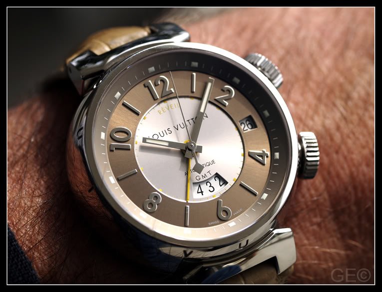
But the way Bulgari does it, twice on front of the bezel,
is too vulgar for me.
I am glad that there are also Bulgari watches, without logos engraved on the case.
GEO
Very subtle and appealing...
I like the way LV placed theirs along the side of the case so it isn't readily visible at first glance, similar to the PPro ABR.
Thank you for sharing the picture.

... it depends on the time
Back in the 80s things have been different - fashion, hairstyle, design, ...
When Bulgari started with watches I think they did a good job:

A classics which is still wearable and somehow "cool". Yes, most of them with a quartz movement, but hey 80s
The next one which caught my attention was in the the 90s:

A classics as well and at least with a well known automatic movement from ETA. Had one for a while and to be honest it felt good on the wrist.
OK, the logo was not my favourite, but I liked the design. The leather straps in these days have been gorgeous.
1997 - I bought my first watch from Bulgari together with a fellow student.

He bought the Scuba SD38 with the rubber strap which smelled so tasty after Vanilla, but felt too big for my wrist. So I got it with a very smooth
leather strap.
Believe me we had lots of fun, parties, ... with the people from Bulgari - in these days
It was not a bargain, but worth each penny we spent. My dream watch in these days was a Blancpain which was out of reach for me as a student.
Movement was an automatic from ETA and it still does a great job. I never had any problems - never.
When I started thinking about a Chronograph ...

... I decided to wait until I could afford a Flyback from Blancpain and nothing from ETA. The Chronograph from Bulgari was looking good in these days,
but I started to get the movement bug
Let me show you some pictures of my (still) loved Scuba SD38:


Simple and pure dial, sexy lugs with cool screws, ...

As mentioned before I bought mine with a leather strap, but later I got the rubber as well. Unfortunately it didn´t smell like Vanilla as the first ones :-(

Today I like both straps.


(Take care - the bezel is a killer for shirt-sleeve
)When I travelled to Hong Kong in 1997 there was Limited Edition (998 gents´and 998 ladies´) in matt black stainless steel - to commemorate the handover.

In these days I found it very cool and was really keen on this watch. Unfortunately, no more budget for a second watch in the same year :-(
The steel bracelet came to my mind later and therefore I bought one in the earlier days of "...bay":

What do you think about that one?


Do you like the finish, the details?
The people at Bulgari liked it, until I told them about my impression.
To me it was a fake and at the end only the Box was original :-(
Lessons learned!
Back to the topic.
Bulgari offered a Scuba SD40 after SD38 and in these days the quality of the whole product changed. I never liked them and still have a problem with the straps for mine.
The latest ones seem to be of better quality, but they are too "flashy" for my taste and too expensiver for what they are- from my POV.
Mine gets a big service these days and it will always be a very special watch for me, with lots of memories
Oliver
ps: Some of the early watches from Bulgari had movements from Girrard Pergeaux
Seems like you've followed Bulgari's history closely Oliver...
Love the Scuba SD38, the semi-circular cutouts on the bezel are an interesting feature.
The double logo doesn't stand out as much in the matte black stainless steel. Is that PVD?
Thank you so much for sharing your points of Bulgari fondness with all of us.
Great post!
one thing for sure is these bulgari has strong styles
THx for sharing,
Ed~

Your Scuba 38
Hi Oliver,
Thanks for sharing your pics of the Scuba 38. Which strap do you wear most, the rubber or leather? And do you change the strap yourself?
Regards,
ED-209

Thoughts …
Bulgari is another example of a company (and watches) that evoke strong emotions in both directions. Just as we bristle over internet posts with capitals, my first response to BVLGARI BVLGARI is “stop SHOUTING at me”. But I prefer my watches a bit more understated and these pieces are probably not directed at me. There is a place and time and customer for this type of watch. Most Gerald Genta pieces are hardly shrinking violets either, so that match seems good. I am more concerned about DR being absorbed into the Bulgari line-up. Bulgari do have watches that are less obviously ‘branded’ but still have enough DNA in the design to let me know the house they have come from. Bulgari, like other companies with a strong history in jewellery, have shown us they are capable of producing some great cases, bracelets and dials. With the depth from GG and DR there is an opportunity to diversify their product line. It could be a giant screw up for all, or we could see some interesting new watches emerge.
More to come …
Andrew
Very well articulated Andrew...

Without agenda
AndrewD,
The current Mrs MTF and I share a BVLGARI or two. Actually, it was my Rettangolo that, mysteriously, migrated to her watch box (!)
I don't get to share her BVLGARI stuff.......I'd look odd wearing them anyway.
I just wanted to point out that when Gerald Genta's BVLGARI BVLGARI design was drafted and launched, it was as a design motif and not 'web-shouting' because the WorldWideWeb was still in its infancy as far as luxury industry was concerned. The meaning is not the words but the icon.
Regards,
MTF
Branding …
Hi Melvyn,
The ‘web-shouting’ observation is an interesting one. It hadn’t entered my mind that capitalisation prior to the 1990’s might have meant something different to what it does today.* That’s probably an interesting question for the BL Forum.
Personally I still find any product with a name across it in big letters is either trying too hard (perhaps more applicable to a new upstart company) or is being a little unsubtle about their ‘brand’. I guess a “C” in a Cartier product, a recognised pattern on a Louis Vuitton bag or a monogram on a Chanel piece is telegraphing the same message, but to me it just all seems a little more restrained.
But as I said, there is a time and a place for all these ‘luxury’ accessories.
Andrew
* I will ask my 80yo mother who has NEVER been on the internet how she interprets capitals.
It's lik the Big M Golden Arches
for McDonalds burgers.......not just any sandwich....but a Big McD sandwich!
BVLGARI did not mean to be subtle....the roman capitalisation is 'required' to represent the company logo as a Roman brand. Mr Genta decided to play on the logo by saying it twice like the famous song: 'New York! New York!'; so good -- they named it twice.
Not just a vacumn cleaner.....a HOOVER. I guess its 'Dyson' nowadays.
Regards,
MTF
Agree with your thoughts on this...
I agree with your thoughts about DR/GG. There is a huge opportunity for Bulgari to diversify their product line. We'll have to see what happens in the next few years.
And interesting point about the shouting with the logo. I never thought of it that way but it makes sense. Would it be more subtle if the logo was placed on the side of the case (as in the PPro ABR or the LV watch example)?
Regards,
ED-209
Diversification ...
Hi Ed,
Congratulations on this new Forum.
While it might be more “subtle if the logo was placed on the side of the case”, this is not what Bulgari is about. What I would prefer is that the watch lines are diversified. There is a place for the traditional ‘in-your-face’ Bulgari luxury that I equate with other brands such as Versace, but also the more subtly designed pieces that might be exemplified by Daniel Roth. I would be disappointed if BVLGARI were branded over all new pieces and I doubt they will do this. There are already examples in the Bulgari range that have good wrist presence but don’t shout their pedigree (quite as loudly).
I really do look forward to seeing what comes from all this.
Andrew
Logo or no logo?
This is a very thought provoking topic. Should the Bulgari watches have the logo displayed on the bezel or not? In some ways, I feel that Bulgari should definitely keep at least one line of watches with the logo to continue the successful heritage of the Bulgari-Bulgari series. IMO there's nothing wrong with proudly displaying their name on their products especially when it's fairly well known. At the same time, I'm glad to see that the newer Sotorio collection (maybe even thought of as a more serious line of watches) without the logo. Best of both worlds.
Just a few more months and we'll find out more of what Bulgari will debut at Baselworld!
Regards,
ED-209
Perfectly said...The Best of Both Worlds...
I absolutely agree that the best way Bulgari can maximize their profit and market share is to preserve their heritage as well as explore new territory.
Whether they will be successful or not at the feat remains to be seen. I certainly think they are on the right path with the Sotirio line, as you said.

So that's the secret behind the name!
I was wondering for a while why it is BVLGARI vs Bulgari and your explanation makes sense. Mystery solved!
-MW