
Baselworld 2017 First thoughts on the new Patek Philippe 5320G Perpetual Calendar
Dear all,
Next to the recap article of the whole Baselworld 2017 collection I posted (here, www.watchprosite.com), I wished to put forward, in different threads, a few important novelties that Patek Philippe has released.
Let me start first by what I find to be an unexpected and very appealing surprise: the new Patek Philippe 5320G Perpetual Calendar.

At first, this was quite a surprise indeed as the 240 caliber-based Perpetual Calendar has been renewed last year with the presentation of the new 5327 reference (that I reviewed here, www.watchprosite.com ) and its stunning case borrowed to the 5227 Calatrava and its beautiful dial.
However, when we go further into details, it is clearly another interpretation of the Perpetual Calendar complication for the brand. This isn’t really a surprise when we know this complication integrated in a wristwatch for the first time in 1925 by Patek Philippe has been one of the brand’s masterworks, starting with the unique 97’975.
The 1925's unique 97'975 (jumping hands for the perpetual calendar indications):
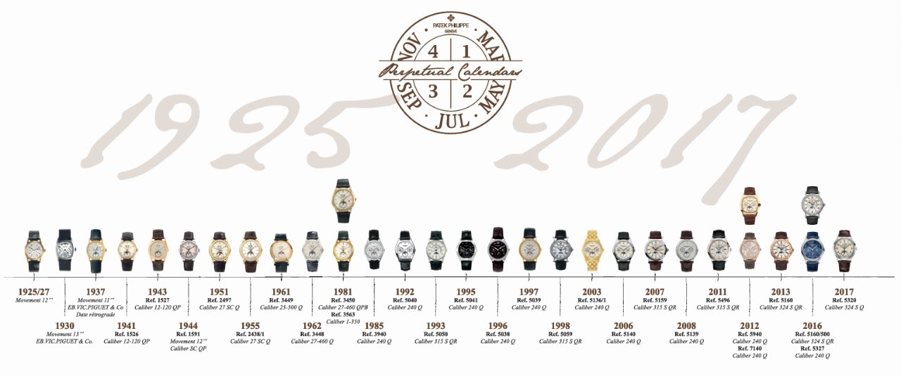
I’ll detail the watch later in the year but this is important to have a fresh look at what is proposed here as it will also represent to me an important step in terms of style evolution in the contemporary collection in line with the Timeline you can see here below.
THE WATCH
First, this is a brand new model in terms of case design.
The beautiful 5320 from Magnus:

The style of the case (and especially the lugs) is a cousin of the gorgeous 5975 Chronograph (maybe my favorite case from the two last decades) released for the 175th anniversary in a limited edition in 2014. But, this time, you will see that it has been refined in order to match its new spirit, in a very smooth and elegant way, with little less sharp or straight edges and in a little less complicated way to craft as it is in one piece this time, like most of the similar references from the catalog.

Credit: Dr.Kol on PuristSPro
It is in fact a light rebirth of the older 2405 reference’s lugs that is brought back to life from the brand’s DNA. Indeed, these three-tier lugs are slightly curved and participate with the dial to give that new style Patek wishes to include since the two last years in the collection. I find the whole case and lugs working wonderfully and so romantic.

Together with the lacquered cream dial, the case isn’t inspired by a traditional classic style (early 20th century), but rather by a more 1940’s or 1950’s classic period. This is also something we can feel from the fine-tipped baton hands (with Superluminova) which are maybe the most obvious element of this style uniqueness. Indeed, they are borrowed from some 1463 Chronograph versions that were produced between 1940 and late 1960’s (photos here below).
The 1463 Chronograph reference (credit Bonhams):

In addition, the applied gold numerals and cabochons with luminous coating are completing this decoration and participate in keeping the style away from the traditional references.
Furthermore, the main point to notice is the dial layout: it is inspired from the famous 1526 models (a Perpetual Calendar reference as well), with the addition in the 5320 of the two small apertures at 4 and 8 o’clock seen in the 3450 for Leap Year window or in the latest models (5270 for instance).

Moreover, I think that the choice of a 40mm size (same than the 5975) is something that fits perfectly the style of the case, especially because of such lugs. Furthermore, it will also please clients who think their wrist doesn’t fit the 39mm 5327.
As a side note, this case is back to the original PC proportions the brand has proposed during a long part of its history. The new 5320 has the proportions the 1526 or the 3448 have. If these older models were released today, I imagine they would be 39 or 40mm as well. Finally, the 3940 and 5140 sizes were a significant change and this was the exception. Today, the brand has moved with a 5327 (more classical and traditional) on the one hand and with the 5320 (classical but more 1940's or 1950's) on the other hand adapted to today's standards. This is what I wrote last year when looking at the new 5230 and 5930 references: they introduced a classical but different approach in terms of style.
I’d like to emphasize again the work performed by the brand on the case’s shape. This case design is much longer and expensive to craft in order to achieve such an appealing and more interesting result compared to making simple and straight surfaces only. The lugs in particular must be very time consuming in order to maintain those 3 levels in the design during the polishing phase. I don’t think that another brand provides as much case side’s diversity and complexity in its catalog. This is something we don’t mention enough IMHO and has been supported for decades now.

Another very interesting detail to notice: this dial is visible through a new box-form Sapphire glass shape. Indeed, in order to maintain the case slender, the glass has adopted a thicker shape like you can see on the profile here below. This is an unusual feature but adds again a little vintage charm I like a lot, especially as it is coherent with the period inspired by this watch. I imagine it is coming from the glasses we knew back then, though they were in Plexiglas at that time, easier to craft than Sapphire today. Patek could easily have chosen a standard bezel and flat glass combination but it wouldn’t have been as well conceived, hence thicker. That way the watch remains at 11,08mm in thickness.

This slight change from a period of the 20th century to the other for a new family design is definitely very tastefully carried on and I think that we can make a parallel here: as the 5930 last year was a kind of evolution in terms of period from the 5960 and other more traditional style designs, the new 5320 is following the same path from the 5327, 5140 and other models.

Credit: Dr.Kol on PuristSPro
On the movement’s side, the brand has chosen to make it different than the 5327 as the 324 caliber now comes into play. The 5320 houses this caliber in its S Q spec. (Second hand and Perpetual Calendar) with a new PC module (from the one used in the 5270 reference) compared to the 240 version. We change from the beautiful little micro-rotor to the very nice bigger version, with an additional winding efficiency (though the 240’s winding power is excellent from my own experience) but, more important, the 324 caliber allows hands and information positions the 240 can’t provide. Indeed, the obvious changes on the dial side are the way the date and indications are displayed on the bottom side with the two small holes for the Day & Night and Leap Year indications.

Finally, the watch is provided with a see-through and as a solid case back and the strap is equipped with a fold-over clasp.
CONCLUSION
I’m glad to see that Patek Philippe brings some further changes and evolutions to the collection. They keep the traditional side while including a modern new design inspired from their wonderful History. It has started a few years ago with the great 5930G, or in a way with the 5524G Pilot Travel Time and now this new Perpetual Calendar inspired and evolved from the brand’s legacy.
It isn’t easy to bring evolution for such an admired brand as it is not always understood by observers who are used to more traditional choices. As usual, I imagine that it was the same in the early 2000’s while collectors preferred 1980’s watches and their a little more Baroque style (especially in regards of the lugs work) to the latest 5070, 5027, 5970 cases etc… or even before when the Nautilus was unveiled. A brand should not stand still and Patek will continue to evolve while being truth to its legacy.
Each around 20 years there is a switch or a new addition in terms of style and I think it is important that this evolution follows the essence of its time.
It isn’t the kind of watch people knowing the brand for very long would have think of at first but I think this is exactly the kind of watch that is on the verge to be recognized as a beautiful true Patek Philippe.
Let’s see if the “live” experience will confirm that.
You’ll find more details on Patek Philippe’s website: www.patek.com
The 5320G's MSRP is 73 000 CHF.
I will go a little further into details in the future but I think this is an important watch to discuss about.
Please feel free to share your thoughts.
Best, Mark

And here is the official presentation video of the watch:

Great review as usual Mark! :-)
I did try the watch on and although it is 40mm, it was not too large for my small wrist. However, unlike the large fan base this watch has developed, it is not my favourite Patek perpetual calendar. It ispriced very well and is great value for money though!
Thank you.
Thank you Sham :)

Thank you Mark,
Indeed, it will have a very different look depending on the material

Interesting detailed review Mark
Yes I think so too, it helps having a perspective on the whole PC history

Patek is giving a lot
Anyway, as a general consensus one has to applaud Patek to such a wonderful creation.
Many thanks to you Mark for your quick and very enjoyable report.
Best
Moritz
Great review as always.
That's a nice move :)
This watch brings a lot indeed

Lovely summary as always Mark!
Personally my impression is a slight sense of disappointment in Patek going down the retro route. It seems many manufacturers are hoping the vintage hype can be capitalized on by recreating modern iterations of classical designs. Do not get me wrong, I can appreciate the design here. Just not sure it is the path I want to see Patek tread too far down... perhaps with a different dial color (not any more blue dials however! In case you are reading this at PP hq) it will come in a different light and perhaps feel more contemporary. The cream dial with white date windows can bother me, but perhaps that is just my eyes. Black would me amazing... with black dial windows and white text...
Please do not get me wrong, I appreciate vintage a lot! But for that fix I prefer vintage personally.
However I reserve my right to full judgement until I have had the opportunity to handle one in the real.

+1.; this one is trying too hard to look vintage,
That's an interesting topic I wanted to discuss in the future
Very thorough exposition Mark.
To me Patek is feeling the waters in two directions this year. One can argue the trend among modern timepieces is towards sportier wristwatches. Especially considering how sought after the Nautilus range is these days. And Richard Mille and Royal Oaks for that matter. I believe it is a result of the lifestyle many affluent consumers lead and wishes to display. Less formal and less suits. More casual and active. Hence I am a big admirer of the 5650G. An AdvRes movement in a sporty time traveler. Absolutely love this and hope a beginning step of what is more to come from Patek. Technically interesting sportier references!
Dress watches therefore have to work harder than before to attract a new audience. The 5320G is certainly an attempt at doing this with a vintage style. I find it very balanced and attractive on a layout basis, but perhaps it is the choice of dial color that bothers me the most when I think about this. Perhaps trying a touch too hard to look old. But again I may completely change my mind on this once seen in the real.
But as you note preferences are so different to different people. We on this forum are a very narrow group of opinionated enthusiasts. Generally our tastes are leaning similarly. This year judging by voices here I feel I am perhaps somewhat leaning against the consensus on both the 5650G and the 5320G. I find this quite intriguing and will have to come back to how this feeling evolves in a later post!
Thanks again Mark for raising so many wonderfully relevant thoughts to contemplate!
I agree with you, thank you keks
I think the dial and hands is an exact copy of reference 1591 Perpetual Calendar
The layout of the 1526, the first one to use that layout, has been used in several other references afterwards

Thanks for this very interesting review, Mark.
My pleasure Nicolas

Great review of a great watch.
I'm looking forward to this as well

Hi Mark, another excellent review on the 5320 !
Cheers,
Gordon
You're right
Superb, Mark!
Other than that: my grandmother called, she wants her alarm clock back. I dont like this watch, as I did not like the pilot one.
Mark, thank you for your scholarly review of this watch and describing how it is an homage to the past combined with a modern sensibility.
My pleasure Patekova :)

This is a wonderful review. Thank you Mark!
I think it is a great move

A great read as usual Mark! Thank you.
This reference is indeed an evolution and in my opinion, a fresh approach... although this may not float everyone's boat, the 'younger' and 'young at heart' PP fans would probably love this iteration [I'm guessing].
The dial seems esthetically 'lighter' to the eyes, perhaps due to the dial color and font of the hour markers.
At first glance, I was 'taken in' by this fresh design but unfortunately upon seeing it closely [only from photos] my opinion has changed somewhat...
I find the hour markers font to be a 'mismatched' to a perpetual calendar piece, especially one signed by Patek Philippe. And I'm wondering how an applied WG Breguet font like the one used in the 2014 PP 5940G would fare on this new 5320G.