
Review: Girard-Perregaux 1999 Chronograph, Ref. 4946

Hi All,
I loved the cream-dialled 1999 Chronograph from the moment I saw it seven years ago. Unfortunately the Ref. 4946 was only made between 1999 and 2002, with perhaps less than 500 pieces in this colour combination (there was a black dialled version as well). However patience has paid off and this perfect example is now permanently on my wrist.


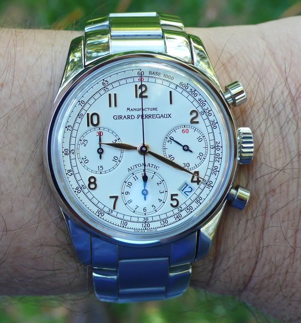
The case measures 38mm x 13mm but has long curved lugs that literally wrap around the wrist. Combined with the narrow bezel and the curved strap ends that frame the watch, the 1999 Chronograph sits perfectly and wears larger than you might imagine.

Girard-Perregaux manufactures their own cases (as well as bracelets and buckles) and the attention to detail is obvious. The case sides are brushed, while the thin bezel and the upper and lower surfaces of the 21mm-wide lugs are mirror polished. The sapphire case back is also polished and seven screws secure it to the case, which is a nice detail. The large crown is engraved with “GP” and is easy to wind and set. The case is water resistant to 30m, if that matters with a chronograph (well I guess it does as you don’t want condensation, humidity, or the occasional rain shower to ruin your day!). Mushroom shaped chronograph pushers and a high box-shaped sapphire crystal emphasise the vintage feel.


The dial is beautifully proportioned. A seconds track and a tachometer scale encircle the dial which features applied polished gold Arabic numerals, set off beautifully against the eggshell coloured dial. These match the leaf-shaped gold hour and minute hands that catch the light and make time telling quite easy. The chronograph is a tri-compax design, but the continuous seconds register is on the right. I find this quite useful when the watch peeks out from under a shirt cuff.

There are two important attributes of a chronograph for me: one is being able to read civil time at a glance and the other is being able to determine elapsed chronograph time easily. So many chronographs are a cluttered cacophony of colours, hands and subdails that this basic requirement is actually quite challenging. The 1999 Chronograph, however, is a case study in functionality. The only possible variation in the design I could see would be to make the continuous sub-seconds hand gold to differentiate it from the chronograph hands. But for aesthetic reasons I like the balanced blued hands on this face, and in practice you soon learn which dials to use to read off the various functions.


The chronograph and sub-seconds hands are in heat-blued steel and the chrono seconds hand is a delightfully sensual design, as you can see from the images. All the hands reach their appropriate tracks with a definite nod to function over aesthetics. There is a small date window at the 4:30 position (which does not eat into the chronograph seconds track and is a more elegant design than Zenith often achieves) with the date shown in matching black font on a grey background. I find this just perfect. It doesn’t upset the symmetry of the dial very much and provides useful information when you require it. The date can be quick-set from the crown.

The movement is the in-house Calibre GP3370. This is based on the robust workhorse GP3300 calibre that powers many Girard-Perregaux watches. The Cal. 3300 is an 11.5 ligne (26.2 x3.28mm) uni-directional (counter-clockwise) automatic movement with a glucydur balance and flat Nivarox 1 hairspring beating at 28800vph (4Hz). There is no ‘slop’ at all in the hand setting train and, combined with a practical hacking seconds, allows very accurate time setting – which I like in a chronograph that purports to accurately measure time.

On top of the base calibre is a Dubois-Depraz cam/lever chronograph module (DD2021). While many look down on modular chronographs (they tend to be thicker, date displays are usually recessed, pushers are not in line with the crown, hand setting may not be as accurate and the chronograph movement is hidden under the dial) the Cal. 3370 has been nicely thought out. The date ring is raised up on an additional bridge so that the display is flush with the dial. The pushers essentially align with the top of the large crown and the pusher feel is very positive. It’s not buttery smooth and one needs to press quite firmly and a long way in (so to be accurate you have to partially depress the pusher and wait for your moment), but there is no delay or jump that can sometimes be an issue with modular designs.

The base Cal. 3300 has 27 jewels, but combined with the chronograph module there are a notable 63 jewels. The power reserve is around 45 hours. The movement itself is seen through the sapphire case back. The main plates and automatic rotor are decorated with Geneva stripes and there is carefully applied perlage around the perimeter of the movement. Anglage is applied to the visible edges and the movement is pleasingly well finished at this level of watchmaking.


The brown signed crocodile strap with matching brown stitching tapers to a signed 16mm simple pin buckle, perfectly suited to this ‘dress’ chronograph. The Ref. 4946 was also available on bracelet, but the 38mm diameter lends itself more to a multipurpose dress chronograph than an all out sports chronograph, so I think it is very suited to the leather band which has the additional effect of emphasising the watch ‘head’.


The movement was serviced only recently (its second routine service in 10 years), but I have been enormously impressed with the accuracy of the watch, on and off the wrist, in all positions and with and without the chronograph running. Basically the watch has lost 2 seconds over the last fortnight! It’s only one watch in a series of course, but I find that performance impressive, and I’m glad this watch is mine.  This is perhaps one of the theoretical advantages of the modular over integrated chronograph design: in the modular design the wheels of the chronograph are moving continuously and it is only the hammers on the hearts that prevent the hands from moving. This has the advantage of producing less drop in amplitude of the balance when the chronograph function is activated.

The 1999 Chronograph is a watch that surprises and delights in the details. As you wear it there are so many aspects to marvel at: the curve of the lugs, the length and shape of the hands, the red accents on the dial, the interplay of brushed and polished surfaces and the shape of the crystal.

For me a Girard-Perregaux watch is all about the wearing. They are generally not watches to be put on a pedestal in the collection and admired from afar (excluding perhaps the Three Gold Bridges variants, and other exotica, but you know what I mean). Girard-Perregaux more often than not seems to get the important aspects of the case, the wrist feel, and the dial very right, and the Ref. 4946 is no exception.


Andrew
This message has been edited by dxboon on 2012-05-10 06:48:04 This message has been edited by dxboon on 2012-05-17 11:36:42

Thank you so much for sharing this Chrono with us, Andrew.
This is a lovely GP you got here.
You explaiend very well all the details whiich made your decision, and, to make it short, I concur.
The only small thing which disturbed me was and still is the bloody date, located between 4 and 5 o'clock.
I think this dial would have been even much nicer without the date.
At this very small reserve, you have a lovely Chrono, a great alternative to the common competitors of the category.
Best, and once again, thanks for the great review!
Nicolas
Symmetry and date
I hear what you are saying, Nico. In regard to the Ref. 4946 all I can comment on is that GP have included the date very tastefully. There is no border around the date window, the font is the same as the dial markings and, most importantly, the window doesn't eat into the seconds track.
Here is a comparison with the Zenith Prime:


The Ref. 4946 is otherwise beautifully symmetrical, and none of the numbers are nibbled by the subdials, which I applaud. Either the date window provides some tension to an otherwise symmetrical dial, or it draws your eye and upsets the symmetry. Each owner will have to decide, but on the wrist it is not bothering me, and the date provides some useful information in a chronograph.
Here's a quick Photoshop removal of the date window. What do you think?

And with the date window, as delivered. ;-)

Andrew
Thanks for the photoshop efforts, Andrew. ;)
Yes, it speaks a lot with outh the date, and much louder to me.
But this is just my opinion, and as I said, a minor detail which can't damage the appreciation on this Chrono.I am more and mopre turning around this brand, by the way.
There are some pure treasures to re discover.
All the best, my friend.
Nicolas

A touch of asymmetry...
That's a very helpful observation ...
I have been looking again at the photoshoped image without the date, and looking at the watch on my wrist and the watch is much more interesting with the 'beauty spot'.
To borrow one of Art's usual succinct analogies: Cindy Crawford ...

With or without?
A
GP purchase
Thanks,
Mark
Beautiful
One question Andrew...
Andrew,
Congratulations on the beautiful GP 1999 chronograph. This is one of my all-time favorites and I wish GP would introduce another reference similar to yours for those of us who have not been able to locate the 1999. Also, great photos and report as well.
When you compare the feeling of the pushers on the GP compared to the feeling of the pushers on the Zenith, which feels more fluid? It sounds like the GP pushers are somewhat stiff when activating the chrono. Does the Zenith feel better in this regard?
By the way, I think the date window is positioned perfectly on the dial. A design well done by GP IMHO.
Best regards,
Mike
Pusher feel
Hi Mike,
Thanks for your kind words. There seems to be more than a few who love this reference. The closest watch in the current GP catalogue is the Ref. 49585 which is 40mm in size and has a solid case back, but otherwise has a very similar dial. I will do a post on this shortly as an alternative option.
In relation to pusher feel there are a lot of differences. The Zenith El Primero is obviously a column wheel design compared with the cam/lever of the GP. The Zenith has a shorter 'throw' to activate, is softer to press (although still finishes with a distinct 'click'), and you can almost feel the column wheel rotating under your fingers. Functionally it is let down by the smaller pushers.
In contrast, the mushroom pushers on the GP are nicer to use, but there is more 'dead space' before it activates and with the cam it is more a notchy hard click to finish.
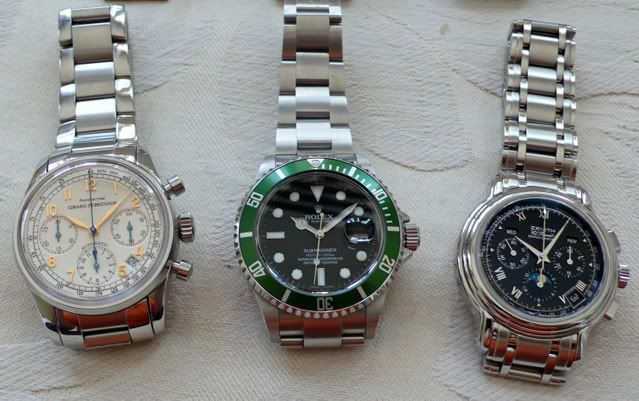
All difficult to describe over the internet! Neither watches are as smooth as a VC or ALS chronograph. And of the two I prefer the Zenith. I will take some photos of the Zenith Prime and 1999 Chrono side by side at some stage.
Regards
Andrew
Thanks Andrew for the good description...
I look forward to seeing your GP and Zenith side-by-side for a comparison. Again, congratulations on a beautiful piece!
Best,
Mike

Thanks for the review Andrew.
Fx
This message has been edited by foversta on 2012-05-09 14:54:21
The view from behind ...
Thanks FX. I agree that it would be nice to have a column-wheel movement visible under that sapphire. It may be why the current Ref. 49585 has a solid case back. But you can't argue about the performance of the calibre - it's a very well thought out design.
Andrew

Excellent review - a cousin says hello
Congratulations on this acquisition; like you I was smitten by a similar model (see below) as I found the aesthetics very irresistible. I must say that I admire your taste!
As you say, it wears pretty big and over time, I've forgiven GP for the date window which I think was done about as tastefully as it could be. I've also found it to be a very accurate timer and time keeper which has assuaged my initial hesitation on the layered chronograph. Also, the action on the movement is extremely smooth and the watch definitely has a solid feel to it. Mine came with a deployant which I never found comfortable and so quickly switched to the GP buckle. The strap by GP is excellent and, at least with my more recent model, becomes meaningfully thicker near the lugs, which makes for a more attractive fit. My primary gripes are that at times I find the gold hands hard to read, although I spend an equal amount of time admiring their aesthetics, and that my model has a sealed case-back; this must be a prime advantage of the 4946 model.
Excellent review and thanks for the education! Here are some shots:


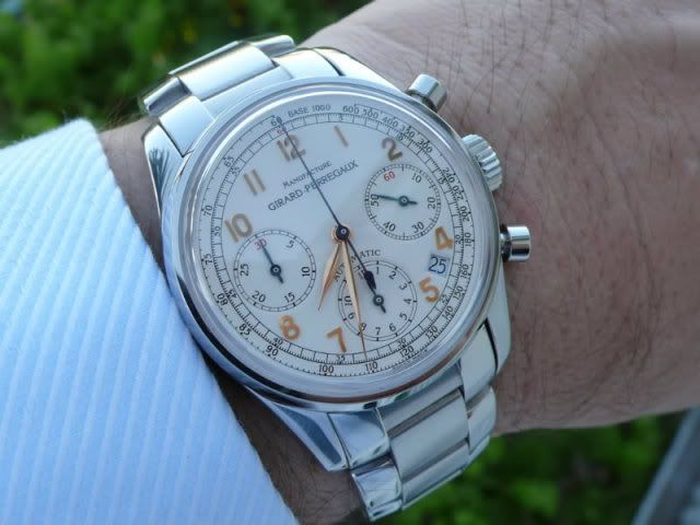
"Manufacture"
Thanks Nomer, you clearly have great taste in watches. ;-)
Thanks for the photos of your Ref. 49585 which adds a lot to this thread; it's great to see these watches evolve. The 40mm is more in keeping with modern size standards. Although I like the enlarged "12" and probably even the removal of "Automatic" on your watch, I do like the word "Manufacture" on my Ref. 4946. It just emphasises to me that I am wearing a watch from a fully integrated company and there is a certain pride in that.
Seems like your experience with accuracy and the chronograph functionality are the same as mine so far. The tapering strap from 21mm at the lugs down to 16mm at the buckle further emphasises the vintage feel. The gold hands haven't posed a legibility problem for me, but I have mainly used it in artificial light so far.
Regards,
Andrew

You found a keeper...
Patience paid off ...
I had always been impressed by this watch, but put it out of my mind. But when it became available I jumped at it.
Pleased you like it too.
Andrew
What doesn't come out in the photos is ...
Thanks Sanro, the dial, and actually the case work, really make this watch.
What doesn't come out in the photos very well is the perfect eggshell yellow of the dial. And there is also a graininess to the dial, much like the surface of an egg. It greatly accentuates the vintage feel, and beautifully sets off the golden accents of the hands and numerals and matches the strap.
It's hard to stop looking at it, and dangerous in traffic!
Andrew

Marvelous piece
for this great review of beautiful watch
Congrats
Best
Damjan
Traditional, Damjan? Wow, that gives a whole new definition of the word " Traditional ".:) [nt]
New definition as....

I'm veeery traditional in many things my friend
Best
Damjan
Here's the 'traditional' Damjan ...
... I know and love:


Deep down, perhaps, but there is no doubt in my mind.
A

Thank you for your review Andrew
I can say I like your watch, and prove it since I have nearly the same one:
gp.watchprosite.com
In fact since they made mine in 2007 they issued at least another series of 4946 in late 2007 or early 2008, the "Chronographe Monte Carlo 1965", a cream or black dial version of 250 pieces (each ?).
I still love this watch as it is perfectly sized and very nicely made like Girard-Perregaux knows how to do them!
So after the Prime it's a new common watch....
Best
Dje
Excellent review of the history and evolution ...
... of these vintage mushroom pusher chronographs, Jerome. Thanks for the link. It reminds me again what treasures are in the archives here.
I certainly remember your Ref. 49460 and it was your watch that kept the fire burning for me with this piece. So we clearly share the same taste in chronographs! And the subtle changes in your watch are nice, such as removing "Automatic" from the dial, and of course the arrow indices.
Your pictures prompt me to mention how thick that box-shaped sapphire is. It gives the watch a more substantial wrist presence but also has the pleasant effect of distorting the dial when viewed at an acute angle. So the dial is always changing and the overall look emphasizes that vintage feel we have been talking about.
Great series of watches!
Andrew

Beautiful watch, Andrew
I love vintage style chronographs, and GP's models are among my favorite along with Patek and VC. I prefer rose gold cases with the exception of a white metal case with rose or yellow gold numbers and indexes. The contrast between the numerals/hands and the case is fantastic. I have to agree with Nico in that I would prefer the date to be absent, and I also agree with you that the date has been added with the least amount of disruption to the balance of the dial. I am becoming more and more interested in GP. With the 1966 line, the new minute repeater, all models with 3 gold bridges along with their chronographs there is alot to like. Thanks for the review and enjoy your new prize
Stewart

Thank you very much once again, Andrew...

Hmmmm...
...better on the strap for me in this case. Not that I don't like it on the bracelet, but something about the vintage styling cues of the dial and pushers calls for a strap IMO. I'd be happy to have either version in my watch box, of course!
Cheers,
Daos
Two personalities perhaps?
Thanks for the photos on bracelet. You make a strong case that the 1999 Chrono is a a very suitable sports chronograph. The bracelet adds heft to the otherwise demure 38mm case and many have commented on the quality of the GP bracelet and the invisible clasp. These are clearly two watches that we need to get together for a side-by-side comparison. ;-)
Regarding the reviews, these things basically write themselves. To get the most pleasure from my watches I am compelled to gather information and consider my own reasons for having them in the collection. And it makes a nice focal point to look back on.
Nice to share this watch with you.
Warm regards,
Andrew