Comments:


 Load More Comments >>
Something about this 1675 drives me crazy :)
It puts a huge smile on face every time I strap it on

Some people think the dial is not even real which makes it even more exciting
Best,
Laurent
It could be that if it is a gilt dial with a large vs small 24hr people get confused.
There are so many thing that can give doubt but unless someone has a ligit observation enjoy it.
But this is not the case... And even, in 1967, you had a bit of everything. I don't know if our friend's watch is from 1967, though. The charm of Vintage Rolex.
You also have a wonderful fat font insert. And a close relative.
The last picture has the swiss t<25 across five vs yours across three.
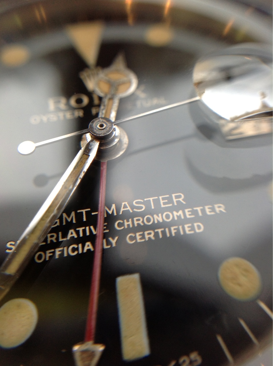

They come in two variants as far as the swiss t<25
How is the glow on the dial and hands. Luckily with the small 24hr hand they don't usually affect the whole look if their temperature is a little different as the tritium surface is small. Looking forward to seeing the new configuration. The all red hand will be happy on a matt dial.
Yes thats what I saw.
Was looking at some photos online and saw the 2 variants!
The lume on my watch still glows a little in the dark since it’s Zync sulfide which lasts longer than the usual tritium I guess.
I will replace the GMT at some point for sure. It should arrive in about 2 weeks but not in a rush to do it as I have to find the right watchmaker who would be willing to take off the hands without risking scratching my dial
That’s what I’m worried about tbh.
Best,
Laurent
I am in such awe
I am in such awe of these dials; all three are such amazing specimens. I'm not sure why, but I've always been drawn the most to Bill's dial variant. I refer to that style as "The Double R" because of two minor imperfections with the printing cliché.

1) The bottom right of the "R" in GMT-MASTER seems to have a little pinch near the tip, sometimes making the tip appear square.
2) The bottom right of the "R" in CERTIFIED has a tiny vertical line that extends below.
Therefore, it earned the Double R title, at least in my head.
Other differences that stand out are a cleaner and/or less bold "ROLEX" and "OYSTER PERPETUAL" text. Similarly, the SCOC text has less pronounced serifs making it appear thinner when compared the other variant(s). Finally, the SWISS>T25 is not as bold. I certainly love both styles, but under a microscope, and for no specific reason, I find the Double R type more visually appealing. Could only find the blurry picture below for Exhibit A; sorry for the poor example.
And after all this time, I never realized the dial with larger serifs has SWISS>T25 spread across only three hashes. Would love to see some more macro photos of these dials. I consider them amazing pieces of art.


Amazing. Thanks for sharing! Pictures like that make me second guess my preferences. The craftsmanship to achieve such clean serifs at that size is a true art.
Amazing dial there, simply amazing. And with such clean lume plots, it's almost like you purchased it from a time capsule! Congratulations on that museum piece.
Amazing dial there, simply amazing. And with such clean lume plots, it's almost like you purchased it from a time capsule! Congratulations on that museum piece.


Yeah the only thing that was previously replaced is the gmt hand.
Since it’s a 1966 glossy gilt, should have the small gmt arrow hand. I’m actually buying one now. Besides that it’s all 100% original. I also have the original box and papers too