A Comprehensive Guide to Vintage Rolex Submariner MK1 through MK3 Bezel Inserts.
Rolex Fat Font inserts explored MK1 through MK3.


Historical Context
The evolution of Rolex bezel inserts tells the story of the brand's attention to detail and continuous refinement. Some of the very early inserts from the 1950s had no markers between 0-15—they just had individual marks at every 5-minute increment. We also have the famous red triangle that adorned the Rolex Big Crowns during the 1958-1959 period. Of course, there's the later military insert for the 5517 issue, which featured marks at every minute.

Scope of This Guide
The focus here will be on the inserts fitted to the 5512, 5513, 1665, and 1680 models. As always with Rolex, I must preface this guide with the fact that we are discussing Rolex, and nothing is definitive. Please enjoy this review as a guide formed by experience.

Understanding "Fat Font"
First and most important is to cover the main buzzword: "Fat Font." What is it with Rolex and "fat" this and "fat" that? First the lugs, now the fat inserts. Well, when dealing with the time period from the late 1950s to early 1970s, the standard was fat font. During the vintage period in question, MK1 through MK3 inserts are all fat font, with only service replacement inserts being thin/skinny. There are degrees of "fat," which will be illustrated throughout this guide.
Insert Classification Overview
| Classification | Time Period | Key Characteristics | Models |
|---|---|---|---|
| MK0.5 | Late 1950s | Transitional insert, may have had red triangle | Early Big Crown models |
| MK1 | ~1958-1961 | "Kissing 40," very fat font, square "5," serifs | Early 5512, 5513 (gilt era) |
| MK2 | ~1961-1970 | Long "5," fat font without serifs, no touching numbers | 5512, 5513, 1680 "Red Sub" |
| MK3 | ~1965-1980s | Slight serifs, somewhat thinner font, square "5" | Most vintage Subs into early 1980s |
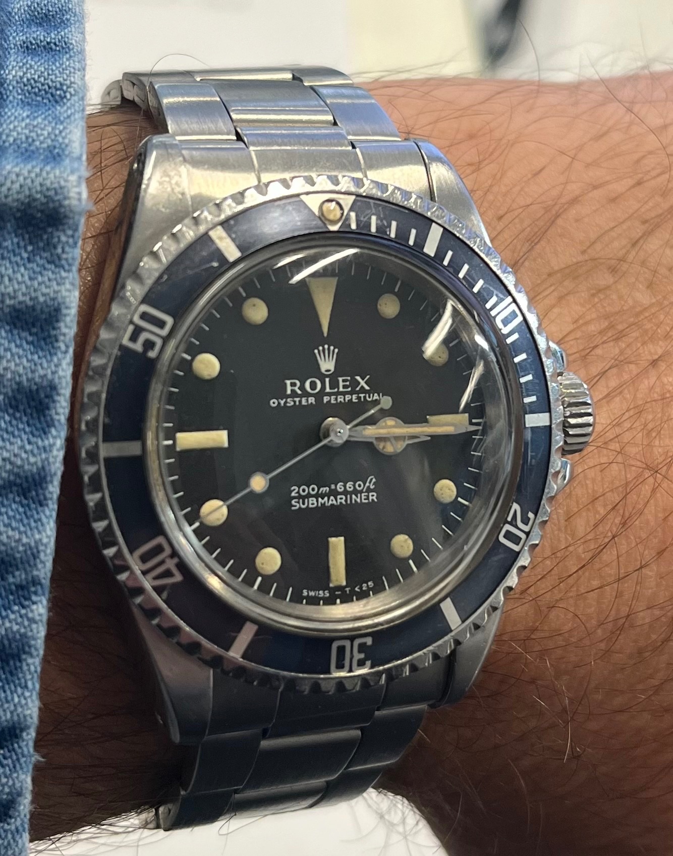
MK1: The "Kissing 40" Insert


The fat font insert shown above features the early "kissing 40 font." Very rare to find, holding the position just after the early Subs with the red triangle. This model would have been present on early 1960s Submariners like the 5512 from the gilt era, and most likely the 5513 of the same period (i.e., a gilt "Swiss only" ending around 1963/64). It's not very common to find these intact on watches from this period.
MK1 Key Identifying Features:
- The "Kissing 40": The "4" and "0" in "40" actually touch each other
- Small Square "5": The number five has a distinctly small, square shape with thick font
- Serifs: Numbers feature small serif details—like little feet protruding at the ends
- Font Thickness: The fattest of all fonts, with numbers almost touching each other
- Thick Index Markers: Very substantial markers, appearing somewhat "sloppy" but correct
- Character: Overall appearance is bold and distinctive

MK2: The "Long 5" Insert

The key identifier for this variant is the "long five" feature in the 50 marker. The interior of the five is elongated vertically, rather than square as in the MK1 (with the exception of the MK0.5 or MK1.5, which I'll discuss later). The fonts are without serifs and fat, but not touching in any way. There's slightly more breathing room between the fonts compared to MK1, but they're still very substantial.
MK2 Key Identifying Features:
- Long "5": The interior space of the "5" is vertically elongated
- No Serifs: Clean font without the decorative elements of MK1
- Fat but Separated: Bold font with clear spacing between numbers
- No Touching Numbers: Unlike MK1, numbers maintain distinct separation
- Cleaner Appearance: More refined look than MK1
This insert was probably fitted on the 5512 and 5513 models through the late 1960s to early 1970s. It was likely also the model found on the 1680 "Red Subs." It remains a highly desirable insert for all vintage Submariners.


MK2 on Rolex 5513


MK3: The Final Fat Font


The MK3 fat font appears to be the last of the fat fonts and exhibits some sort of serif in the font style. It appears slightly thinner than the other two variants. You can see the little tails on the "40" as well as on the "20." The number "50" is again more square but not as small as the MK1.
MK3 Key Identifying Features:
- Subtle Serifs: Small decorative tails on numbers like "40" and "20"
- Slightly Thinner: Still bold but not as heavy as MK1 or MK2
- Square "5": More square than MK2 but larger than MK1
- Bold Feel: When sitting alone, still appears solid and substantial
- Most Common: Graced most vintage Subs up to the early 1980s, possibly later
When compared to a thin font insert, the difference is quite evident. However, when viewed alone, it appears to have a solid bold font feel. This is the insert that graced most vintage Submariners up to the early 1980s, maybe even later, and can be considered the last variation of the fat font era.
Visual Comparison: Fat vs. Thin Font
The following images allow you to really see the differences between MK1, MK2, and MK3 as compared to the thin font service inserts:


Special Classifications: The MK0.5
These last two examples presented a classification challenge. As promised, here's the MK0.5—I'm not sure what else to call it. These inserts look like they would have featured a red triangle. While I had some doubts initially, they are genuine examples, and as I always say: this is Rolex.


Quick Reference Guide
| Feature | MK1 | MK2 | MK3 |
|---|---|---|---|
| Font Weight | Fattest | Very Fat | Fat |
| "5" Shape | Small square | Long/elongated | Medium square |
| Serifs | Yes, pronounced | No | Yes, subtle |
| "40" Touching | Yes ("kissing") | No | No |
| Spacing | Minimal | Slightly more | Moderate |
| Rarity | Very rare | Rare | Most common |
Conclusion
The evolution of Rolex Submariner bezel inserts from the late 1950s through the early 1980s represents a fascinating journey in design refinement. From the ultra-bold MK1 with its distinctive "kissing 40" to the more refined MK3 that served collectors well into the 1980s, each variation tells part of the Submariner's story.
While these classifications (MK1, MK2, MK3) provide a useful framework for understanding and identifying vintage inserts, it's important to remember that with Rolex, variations and transitional pieces always exist. The dates and model associations provided here are educated estimates based on experience and observation of numerous examples.
For collectors and enthusiasts, understanding these distinctions adds another layer of appreciation for these iconic timepieces. Whether you're verifying the originality of a vintage Submariner or simply appreciating the evolution of design, these "fat font" inserts remain one of the most sought-after and distinctive features of vintage Rolex dive watches.
Best regards,
Bill
Addendum: Community Insights and Additional Discoveries
The "Skinny 4" or "Slim 4" Insert
One of the most significant discoveries from community feedback was the identification of a distinct insert variation known as the "Skinny 4" or "Slim 4." This insert doesn't fit neatly into the MK1-3 classification system and represents an important transitional piece in Rolex insert evolution.


Skinny 4 Characteristics:
- Distinctive "4": Notably slimmer "4" compared to all fat font variants
- Positioning: Numbers and hash marks appear pulled toward the outer edge of the insert
- Font Style: Roundish font with a tail on the "4"
- Square "5": The "5" has a square body similar to some fat font variants
- Time Period: Primarily associated with 1963 Submariners, particularly the 5513
- Rarity: Relatively uncommon and mostly observed on early 1963 examples
Chronological Placement Questions
The exact placement of the Skinny 4 in the chronological sequence remains debated within the collector community. The primary question is whether this insert predates or follows the MK3. Based on observed examples:


- Early 1963 Association: Most documented examples appear on 1963 5513 references, suggesting it may be contemporary with or slightly after the MK2
- Vintage Advertisement Evidence: Some period Rolex advertisements from later years (late 1960s) appear to show similar inserts, though there's debate about whether Rolex reused older photographs in advertisements
- Printing Variations: Some experts suggest certain "Skinny 4" examples may result from printing errors where the design was positioned too close to the outer edge, causing the appearance to differ from standard fat fonts
- Regional Variations: Different markets may have received slightly different insert variations during the same time period

Printing Error Theory
One theory suggests that some Skinny 4 examples may result from printing errors where the font positioning was too close to the outer edge of the insert. This caused the paint to be visible on the outer edges and created the distinctive appearance with numbers and markers pulled outward.


Period Advertisement Evidence
Vintage Rolex advertisements provide additional context, though their reliability for precise dating is debated. This 1967 advertisement shows insert characteristics that warrant careful examination:

The "40" as a Key Identifier
Community member M. Pisani contributed detailed analysis highlighting that the "40" marker is perhaps the most telling feature across all insert variations. Examining the "40" can quickly help identify which MK version you're observing:

- MK1: "Kissing 40" - the "4" and "0" touch each other
- MK2: Separated "40" with fat, clean fonts and no serifs
- MK3: Separated "40" with subtle tails/serifs on the "4"
- Milsub: Distinct military specification font with unique characteristics
Expanded Insert Classification System
Based on community observations and documentation, a more comprehensive classification system has emerged for plastic Submariner inserts with crown guards:
| Version | Time Period | Key Features |
|---|---|---|
| 1. Square Font Red Triangle | End of 1959-1960 | Transitional piece with red triangle at 12 o'clock |
| 2. Super Fat Font "Kissing 40" | 1960-1962 | MK1 - Fattest fonts, numbers nearly touching |
| 3. "Skinny 4" Insert | Early 1960s (1963) | Roundish font with notably slim "4", numbers pulled outward |
| 4. "Long 5" Insert | Mid 1960s | MK2 - Elongated "5", fat font without serifs |
| 5. MK3 Insert | Late 1960s-1970s | Fonts with small serifs similar to Milsub, slightly thinner |
| 6. Fat Font No Serifs | Late 1970s-1980s | Later fat font without decorative elements |
| 7. Mid Font Service Insert | Service replacement | Transitional service replacement font |
| 8. Skinny Font Service Insert | Modern/Current | Modern thin font service replacement |
The MK3.5 Possibility
Some collectors have proposed an additional classification - the "MK3.5" - to describe inserts that exhibit medium font weight similar to the MK3 but lack the characteristic serifs. This would represent another transitional piece between the classic fat fonts and the later thinner service replacements.
Important Considerations for Collectors
Authentication Notes:
- Period Advertisements: Vintage Rolex advertisements cannot always be relied upon for definitive dating, as Rolex may have reused older photographs in later promotional materials
- NOS (New Old Stock): Occasionally, new-old-stock bezels from earlier periods were fitted to later watches, creating seemingly anachronistic combinations that are nonetheless factory-correct
- Manufacturing Variations: Rolex used multiple contractors and printing methods, resulting in subtle variations even within the same classification
- Printing Errors: Some unusual insert appearances may result from manufacturing errors where designs were positioned incorrectly during printing
- Regional Variations: Different markets may have received slightly different insert variations during the same time period
Community Contributions
This guide has benefited enormously from the vintage Rolex collecting community. Special acknowledgment to:
- M. Pisani - For detailed photographic analysis of the "40" marker evolution across insert variants
- Multiple collectors - Who contributed examples of the "Skinny 4" insert and helped establish its approximate dating
- Forum members - Who shared their observations about NOS bezels, period advertisements, and manufacturing variations
- Vintage Rolex Forum community - For ongoing documentation and discussion of insert variations
Ongoing Research
The study of vintage Rolex bezel inserts remains an evolving field. As more examples are documented and analyzed, our understanding of the chronology and variations continues to develop. Collectors are encouraged to:
- Document their inserts with clear photographs, particularly of key markers like the "40" and "50"
- Record serial numbers and corresponding insert variations to help establish more precise dating
- Share observations of unusual or transitional pieces
- Maintain healthy skepticism about definitive classifications - with Rolex, there are always exceptions
Final Thoughts on Classification
As one community member astutely observed: "Great message...now I know why my inserts look like they were made by 20 different contractors or artists." This captures the reality of vintage Rolex insert collecting - the variations are numerous, the exceptions are common, and definitive classification remains elusive in many cases.
The MK1-3 system provides a useful framework for understanding the major insert variations, but collectors should remain aware that:
- Transitional pieces exist between all major classifications
- Manufacturing variations create legitimate outliers
- Time periods overlap significantly
- Multiple insert styles may have been in production simultaneously
Rather than seeking absolute certainty, collectors are better served by understanding the general evolution of insert styles while appreciating the unique characteristics of each individual piece.
Updated: This addendum incorporates community feedback and discoveries made following the original publication. As always with vintage Rolex, new information continues to emerge, and classifications may be refined as our collective knowledge expands.
Best regards,
Bill
With appreciation to the vintage Rolex collecting community

A Reference post I will save with your permission, Bill.
You wrote it very well. Inserts may look futile, but like a good piece of Art, the devil is n the details.
And a Vintage Rolex needs its own insert.
If you add the patina to the graphics, a nice and correct insert is not tha futile.
We are two damned souls to wander in the purgatory, before finding the coreect one for our 5508s, Baron and me.

By the way, I love, more and more, the version without baton indexes between zero and fifteen, of the Big Crown. Very pure!
Best, my friend.
Nicolas.
Every piece of art needs a frame
The Rolex insert is one of the most recognizable aspects of a Rolex Submariner. Often imitated but never duplicated. The Rolex insert is a mark of distinction across the world and the Rolex Submariner is the most recognizable when it comes to dive watches. It was an essential tool for divers to safely calculate their dives long before computers and other sophisticated tools took over.
Some of the very early inserts from the 50's had no markers between the 0-15 they just had individual marks every 5 minute increment. Also we have the famous Red triangle that adorned the Rolex big Crowns in the 1958 – 1959 period. And of course the later Military insert for the 5517 issue with marks at every minute.
source:internet credits unknown .. will credit if noted. pic for reference only
The focus here will be on the inserts that were fitted to the 5512, 5513, 1665 and the 1680. As always with Rolex I must preface this exposé with the fact that we are talking about Rolex and nothing is definitive so please enjoy this review as a guide of an opinion formed by experience. I will use the nomenclature of MK1-3 as it seems to be widely accepted. I will also sneak in a Mk0.5 as one that may have come just before the MK1 but still not stepping on the red triangle insert. However as there are possible variations please feel free to add your comments. Also the inserts are prone to fading and come in an abundant array of shades of gray/black but again I am focused on the base models. They also have a range of pearls that would be affixed tritium and luminova among the most common. I will not covet these accoutrements just the inserts here.
First and most important is to cover main buzz word "Fat Font". What the hell is it with Rolex and fat this and fat that. First the lugs now the fat inserts. Well, when dealing with the time period of the late 50's to early 70's the standard was fat font which I will describe in a minute. Actually I will let the pictures describe it in more detail. The rage on inserts MK1 through MK3 are all fat font with only the service insert being skinny. Again of the vintage period in question. There are degrees of fat which again will be illustrated.
Rolex 5512/5513 Insert - Fat Font MK1
The fat font insert on the above is the early "kissing 40 font". Very rare to find holding the position just after the early Subs after with the red triangle. Here I will present the reference model which is widely accepted as the MK1. This model would have been present on the early 1960's submariner like the 5512 from the gilt era. This would include most likely the 5513 of the same period i.e. a gilt Swiss only ending around 1963/64. Not very common to find these intact on many watches of the period. Key elements to observe is the shape of the five which has a small square with think font. The number forty have the "kissing distinction". I think we can all agree to call this one the MK1. If we then assume the the variations we call MK2 and MK3 as simple slightly less "fat" i.e. the font is from fattest to fat we can draw the distinction. However, I don't have a solid theme to say which watch had which of the inserts exactly what year but you can also assume that the period late 50's through maybe 1961 could be mk1 ans then 1961-63/64 as the MK2 period and then from the 1965 period onward to be the early MK3 variety. But this is only an assumption.
The Characteristics are clear as you can see the fonts are so thick that they are almost touching each other with the exception of the forty which is touching "kissing Forty". The index markers are also very thick. They do appear to be somewhat sloppy but this is a correct feature. You will also notice the shape of the five in the fifty where you can see a small square shape with a slight serif at the tips. The numbers in general have a small serif features to them all not in a traditional sense but like little feet protruding at the ends.
Rolex MK2 fat font - Long 5
The key tell on this one is the long five feature in the 50 marker. It is the interior of the five that is elongated vertically rather than in the MK1 which is square. The exception is of course the MK0.5 or MK1.5 which I will expose later. The fonts are without serifs and fat but not touching in anyway. There is a slight bit more breathing room between the fonts but still very fat. I imagine this one to have been fixed on the 5512, 5513's through the late 1960 up to early 1970. It was probably also the model you would have found on the 1680 "Red Subs". It still remains a highly desirable insert for all vintage submariners.
.
Rolex 5513 Insert - Fat Font MK2
Rolex 5513 Insert - Fat Font MK3"
The MK3 fat font seems to be the last of the fat fonts and seems to exhibit some sort of serif in the font style. It appears slightly thinner that the other two. It is the one on the bottom. You can see the little tails on the forty as well as on the 20. The number fifty is again more square but not as small as the MK1.
When compared to a fat font insert it is quite evident but when sitting alone it appear to have a solid bold font feel. The fonts are also non serif. This is the insert that graces most vintage subs up to the early 1980s. Maybe even later but it can be considered the last variation. The last sequence of pictures allows you to really see the difference of the MK1-2-3 as compared to the thin font. There are a few other variations which I have not really classified as I am actually not completely sure. First a couple of picture with a broader range on Fat and not so fat inserts.
These last two I really did not know how to classify. As promised a MK 0.5 not sure what else to call it. They look like they would have had a red triangle. I had some doubts but they are real and as I always say this is Rolex.
Best
Bill

Great and informative thread my friend!! Cheers,

great research report Bill!
Pearls are a little more simple
Best
Bill

Great Post Bill
Very informative
Excellent post. Here is a "Skinny 4" similar to one in the center of the third to last photo of inserts you show. Notice how the numbers and hash marks are pulled to the outter edge of the insert, as well as the skinny 4. I have been told these were produced on gilt 5513's for only a year or so around 1963. Here is an example posted here some time back. rolex.watchprosite.com= and rolex.watchprosite.com I hope it's ok to link to this previous post.
Daniel

This message has been edited by Suboc on 2013-03-11 08:05:32 This message has been edited by Suboc on 2013-03-11 08:11:23
I have observed the insert in question
Bill


Here are some better images of the insert in question
Thanks Bill. There are certainly a number of other inserts, and figuring out how they fit into the chronology is a little confusing. I believe this insert is correct however not sure what period its from. I appologise for redirecting this thread from Mark 1,2,3. I was just comparing my insert to a similar one you posted under "There are a few other variations which I have not really classified as I am actually not completely sure".
Daniel


This message has been edited by Suboc on 2013-03-11 10:15:31
I think it is safe to say based on the 5
I personally don't know how to classify beyond the Mk1-3 and even in the fat fonts there are many variations which are nuances on the known versions.
I also don't think the one you presented is a service dial or the more common slim versions.
I have a few more inserts I will try to photograph and see if we can find a match.
Best
Bill
Your insert is worth a deeper review.
I need to do some review at my end but all comments are welcome.
Best
Bill
Here is a borrowed image with what I believe is a similar insert, although later than 63

That does shed some light on the time period for that format


Funny thing is...
This message has been edited by Suboc on 2013-03-11 14:28:51

Hi-res of the 1967 ad
Hi Bill,
Thank you for a great post - a newbie like me can only sit backk and enjoy the ride!
Here is a hi-res of the second ad (1967) you posted, maybe there are some details that can help?

Best
Blomman
Thanks for the Hi-res image.....
Anyone recognize what 5513 dial variant(year) the add shows. Does it look like a 67 dial when the add was printed or a 64 dial? Reason I ask is that "Skinny 4" inserts have been seen on early 1964 watches and perhaps the image although in a 1967 add is that of a1964 watch.
Thanks,
Daniel
This message has been edited by Suboc on 2013-03-13 20:54:33At first my guess was Bart Simpson 1965-66
Again it is hard to distinguish in the picture.
What you can say generally is that a 1963 gilt dial is a swiss only or a double swiss only but not swiss - t<25.
Below is a 5513 purported to be from 1967. Observe the crown.

Below is a 1963 dial swiss only so not a match for sure

Finally a Bart Simpson dose not look like the ad.

So your saying it doesn't look like a 1964 Swiss-t<25 dial? [nt]
Yes it could very well be a 1964-65
Sorry I was all over the place I was hung up on the slim 4 and the 1963 model.
Best
Bill
Thanks...

Thank you Bill!
Bill:
Awesome and informative post. Thank you for educating all of us here. You are right - every piece of art needs a frame.
I just got a 10x loupe and have been looking at my 1665 and 16600. The bezels are really a piece of art, and the variations in them over the years make for subtleties that are just awesome.
V/R
Mike
The art of Rolex
Best
Bill
But if I was a betting man I would say non gilt MS 1967
It has all the attributes of the ad and it is non guilt consistent with a 1967 + dial.
But from the ad it is hard to tel just going by what Rolex would be advertising in 1967 more likely the mat dial.

Perhaps, but the L in Rolex....
Super hard to tell for sure.
Actually in your first ad it does say 1968. But the hi res one I can't see the date.
Some many possibilities.
Bill