
The stark white dial of the Octa Automatique Reserve

This message has been edited by bs22fly on 2009-03-10 18:55:50
Terrific dial, but prefer the Octa RDM as my favorite. Just perfect

Nice picture
I actually like the dial on this watch very much. The shade of white used is very clean and eye-catching. Also, love how the typeface near the power reserve is smaller (no numbers get cut-off!). Thanks for sharing this with us!
Cheers,
Daos


I Don't Know
You are right to call out this watch, Brad. It is very little commented upon, and I mean no offense to anyone with my observations; however, in my eye this is the most un-Journe in his collection.
Douglas
tend to agree....
With that said if I had to recommend a Journe to someone who is not a savvy collector, will only own one watch in their collection and will wear it every day.. then this model is it.
Douglas
I to was an individual of convenience and really wanted the auto.
The CS has something alluring about it. Not sure what it is, but it has changed my desire from the auto.
It's nice to have all of the opinions from the members because at the end of the day we are all in here for a reason.
To trade ideas and thoughts and so as it goes, we determine what is best for our own use.
Prefer the Octa to CS
this is a beautiful watch. Admit my bias towards a dial with a date!
No question for me. The orginal RDM is true Journe, dial and movement
octa Automatique

What it lacks in pizazz....
it makes up for in functionality and ease of use .I think everyone is correct in their assessment of this watch.I also think this is the most un-Journe piece when comparing to those with much stronger DNA ie. Resonance, CS,Calendria &DS etc. Is it overlooked and under appreciated? Probably yes but somehow I'm glad FPJ made this watch.
Here's my take on it: as an automatic watch,this has got to be one of the best with its generous power reserve(5 days) and ease of wind( half day of semi - active wear and it's fully wound.) The dial is simple(no cut off nos. as someone pointed out) and very legible, perfect for those with less than perfect eyesight or getting on in years. Date and power res. indicator comes in handy and positioning IMO is coherent with the rest of the dial with a touch of subtlety - nothing "in your face"..Flip the watch over and what you see is in total contrast to the somber look of the dial;an amazingly beautiful movement ,an array of gold, awaits the beholder:
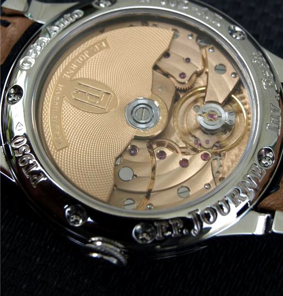
Wrap all this up in Platinum and this is what you get:
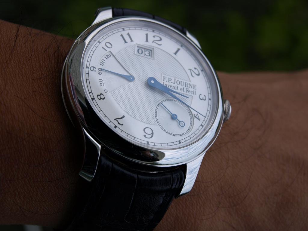
It may not be the quintessential Journes or is often seen amongst FPJ aficionados, which in a way makes it more special to me.However,what I like most about it, is the quiet way it goes about its business and provides the necessary information at a glance .I agree, it is the lazy man's Journe and great for daily ,no fuss wear!
Cheers and thanks for looking.
Fernando
This message has been edited by fernando on 2009-03-15 04:56:53
I like this a lot Fernando...
...particularly the look of the blue hands against the white dial...works really well.
Tim
