Featuresexpand_more
Spotlightexpand_more
Featured Forumsexpand_more
Brand Forumsexpand_more
Independent Brandsexpand_more
Lifestyleexpand_more
Resourcesexpand_more
Patek Philippe: Now, I would ask the forum moderators...
...could you ask the Manufacture an official explanation about the design choices here highlighted and discussed? Thank you in advance! Ciao
16Y
0
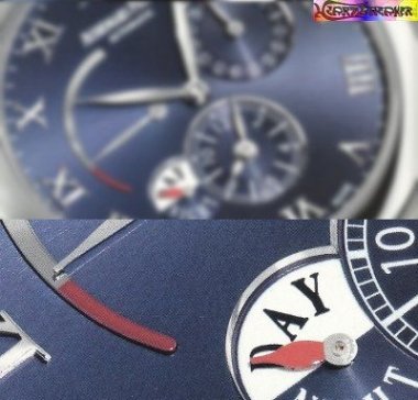
Patek Philippe: Please look at these images

Quoting Goh's message: < Imperfect alignment. Perfect alignment. The desing of markers at 12 and 1 position in both the above Aquanaut. Now, I hope I've well explained the matter. I hope some of the experts Purists could explain us these Patek Philippe's design choises. Ciao e Buona Pasqua a tutti!
16Y
1
Patek Philippe: Do you want some other examples?

Here they are: I started thinking that Patek Philippe use this markers' arrangement (that I find very ugly) for quartz movement-equipped Aquanaut. However, I would point out that this rule - if this IS a rule - does not apply to the Nautilus collection, because they do not show changes in the marker
16Y
1
Patek Philippe: Aquanaut's markers
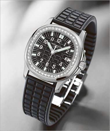
Some days ago, looking my Patek Philippe nearest retailer's showcase, I noticed a pink gold-extra large Aquanaut's with some of the markers not perfectly radial, like you can usually find in the Aquanaut Luce... ...like these... ...instead like these... What do you think about it? Ciao!
16Y
2
Bulgari: The archaic latin alphabet
I would like to add some notes regarding the use of the letter "V" instead of "U". You have correctly written that the "V" in the Bulgari logo is only used when it is written in all caps, as that is the classical Roman type. In fact, first of all, the archaic latin alphabet had only the sign "V" (on
16Y
1
Audemars Piguet: ROO Montenapoleone L.E.: badly painted hands?
Some days ago, I've bought the number 235 (january/february) of the italian magazine " Orologi - Le Misure Del Tempo ". On page 103 you can see this picture: It is the Royal Oak Offshore Montenapoleone, limited edition of 50 pieces, created for Milan's AP boutique, € 35.500,00. Have you noticed some
16Y
3
Horological Meandering: My favorite is Vacheron Constantin, followed by...
... 2) Audemars Piguet 3) A. Lange & Söhne 4) Girard Perregaux 5) Patek Philippe 6) Glashütte Original 7) Blancpain
16Y
0
Horological Meandering: Do you manually wind automatic watches?
I currently have two automatic watches and every morning I use to wind both of them: just a few turns of the crown for the watch I want to wear all day long while I make the other one fully wound. It's many years I got this practice and "feeding" my watches became pure delight, but I'm not so sure t
16Y
8