Featuresexpand_more
Spotlightexpand_more
Featured Forumsexpand_more
Brand Forumsexpand_more
Independent Brandsexpand_more
Lifestyleexpand_more
Resourcesexpand_more
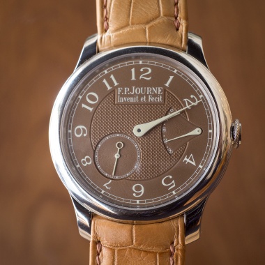
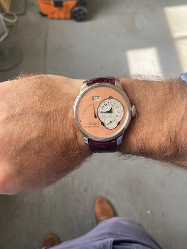
F.P. Journe: Colors Posted
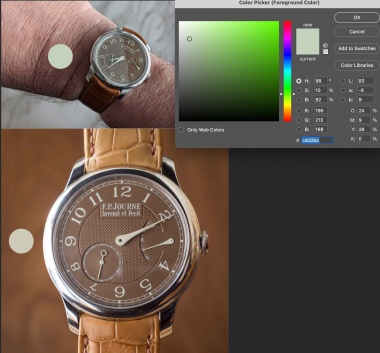
Hi IWC, Your picture illustrates it perfectly. The printing is generally considered to be "cream", call it a low intensity yellow. In bright daylight the numbers and hands look cream and the dial looks brownish. It leans towards an orange-brown. Indirect daylight, which is how we see our watches a l
2M
0
F.P. Journe: Blue over the Havana
This is easy...the blue CS. As typical with Journe he fixes issues over time. The first is that the Havana crystal washes the dial with an blue tint. Blue interacting over medium brown makes for a bad mix. (akin to the color of baby poop, as an old art teacher used to say) I photographed and color c
2M
1
F.P. Journe: Font size
It must be the lighting. My fonts are even. When you order one, you will see they are even.
2Y
1
Officine Panerai: For years
This watch has been something I have returned to year after year, but haven’t pulled the trigger. It has some lovely details like the domed crystal, soft pushers, gorgeous case (was always worried I would crack it, but have a ceramic IWC now…so it would be fine) and love that the chapter ring is not
2Y
0
F.P. Journe: New arrival
Have a great weekend Christian. Just picked up my AN and am very pleased with it. More pictures to come.
2Y
1
IWC: VS Ceramic

The material is nice, it feels slightly different than ceramic, but not by much. Though I suspect it will deal with hits better than ceramic. That said I went for the earlier ceramic version, in spite of size, because the monochrome was a bit flat for me. Great design on the case, but the printing a
2Y
1
F.P. Journe: MOP CS
Wow, very cool. Do you have any pictures of it in daylight? It is nice how there are no awkward transitions like in the nacres. Maybe a matter of taste, but this seems to have much better design unity to the dial.
2Y
1
Blancpain: 1968 Fifty Fathoms not plastic
The swatch version is actually ok. The newer FF case is not something I ever warmed too. It feels like a bloated version of the originals, but then again that can be said about a lot of modern designs. Still much prefer my ‘68.
2Y
2