amarelli
55

Colors Posted
Hi IWC,
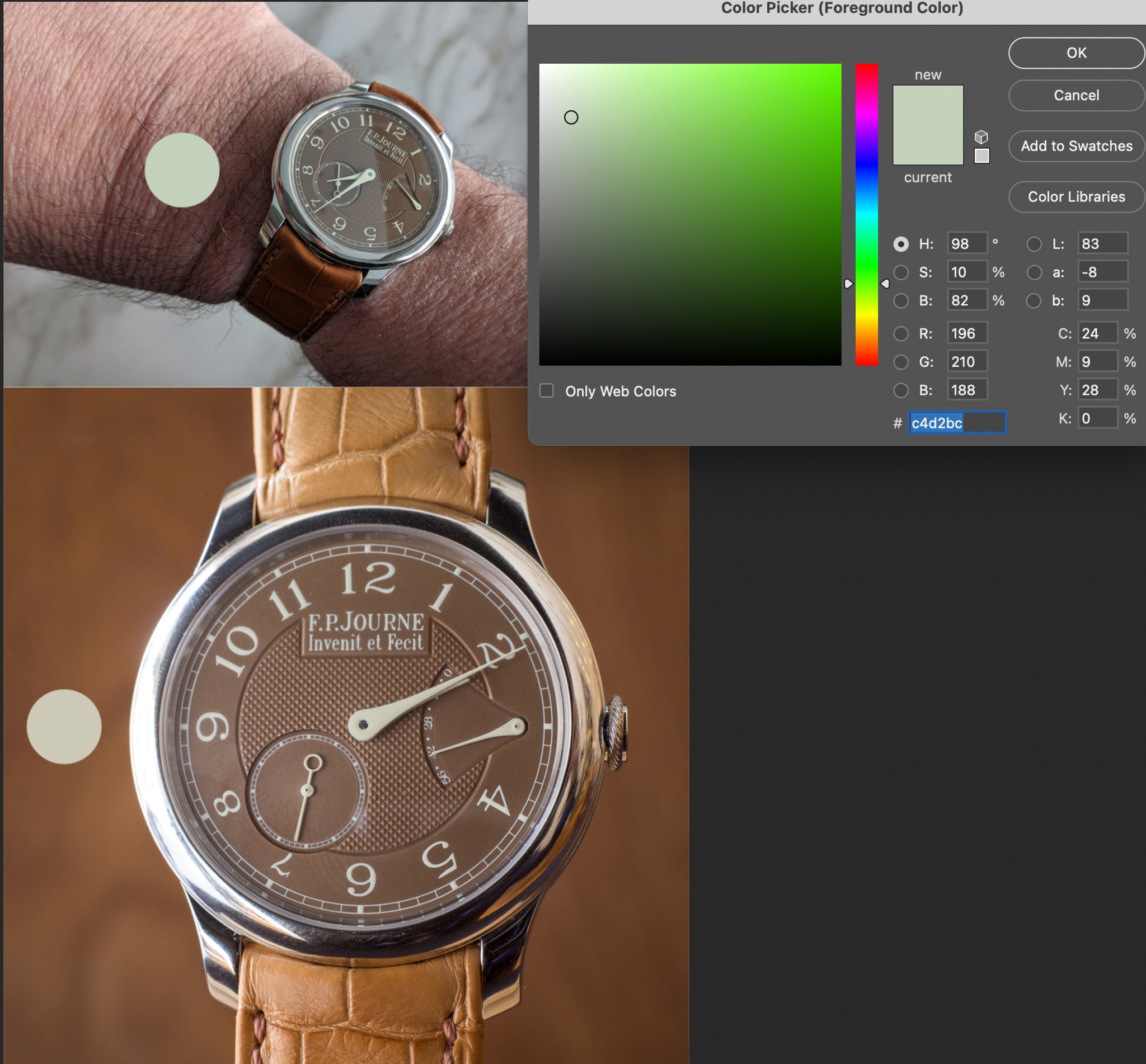
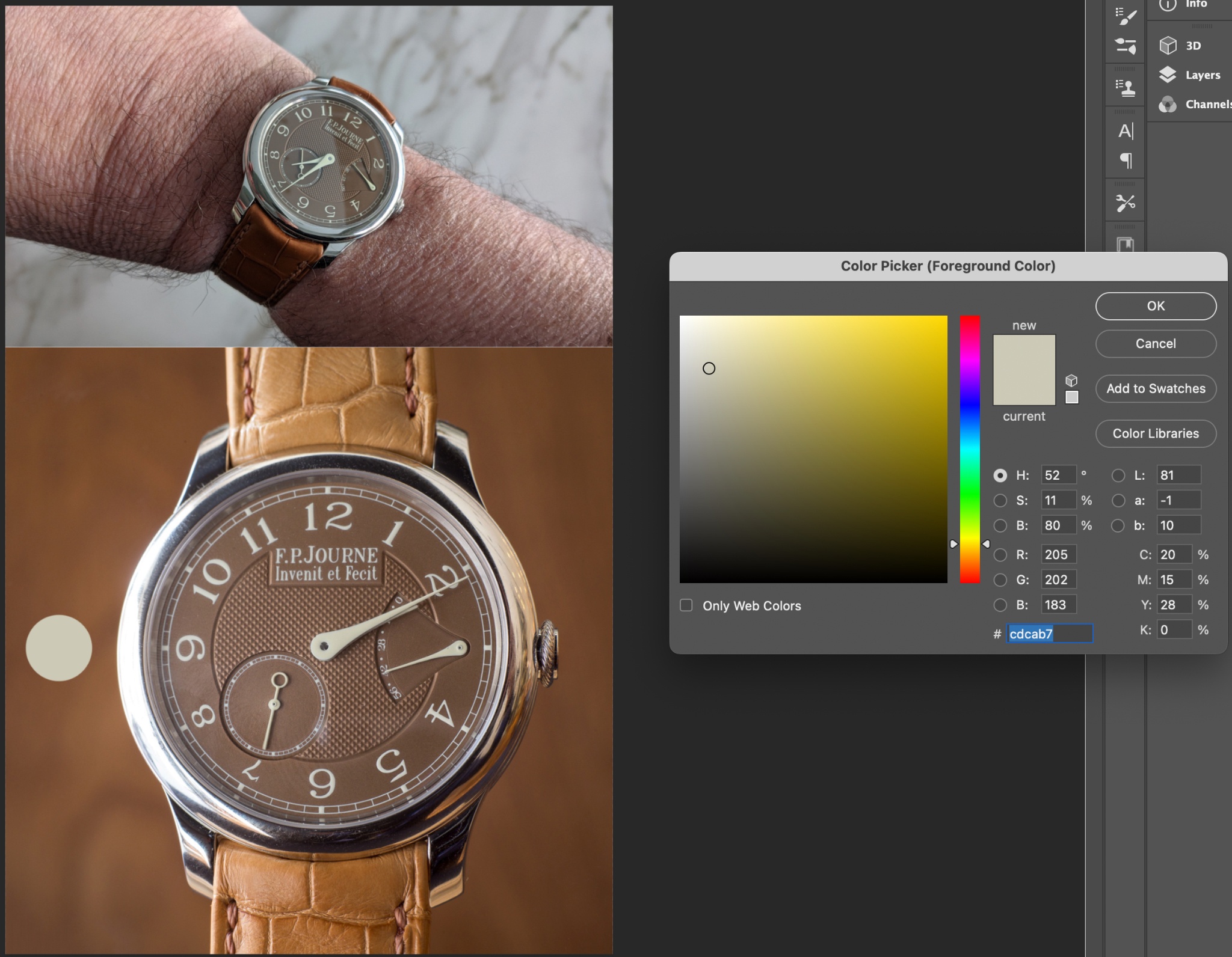
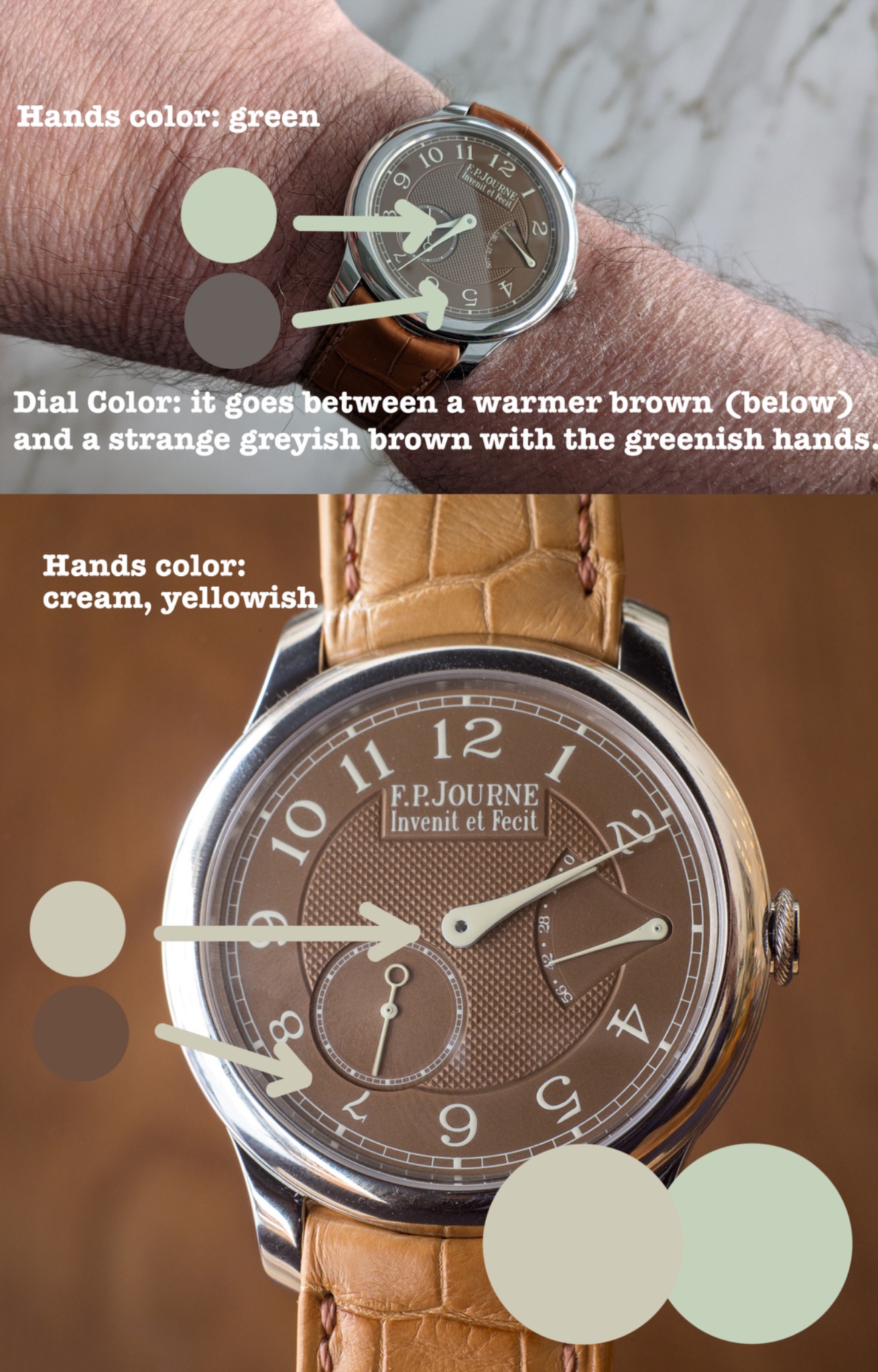
Your picture illustrates it perfectly. The printing is generally considered to be "cream", call it a low intensity yellow. In bright daylight the numbers and hands look cream and the dial looks brownish. It leans towards an orange-brown.
Indirect daylight, which is how we see our watches a lot of the time has a bluish hue. It interacts with the cream printing and the coating on the sapphire making the numbers look greenish.
To make this easier to see, I pulled it into photoshop and used the eye dropper to show the color.
I think the problem is that the color combination of the cream, brown, sapphire, and daylight make for a strange green and a muddy brown.
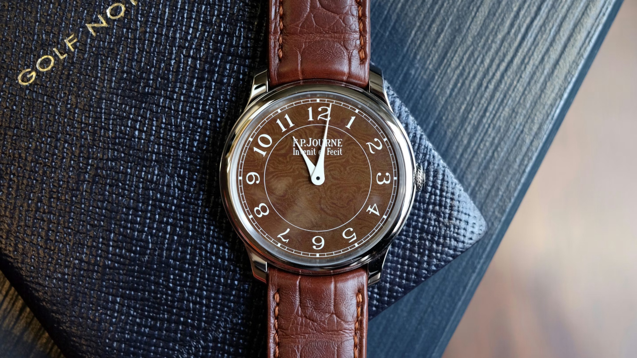
The Holland and Holland has a much more saturated brown. It makes the hands appear more white. My guess is it is the same cream that is on the CB, H&H and Havana. But color is contextual so the dial color has a huge influence on how it reads. CB works, H&H also works, Havana only works in warm light. In a lot of other lights it looks greenish or greyish in a way that personally does not strike me.
We don't know each other and this is an easier conversation to have in person. It is a bit like the difference of a C instead of a C sharp. It just sounds a bit off for the song. In a different context each element could work. But in spite of the market popularity and pleasure I imagine any owner has with the Havana, from a color point it has a dissonance that feels like striking a sharp note.

First Journe… indecisiveness

Both are beautiful.
I realized I like more

The one I have...

I like the Havana.
It’s all about the latitude!

CS is an amazing watch.

Very personal choice.
Don’t currently have any platinum watches in the collection

I have the Havana dial, but in RG.
Leaning more towards the Havana

Two amazing pieces and you will get so much joy from both of them
My local boutique does have any on display/available to try on at the moment

Blue over the Havana