
Marcus Hanke
[PuristSPro Moderator]
11296

Experience Report: Porsche Design Chronograph P'6612 - Part 2
More than just function:
The Porsche Design P’6612 Chronograph
by Marcus Hanke
February 2008
Part 2
The Porsche Design P’6612 Chronograph
by Marcus Hanke
February 2008
Part 2
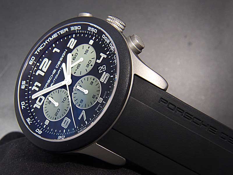
C) Dial and hands:
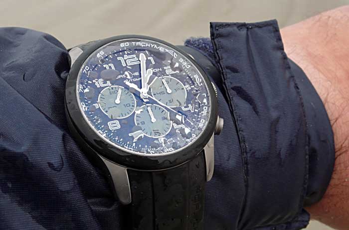
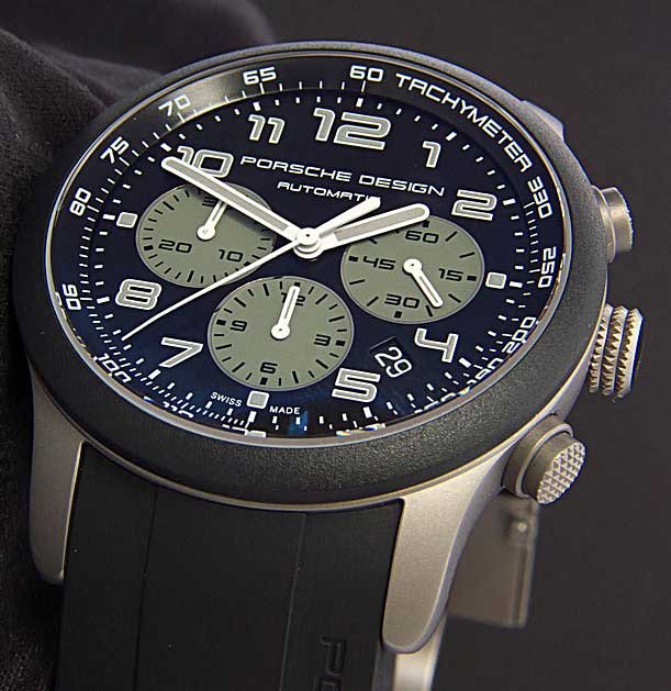
Those who are familiar with the history of Porsche Design timepieces will have noticed immediately the departure from earlier design principles, that incorporated dials reduced to clearly legible hour markers, but did not employ numerals. This changed some years ago, when part of the “Dashboard”-series watches received a new styling, with Arabian numerals, adopted from the dashboard instruments of the famous Porsche 911 sports car. Consequently, the chronograph reviewed is featuring these uniquely styled numerals, which are thankfully not mixed with other font styles, with the exception of the date window. What makes this version so particular are the subdials being coloured in olive drab, and the SuperLuminova of the numerals, tinted with the same colour. This looks very outdoor-ish, and certainly is more fashionable that the classic and sober Porsche Design dials.
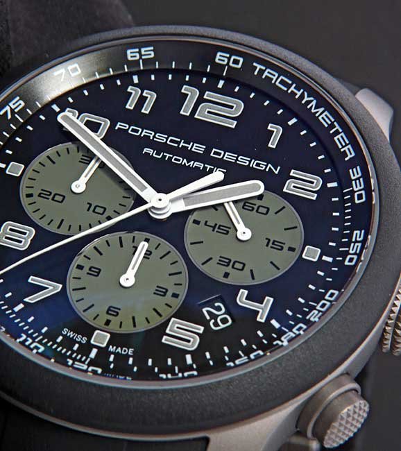
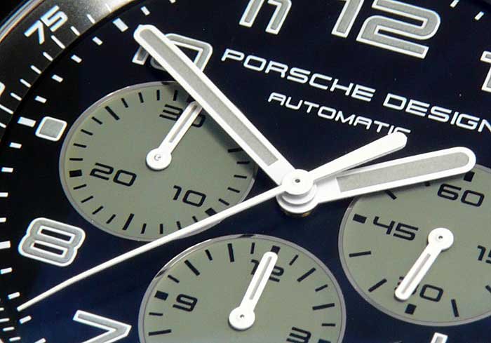
The hands are bright white, using the same olive drab coloured SuperLuminova as on the dial. Why all the chronograph subdial hands are luminous, but not the chronograph second hand, is very strange, but the Porsche is sharing this mystery with many other chronographs on the market. The contrast over the dark dial is very good, at least where the crystal’s anti-reflective coating is still in place and working. A nice detail is that the minute and the chronograph’s second hand have their tips bent downward, which helps avoiding parallax errors when reading the time. However, the minute hand and the subdial hands are too short, compromising the legibility.
The finish of dial and hands is first rate, all printing is sharp and clean, the luminous mass used is of fine grain structure, without any apparent flaws in application, and the lacquer on the hands is regular and smooth.
D) Movement:
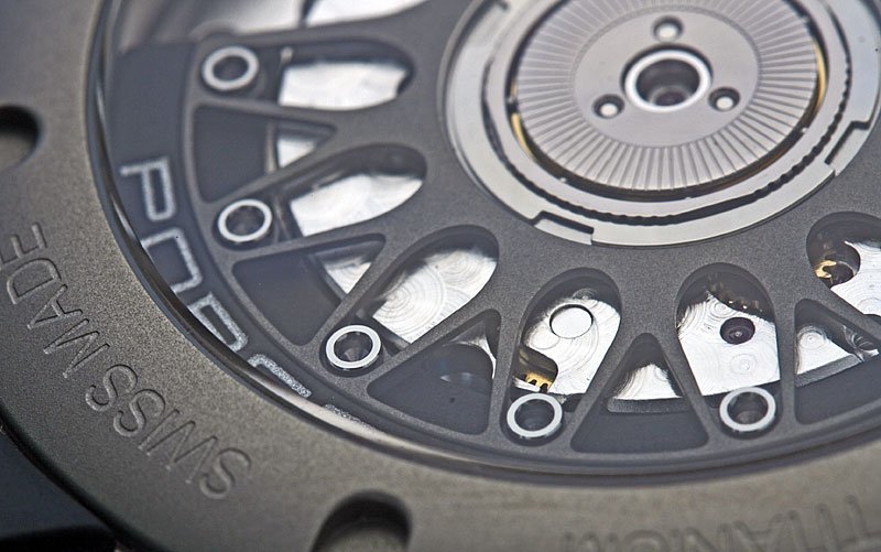
The P’6612 chronograph uses an ETA 2894-2 modular chronograph movement. Based on the tried and reliable 2892A2, it is not exactly an attractive sight: The chronograph complication is located under the dial, and the base movement has a tiny balance wheel, that is barely visible aside the huge automatic winding bridge and the large rotor ball bearing.
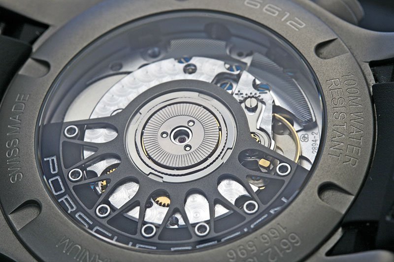
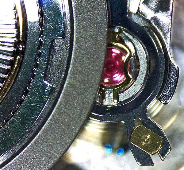
Yet Porsche Design invested some effort to give it an attractive appearance, with perlage on the bridges and some (chemically) blued screws. What is really noteworthy, though, is the rotor, that is truly a small work of art: Its body is made from titanium, copying the shape of a Porsche’s rims. The outer segment is a heavy metal, and attached to the titanium body by what appears to be chrome-plated inbus screws. This looks absolutely gorgeous!
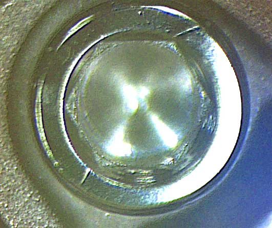
On the performance side, the movement is rather average. As indicated earlier already, the chronograph pusher operation is far from smooth, but not as rough as is common for most 2894 used in cheaper watches. At least, the chronograph second hand does not stutter, and the also familiar jumpback on starting is not visible at all. Causing more problems is the massive, and also unpredictable play of the minute hand, due to the movement’s modular construction. When setting the time, the exact synchronising of the small second and the minute hands (with the minute hand pointing to a an index when the small second is at 60) is an issue of sheer luck. In fact, the play of the minute hand can be somewhere between 30 seconds and more than one and a half minutes. That means, when the crown is pushed back to restart the movement following a reference time signal, the small second hand is passing between 30 and about 90 seconds, before the minute hand starts moving. An accurate time display is thus barely possible at all.
When I compare the small second with a reference time signal, the movement’s accuracy is quite good, with the watch gaining an average of four seconds per day - but only as the watch is worn every day. On the winder, it lost about 20 seconds per day.
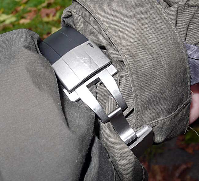
E) Strap and clasp:

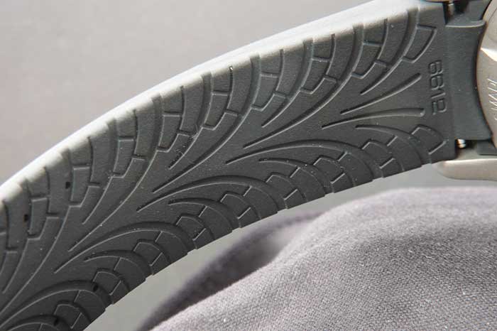
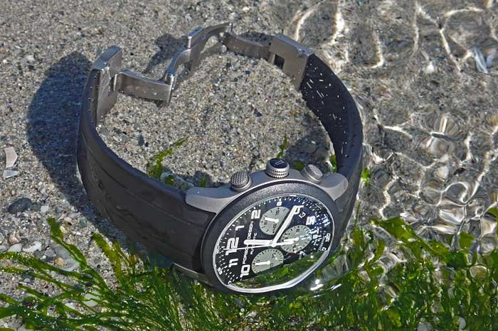
Without doubt, the Porsche Design rubber strap is another highlight of the watch. It is stiff and smooth at the same time, and has absolutely no sharp edges that could dig into the skin. Its underside is featuring a profile reminding of sports car tires, that also helps achieving a good ventilation of the skin even in very hot and humid climates. The only disadvantage of that design is that it is not easy to keep clean the delicate structure on the underside, but a soft toothbrush works well.
The double folding clasp made from titanium unfortunately does not match the strap’s quality and comfort. It is rather large, with its surfaces attracting scratches very quickly. While the operation of the two release pushers is satisfactory, the clasp altogether leaves a wobbly impression.
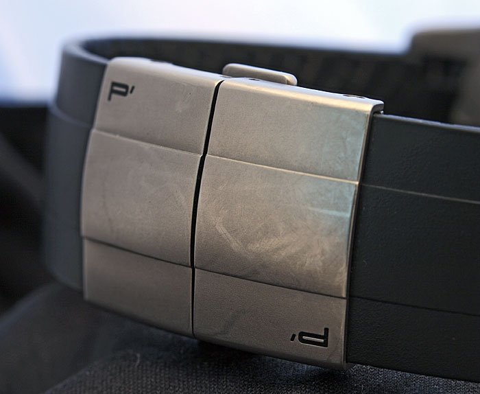
The clasp is attached to the rubber strap by means of two tiny screws on each side, making a quick adjustment of the length impossible. Tiny claws are gripping the strap in holes prepared for that purpose. This appears to be a rather secure construction, but nowadays, modern bracelet and clasp designs should offer a quick adjustment opportunity for the length. Since ergonomics always was Porsche Design’s most important selling argument, I am missing such a provision from a PD watch.
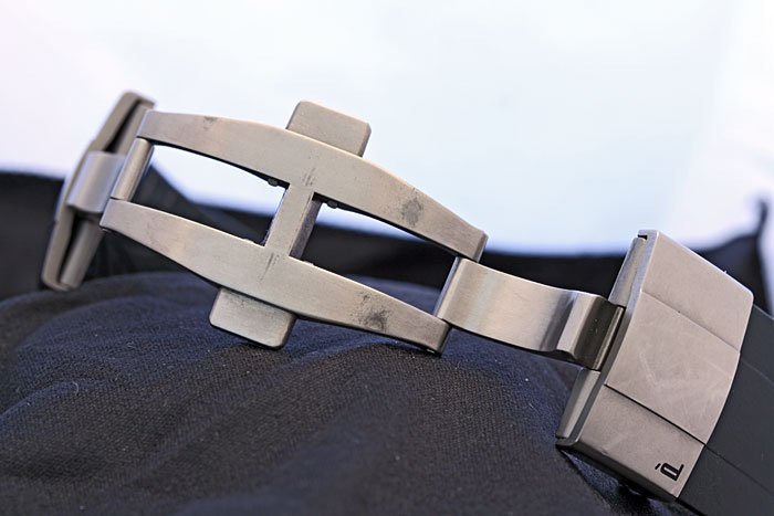
What is nice, but probably not intended by the designers, is the fact that the two halves of the clasp are locked independently, so it is possible to leave one side open as a “diving suit extension”, permitting to wear the watch over the clothes, which is sometimes quite practical.
F) Ergonomics and legibility:

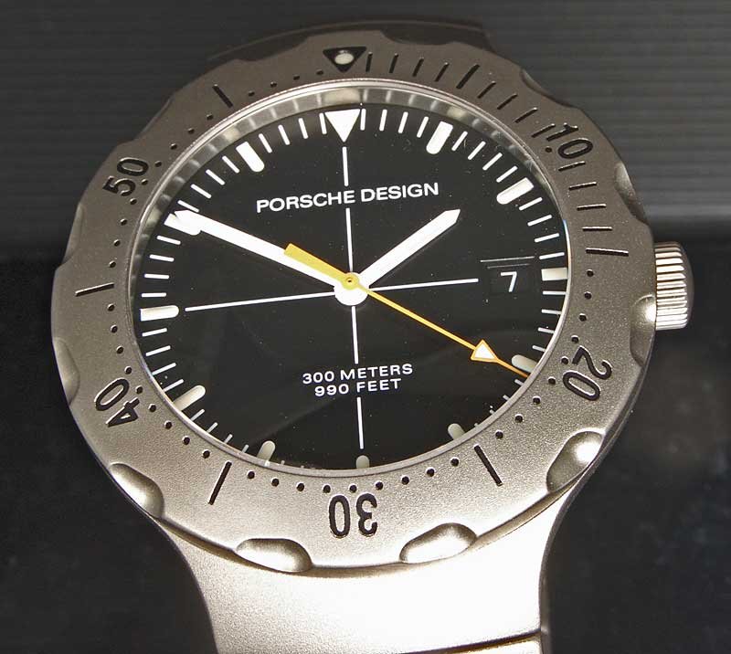
Are Porsche Design watches boring? I have to admit that this is the impression I get when asking people around me - watch enthusiasts and “ignorants” alike - about their opinion on my tiny collection of PD watches. It is interesting, that - with the exception of the Ocean 2000, that has an own and avid community of fans - practically all Porsche Design watches are accepted as highly legible, practical, functional - but not exciting or fashionable.
Ferdinand Alexander Porsche, the famous designer, tried to establish his dogma of the “reduction to the pure function”. Regarding watches, this reduction always meant clean lines, without any superfluous edges and ‘features’, like decorative screw heads or oversized crown protectors; and without numerals. For F.A. Porsche, people in our civilised world are confronted with watch dials already in early development stages of their childhood. To read a clock is one of the most important lessons we all had to learn. The result of this is an almost instinctive recognition of the time when we see the position of two hands, which is the reason why analogue watch displays still are more popular than digital ones. Porsche concluded that numerals, be them Arabian or Roman, are needless and superfluous, since with twelve markers, everybody is perfectly able to read the time; and the watch display can be kept uncluttered and clean, with high contrast.
Therefore, we won’t find a Porsche Design watch with numerals on the main dial (but of course on subdials) that was designed while Ferdinand Alexander was in charge of his studio. However, the reduction to pure function has a big disadvantage: Once successfully established, it is impossible to develop or innovate the design. Therefore, for decades, all Porsche Design watches more or less looked alike.
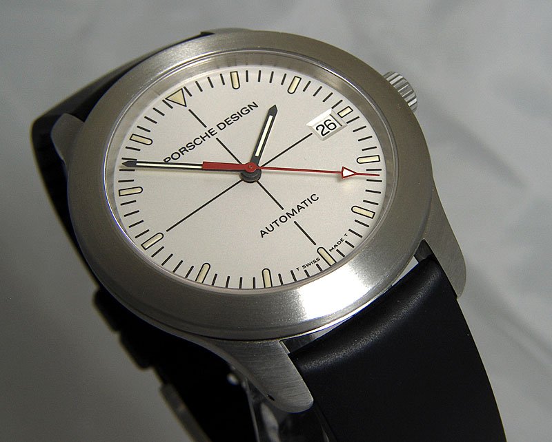
A typical Porsche Design watch from the P10 series
This changed when the design studio’s founder retired and the formerly independent company came under a common roof together with the Porsche car manufacturer. Now, the purpose of design was less interpreted as a pure ‘slave of function’, but something that was subjected to changes in contemporary tastes and fashions.
The difference is apparent at first sight: The ‘classic’ Porsche Design watch is highly legible. Its main purpose, to present the time, is immediately apparent. The lack of Arabian numerals results in a large and empty area on the dial, that permits the hands a very good contrast with the background. But, and this is my longtime experience, this design is met with a disinterested “uh...”, whenever I presented that watch to others. This is not a good starting point if you want to sell lots of watches.
Therefore, the new design line, as represented by the P’6612 chronograph reviewed here, is very different: The numerals borrowed from the Porsche 911 dashboard might be good to read on a speedometer, but they are not very legible at small sizes, like they are used on watch dials. That the 12 got a larger size than the other numerals, is a bit confusing, too. Overall, the numerals make the dial appear more cluttered as one of the traditional watches.
A more serious problem is the poor legibility of the subdials. First, the numeral printing there is black on olive drab, which is very difficult to read. As pointed out already, the small hands are too short and a bit stubby, and together with the black markers on the subdials, an intuitive reading of the measured values is impossible; one has to concentrate on that task.
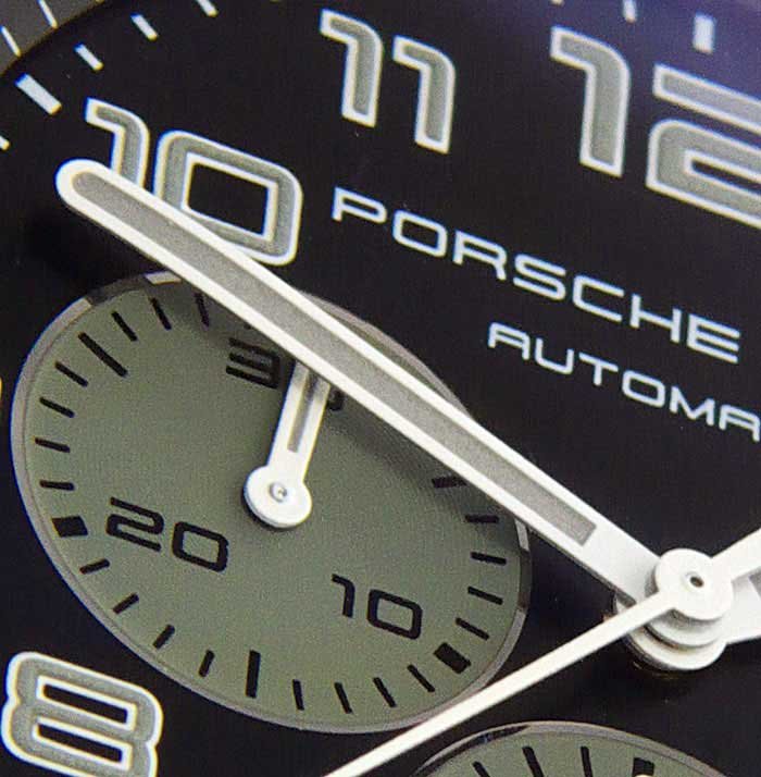
Second, it would have been better to use different colours in order to group the hands according to their function. Since all the hands are bright white, it is difficult to quickly recognise the difference between the permanent second and the chronograph counters.
Finally, the nighttime legibility is rather poor, due to the colour pigments in the SuperLuminova, which reduce the substance’s luminosity. Also here, function had to stand behind the aspect of fashion.
But: it looks so good! This is what justifies all the compromises regarding ergonomics and function. Compared with ‘classic’ Porsche Design watches, the newer lines really are able to attract the attention of people, and that is what the business of a watch manufacturer is all about. So additionally to fulfilling the function demanded from a vacation watch, the P’6612 chronograph also offers me the luxury of good looks, which is why I wear it so often, even outside the vacation time.
Click here to read Part 1
Copyright February 2008 - Marcus Hanke & PuristSPro.com - all rights reserved
PuristSPro Homepage | ThePuristS Homepage
Comments, suggestions, and corrections to this article are welcome.

Experience Report: Porsche Design Chronograph P'6612 - Part 1
More than just function: The Porsche Design P’6612 Chronograph by Marcus Hanke February 2008 Part 1 The perfect travel watch: quest for the “Holy Grail”? In earlier times, I was amused when reading the reports of fellow watch enthusiasts, who spent a lot ...
Experience Report: Porsche Design Chronograph P'6612 - Part 2
More than just function: The Porsche Design P’6612 Chronograph by Marcus Hanke February 2008 Part 2 C) Dial and hands: Those who are familiar with the history of Porsche Design timepieces will have noticed immediately the departure from earlier design pri...


Thanks Marcus for a wonderful review!
Thanks Marcus for a wonderful review! I have always been a fan of PD watches but reviews of these watches are indeed rare. I think your observation of these watches as traveler's watches is right on. For many years, I find them to be the most versatile of...


Changes after the Crash Test Dummy Sings
Marcus, First, I must stress that I am NOT calling you a Crash Test Dummy. I am merely hunting for a catchy automotive-based operatic headline.....as in "It's only over after the Fat Lady sings." I like your crash test reviews though because you winkle ou...

Well, the first change might be an advisory regarding . . .
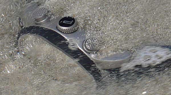
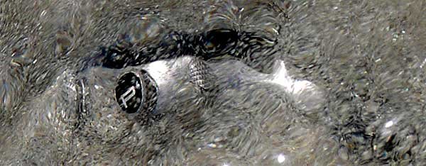
. . . immersion in running water and sand . . . "maelstroms can be harmful to the AR coating, and are not recommended", or words to that effect . . . ;-) . . . cordially, Art


Wondeful review Marcus!
Finally had a chance to finally sit down and read your review. A thorough review and felt as if I was there in the room with you examining the watch! I wonder what Porsche Design thinks of your pictures with the salt water and sand LOL! I love it! Cheers,...