Arronax
5148

Quick random ex1 thoughts
I had a bit of time a few days ago and ventured into a gray dealer to check the multple variations of the explorer1. It's always good to see what the crown has to offer, even if I don't own any as of today. Crystals had protective stickers on making AR coating assessment difficult.
Despite dwindling eyesight I have been gravitating around smaller watches for several years now, it made sense to start with 36mm. I was expecting the 14270 to feel the lightest due to hollow end links. I didn't get a chance to count the number of links in the bracelet however the 114270 felt a tiny bit lighter, to my surprise. I enjoy dial patina on other people's wrists but I'll take functional lume any day, must be the dive watch fanboy in me. The double lock clasp of the 114270 is a nice addition. In terms of feel, they remain quite close to neo-vintage models with both bracelets retaining some lightness which is a feature that I like.
Most of my watches tend to have very minimal polished material on their dials (doxa sub, sinn u50) as well as excellent AR coating and telling time at a glance in any condition is a breeze. The shop had a multitude of spotlights which coupled with the polished indices, glossy dials and thin hands made it almost impossible to tell the time quickly. I suspect this is a lesser issue in natural light with only one light source or more moderate lighting conditions.
Purely from a legibility perspective, the 39mm 214270 mk 2 was the easiest to read, offering enough dial space for indices & numerals to breathe and detach each other across the dial. I had forgotten about this one, very nice with lumed numerals. I also tried the current gen 40mm (224270) but it felt too big for me and I didn't even take a shot of it.
I had read a lot of comments about 5mm taper (19->14) of the current gen 36 but in practice it didn't seem to bother me much. If I was in the market for a 36 I reckon I would probably go for the 114270, primarily because I prefer the looks of the thinner fonts used on the dial, although it would be hard to give up on lumed numerals. The surprise of the day for me was the 39 mk.2, while not offering the vintage vibe of the 36 it felt really attractive and the most cohesive package without looking excessively large, unlike the current gen 40mm. I will probably check the 39 mk2 at a later stage.
Happy Friday!
Left to right: 124270 (current 36), 114270 (previous gen 36), 14270 (T<25 dial).

Left to right and reverse from above: 14270 (T<25 dial), 114270 (previous gen 36), 124270 (current 36)

Left to right, on the wrist: 14270 (T<25 dial), 114270 (previous gen 36), 124270 (current 36). Most obvious is the use of fatter numerals and fonts between the 114270 and 124270.

The forgotten 214270 mk 2, I had forgotten about this one, very nice with lumed numerals:

114270 vs 124270:


Vintage
Uncover the true history of the Rolex Explorer I, debunking myths about its Everest connection. DrStrong details early references, movements, and design evolution.
37 replies31656 views
Collection
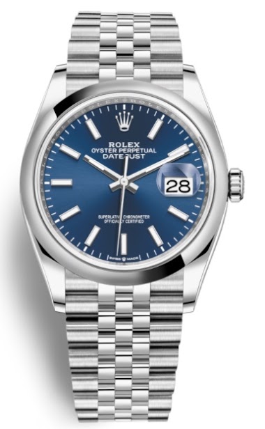
Boris highlights the overlooked Rolex Datejust 36mm (ref. 1262xx) amidst sports model craze. Discover its proportions, new movement, and availability.
21 replies5945 views
Review
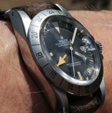
In-depth review of the Rolex Explorer II 1655 'Straight-hand'. Discover its history, design, and collector appeal.
15 replies24613 views
Collection
Jocke - Bad Santa reviews his Rolex Explorer 114270 after 10+ years. Discover insights on its 36mm size, Caliber 3130, SEL bracelet, and market context.
17 replies4374 views

Vintage
Compare vintage and modern Rolex Explorer I references (114270, 6610, 14270) to see how Rolex design DNA has evolved over 60 years.
9 replies2755 views

Reference Guide
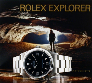
Explore the timeless appeal of the Rolex Explorer 14270. Discover why collectors favor its classic 36mm proportions and unique dial variations.
20 replies4660 views
Quick random ex1 thoughts
I had a bit of time a few days ago and ventured into a gray dealer to check the multple variations of the explorer1. It's always good to see what the crown has to offer, even if I don't own any as of today. Crystals had protective stickers on making AR co...
Indeed
For tritium fans it remains the most affordable while not giving up anything in terms of water resistance and day to day resistance. I yet have to see a 14270 turning to yellow or orange like the 1016 or submariners, a pale yellow is the best I have seen ...

Yes, the patina on the 14270 is not mad...
Not mike those: But some can be very cool looking, like this one ( from Lunar Oyster ). ...

Thanks for sharing
Hi Very little Rolex knowledge & experience of the watches, so your thoughts welcome. Those that I have tried - both 36 & 40 mm of current iteration & the 39mm. While it's a few years since I tried it I can remember I didn't get along with the 39mm as I t...
Thanks for chiming in
My biggest surprise was how hard it was to tell time under very bright conditions with multiple light sources due to too many polished surfaces and thin hands, possibly a matter of getting used to.

I don’t like big watches. There. My wrist is not small (7 1/2”). I wear often a Rolex GMT because I like that watch in particular. That said, my favorite watch is a 36mm Rolex.
The Explorer mainly. But I can live with just about any watch 38mm or less. My son-in-law owns a 39mm Explorer. I find it too big. I don’t mind wearing a steel bezel Daytona because it is thin. But the hands on the Daytona are somewhat difficult to read. ...