
PP World Time Moon Refs. 5575 and 7175 – hands-on impressions and live pictures ...
… plus the official press release. Both watches are part of the commemorative collection for the 175th Anniversary of Patek Philippe.

World time watches from PP in general are highly desired not only by connoisseurs of PP. A modern poetic moon phase added to the display that already shows 24 time zones simultaneously sounds (almost) too addictive to resist. Not enough, the case Calatrava-style case shows sexy curves like we know it from watches in the 40s/50s and we can guess it is not simple to finish – not even today. The base caliber 240 (a legend itself) is shown in its latest development: caliber 240 HU LU. The benefit is a new type of display, featuring a single large moon turning clockwise at the center of the dial. A complex, innovative metallization technique has produced a moon phase whose face stands out against its starry background with almost photographic realism. The accuracy is more than 122 years, before it differs by one day from the real lunar cycle.

So far we are still talking about both references for ladies and man.

During the festivities I saw them like this …


… and like this.


The World Time Moon commemorative timepiece is produced in two limited editions of 1.300 (WG) watches for men and 450 (RG) watches for ladies. In both cases the time zone usually indicated by Paris on the city disc has been replaced by that of Geneva, as a tribute to the PP heritage.
I had the pleasure to play with the uncased version for man and all I can say is that it was pleasing – the feel when changing the time zone. A big plus, in my book.
As you can probably imagine the watches got my attention. I had to see them once more, especially because the readability of both seemed to be a weakness – at least inside the show case. Outside plastic I just managed to see the 5575G and I tried to cover the different shades of the dial and the readability for you. Have a look and judge by your own:


When looking at picture two I had to think about the backs of Ref. 5002 and 6002 or the front of 6102.

(Ref. 6002, just for comparison)
It is all about the light (only) and less sophisticated, but still I like that thought. Let´s just call it an inspired version which shows a modern interpretation. But there is something I would like to mention and maybe you have seen it as well. With a dark background (blue or black), white hands are a nice feature to improve the readability. A missed chance here, from my point of view. Even when the shapes of the hands are very appealing, I would miss something.
Above I mentioned “sexy curves” and here I tried to show it:


Of course it is not crying “sexy” – it is a PP. Still I think it is added value and a sought after detail on top.
Let´s have a quick look at the special folding clasp.

Some may love it, but the first thing I would go for (if owning the watch) is a simple one. It is well executed and just a matter of taste at the end.
On the wrist :
It is very difficult to shoot and I am not happy with what I have, but here we go.


A fellow Purist (ch9698) was more lucky than me.

How does it feel on the wrist? Very pleasing if not to say addictive - to make it short!
The Ref. 7175R I only saw inside a showcase or in plastic and have no extra (live) pictures to share - unfortunately. Nonetheless it is my favorite out of those two world timer´s here. It is very appealing in the details and especially I like the colors shown – shades of bronze/brown. Just so charming and very well balanced.

Some context to see where (probably) some of the inspiration came from. Own history and a comprehensive vintage collection to call your own is a great source and hard to beat – if used appropriate and with added spice on new models. A few selected examples from the PP Museum, for your pleasure:


Aesthetically the major difference is the modern and almost photographic moon. I have to get used to it – even when I think it is nice – to see it in a PP. Maybe it is just paradigm and only me. For others it might be just perfect. One guess by me is that they wanted to add something new they never did before, but also wanted to make it available for a wider customer group. Any kind of more classical/rare crafts would probably have been more expensive and/or available only in a lesser number of pieces.
Conclusion :
Both versions should be winners and if rumors are right, at least the version for man is already sold out. Me like them both for what they are, but without being crazy about them and with a soft spot for the ladies version.
--------
Press release, as added information :
Patek Philippe Geneva
October 2014
Patek Philippe World Time Moon Refs. 5575 and 7175
From the earth to the moon in 24 hours
A company anniversary should not merely be a retrospective, it should also look ahead. This objective was consummately fulfilled with the Patek Philippe World Time Moon, which is being presented in a limited edition to commemorate the manufacture's 175th anniversary. It melds the tradition of World Time watches, highly coveted among collectors, with an innovative moon-phase display that makes this poetic complication come alive in a totally new way.
Ordinarily, Patek Philippe World Time watches feature a guilloché center or, particularly prized at auctions, a polychrome cloisonné enamel motif. With the World Time Moon, this is different for the first time, because the entire center is now occupied by a large-format moon-phase display. Never before have the changing faces of the moon been reproduced by a Patek Philippe watch so realistically and with such prominence. Hence, this commemorative timepiece combines two complications that stand for tradition and innovation. The World Time Moon will be crafted in a limited edition of 1750 pieces, of which 450 as the diamond-adorned Ref. 7175 ladies' version and 1300 in the somewhat larger Ref. 5575 men's version.
The whole world at a glance
The Patek Philippe World Time watch was first launched in the 1930s and patented in 1959. With two rotatable scale disks at the periphery of the dial, it indicates the time in all of the world's 24 time zones at a glance. The organization of the world in 24 time zones, each spanning 15 degrees of geographical longitude, dates back to the International Meridian Conference in 1884 and since then has seen only minor changes. Thus, the outer scale lists 24 place names that each represent an entire time zone, while the inner scale displays the hours that correspond to the time of day in each zone. The minute indication is identical for all zones. The hands of Patek Philippe World Time watches display the local time in the time zone represented by the city which stands at 12 o'clock. The cities on the right are located farther east, those on the left farther west.
This principle also applies to the current models with optimized time-zone mechanism that was patented in 1999. It allows all adjustments to be performed with a single pusher at 10 o'clock in the case flank. The mechanism is separated from the movement when corrections are made, so the steady oscillation of the balance and the accuracy of the minute hand's position remain unaffected. Each time the pusher is pressed, three things happen simultaneously: the uniquely designed hour hand, which evokes the Southern Cross constellation, advances by one hour, while the city and 24-hour disks move counterclockwise by one time zone. If the hands previously indicated 10:15 as the local time for London, they now display 11:15 for Geneva.
The moon on the wrist
The first moon landing took place in 1969. In 2014, the moon landed in the middle of a Patek Philippe watch. Conventional moon-phase displays are based on a characteristically shaped dial aperture. It exposes part of a disk with two round stylized moons that rotates about its own axis once in the course of two lunar months. Accordingly, the changing face of the earth's satellite is comparatively small. To achieve a significantly larger and more attractive depiction, Patek Philippe developed a mechanism for the World Time Moon that showcases the moon-phase display in the center of the dial. It is composed of two extremely thin, superposed glass disks. The bottom one is decorated with the nocturnal sky using an innovative metallization process. It shows a richly detailed and very large rendering of the moon. Several craters, so-called lunar maria, are faithfully reproduced with fine gray-white gradations. This disk performs one complete revolution every 29.53 days. The upper half of the second stationary disk just above it is metallized with a precisely calculated, heart-shaped contour. This mask exposes only the visible portion of the moon on the rotating disk and covers the area that in reality is darkened by the earth's shadow.
The intrinsic and extrinsic beauty of watchmaking artistry
The new caliber 240 HU LU was developed explicitly to achieve a harmonious fusion of the world's 24 time zones with the lunar cycle. It is based on an ultra-thin self-winding movement powered by a 22K gold minirotor totally recessed in the plate. Composed of 270 individual, immaculately finished parts, it fulfills all of the directives of the Patek Philippe Seal. This also applies to its high rate accuracy. Its maximum daily deviation amounts to between -3 and +2 seconds, perceptibly better than watches with official chronometer certificates.
From the outside, the World Time Moon is timelessly elegant. Its round case, inspired by the Calatrava style, is made of 18K white gold for men and 18K rose gold for women. Both models have a solid-gold case back with the engraving “PATEK PHILIPPE GENEVE 175e Anniversaire 1839 – 2014”. On the dial side, Patek Philippe yet again succeeded in creating an eminently legible display of all 24 time zones with emphasis on local time, combined with an unusually large, richly detailed moon-phase display on dials with a diameter of about 35 mm. The local time scale, the 24-hour dial, and the moon phases are prominently distinguished by their colors. In contrast to the World Time watches in the current collection, the World Time Moon anniversary model features an innovative local time hour hand. It recalls the Southern Cross constellation referred to in many seafarer novels and rounds out the astronomical trio – earth, moon, and stars – in an imaginative way. Another special facet of this limited anniversary edition: as a tribute to Patek Philippe’s notable heritage, Central European Time is represented by the city of Geneva instead of Paris.
The men's model, with a diameter of 39.8 mm, is slightly larger than the 38-mm ladies' version. The latter features a bezel that sparkles with the fire of 70 flawless Top Wesselton brilliant-cut diamonds (~ 0.6 ct). The hand-stitched alligator strap with large square scales is secured with a fold-over clasp in gold to match the case, with the engraving “PATEK PHILIPPE 1839 – 2014”. The strap is shiny black for the men's model and shiny beige for ladies.
---------
Side note : At the moment I run out of time and therefore I will add some more pictures later
This message has been edited by small-luxury-world on 2014-10-26 05:52:24

It may sound as a nice addition to the 5130
I talk about 'addition" because it is not better or able to replace the 5130 imo. It is different.
I'll need time appreciating the size of the (too?) huge MP on this dial but it must be really a beautiful craftmanship in the real.
You're too severe with your pics, we can have a quite true feeling of what it looks like in the metal.
I'm not a WT 5130/5110 fan but it is a nice limited edition for this event.
Thanks for sharing Oliver.
Cheers, Mark
This message has been edited by Mark in Paris on 2014-10-26 06:15:12

Mixed feelings, here.
I am among those who think that Patek is the Master of World Time Watches. In that sense, the 5110 was perfect, in terms of size, coherence of the proportions, elegance, class.
The 5130 suffered from the fact that Patek enhanced the size of the case with 2, 5 mm extra millimeters, without opting for a bigger dial.
This one seems to have the same " issue ". Some will not complain, others will.
The choice of a black dial is very good. A stellar one, why not. Universe, Universality, why not.
Now, the moonphase, I am not sure. It is well executed, but try to set it each time you don't wear it for a while... It is a pain to find the right moonphase.
I have one, which in my opinion is the nicest, the Lange 1815 Moopnhase Emil Lange, I will not get another one, unless it is linked to a perpetual calendar, whose age of the moon is automatically set to the date, so no issue, here.
But the thing I am absolutely not sure about is the case...It reminds me the Lyre Lugs case of the... Omega Sea / Speemaster 2d generation!
The Speedmaster / Seamaster lyre lugs case, still alive with the current Speedmasters:
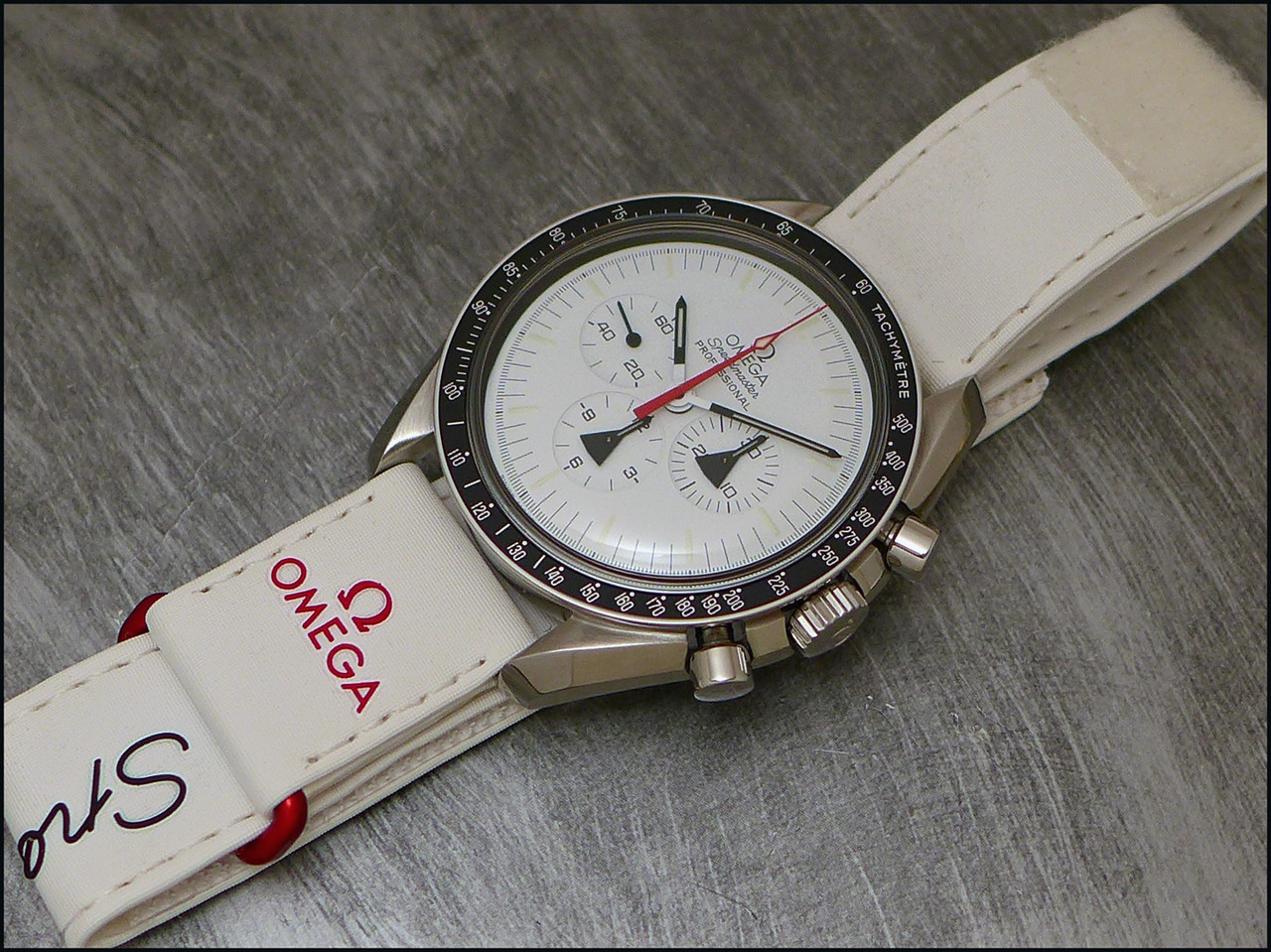
It is ok for a Speedmaster, is it ok for such a Patek?
I have to see it in the real, though, to have a definitive judgement on it.
My biggest deception? The fact that Patek opted for the extra complication of the moonphase, rather than a chronograph, for their WT.
So, to sum it up, not mad about that one. So, no pain! 
My 5110P is still the king.

Best,
Nicolas.
Not so bad...
I have to see it in the flesh, before any final thought on this watch.
I am not sure I like the case or not.... I just don't know. The real experience we=ill tell me.
As for the Chrono, it would have been possible to do it, ONLY if they were re thinking the design of their dial.
As it is, it seems that it has the same size than on our 5110P, with 2, 8 mm more. Like it was the case with the 5130 which was 2, 5 mm bigger.
So, it lack a bit of coherence to have an always bigger case, with the same dial size.
Now, if they opted for a bigger center dial, and a tad thinner world time ring, they would have the place to install the 2 subdials, or, like on the 5960, a monocounter.
As for the moonphase, you always have the problem to set it correctly, when it is not linked to a perpetual calendar.... It is a bit fastidious.
You have to go on the net, find a site about moonphases, check where you are, and use a toothpick to set it.... Fastidious.
Best, my friend.
Nicolas.
You're right concerning the moonphase
That is why I sold the 5712... And because I had the 1815 MP in the tube, too. [nt]
"chronograph complication instead of a moon phase..."

"Speedmaster / Seamaster lyre lugs case"


Thanks Oliver for your candid review !! For me, the new design...
...for the hour hand with the star is a nice feature !!
According to the lucky collector who has received his 5575, the position of the stars do not represent the Geneva sky. If so, are they placed randomly just for looks ?
Given your comment on readability, I am concerned that the dark background would reduce the ability of my aging eyes to see the time !!
Overall 5575 is an attractive watch and has a practical function (worldtime) along with a great novelty (big moon which is great looking but not that functional).
Between 5575 and 7175, I prefer 7175's looks because of its color scheme (except for the diamond if were to wear one).
Cheers,
Gordon
Thanks Oliver
 ) I find important to have an idea behind a watch and not only a beautiful one, this one has.
Great review as always...Love them both!

Lovely combination

great post..


Hmmmmm
Looking at your pictures reminds me ...
Cheers,
Oliver
Thank you Oliver….moon disk color vs strap...
Funny

Great review and nice photos. Thank you....
Basel 2015