RogerP
14

GO / IWC / Omega / Rolex Purchase Journey
Greetings all.
Fair warning – this is not short. For those adverse to long, meandering stream-of-consciousness watch posts, flee or scroll as you see fit.
It had been a good long while since I bought a premium contemporary watch. At least a few years. I had more or less become rather bored with the whole thing, and focussed my energy, attention and funds upon other hobbies. Watches were never abandoned wholesale – once a watch-lover, always a watch-lover – but that pervasive sense of malaise / ennuie / something else French – definitely dampened any smoldering embers of purchase desire.
But the thing about smoldering embers…. well…you can see where this is going. Sometimes it’s good to take a break from a field of interest that you have eagerly pursued for a long time. With the consequent informational gap comes a fresh perspective.
Okay – let’s get on to the watches already.
I had decided to treat myself to “something nice” in the $5-10k msrp range. Although I work in an office environment, I find that a pure dress watch doesn’t get as much wear overall as a more versatile piece. I wanted this new watch to be on my wrist as much as possible. Similarly, while I appreciate that dive watches are all the rage, I have no real need to descend to 200m / 300m / 600m / 2000m or whatever over-the-top (under-the-bottom?) depth rating gains street cred these days. I might voluntarily get as far as 15-20ft. below the surface while snorkelling – and even that is something only occasionally done on vacation. A great many watches of modest water resistance can handle that quite easily. So a massively overbuilt wrist-tank was not going to happen.
Another purchase criterion was that I wanted something a bit special in the movement. This wasn’t so much an in-house / out-house / Swiss-Made / Made-in-Germany / whatever label quest. But at this price point, I just wasn’t interested in another 2892 or 7750, however highly optimised, lavishly decorated, or not-a-7750-anymore it might be.
And the overriding litmus test: I had to love this watch. Liking it a whole bunch wouldn’t be enough.
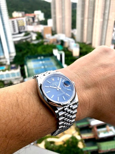
Rolex Datejust II

I’ve long had a love / hate relationship with Rolex. I suspect some here can relate. I will say no more than that I have liked many examples of the product – but little else that came free-with-purchase.
I have also long admired the Datejust line in particular, but could never get past the smallish size and overly delicate feel of past models. I had often wished that Rolex would get past its obstinate refusal to acknowledge a market demand for larger pieces. Lo and behold, in my period of sabbatical, they did.
This model in particular made a strong impression. It had the expected too-much-script on the dial, further exacerbated by manufacturer’s immodest choice to inscribe ‘ROLEX_ROLEX_ROLEX_ROLEX ‘as many times as possible around the inner bezel ring of each piece. I guess Rolex buyers can’t be reminded too often that they bought a ROLEX!
But I got past that. The watch sat nicely on my wrist. The crisp – almost austere – white dial was an attractive, legible and quality piece of work. The flimsy / floppy / is this thing broken? Rolex bracelets of the past seem to have thankfully been left there – I had no complaints on that score. And micro-adjustment was a huge plus. Overall, I found myself liking this piece more than just about any modern Rolex that I can recall.
Would that the dial’s austerity had been extended to the bezel, though. That fluted white gold bezel glitters like it’s hooked up to a high voltage power source. Or on fire. Or radioactive. Or all three. It’s not that my taste runs so strictly along conservative lines that I can’t accept a little bling. It was that this seemed rather a lot of bling imposed upon an otherwise utterly bling-free piece. Like donning a crisp navy blue suit, white shirt, quality tie…. then draping a big gangsta-style gold chain over top. Okay, it wasn’t nearly as bad as that – but it was far enough along that path to be a deal-breaker. I know that Rolex is coming out with a smooth-bezel version later this year – and had that watch been available now, it might be sitting on my wrist. But at the rate Rolex is raising their prices, it might just cost $20k by the time of release – and I wasn’t going to wait to wait around to find out.
IWC Spitfire Chrono

Ah – IWC. My old-time fave. One of the very first watches I fell truly-madly-deeply in love with was a Mark XII. Their modern pilot chronos have evolved into contemporary design classics – but they had long passed a price point where I felt I would rather have a manufacture movement. Once again, an unspoken wish was granted in absentia.
MAJOR props to IWC for pursuing the development and production of their own chronograph movement. Equal props to all manufcturers who have done so (rather more now than several years ago). Chronographs are cool – my absolute favourite complication by a very wide margin. And this particular chronograph was a beauty. That grey dial stopped me in my tracks – such a beautiful colour. The big, blocky, half-inch-thick applied numerals lend a sense of strength and dimension to the dial. And IWC seems to understand a simple concept which eludes so many other manufacturers: a BIG watch sporting a BIG dial requires BIG hands. The minute hand shouldn’t point vaguely in the direction of the closest minute marker – it should reach right out and touch the minute chapter, leaving no doubt about the information being communicated.
As expected of a watch with a serious (and seriously hyped) pilot pedigree – legibility was beyond reproach. But of all the lovely details of this dial, my eye was constantly pulled toward the date window. I am sure there is a logical, historically-motivated and entirely serious reason to display three consecutive numerals of the date wheel. Okay, that’s not true - I’m not at all sure such a reason exists – but somebody clearly signed off on it. Showing not-one-but-three dates in the date window could be confusing when, for example, you want to know the date. Today’s date. So IWC neatly provided a small but bold red arrow that tells you “It’s this one!”. A great example of creating a problem and then solving it in two easy steps. I just don’t get it. I am no mathematical wizard – but if the dial tells me clearly that today is the 25th, I can handle the calculation to determine that yesterday was the 24th, and tomorrow will be the 26th. Bottom line – this bugged the heck out of me. Purchasing aggravation was not in the cards.
Glashutte Original Senator Seventies

An icy flash of blue pulled me stumbling toward the display case – what… is…. THAT??? The GO Seventies easily provoked the strongest emotional response. If you haven’t seen this piece in person, please don’t imagine for a moment that this photo – or indeed ANY photo I have seen of this piece – can tell you much about the impression it makes out in the real world. At best, any phots captures but a single frame of what is a beautiful moving picture. The dial is utterly stunning – an almost-white center portion diuffusing outward into a radiant blue – shifting subtly with the slightest change in perspective. It had me at “hello”. The white gold hour markers are polished to a mirror-like finish and glitter seductively, but fall well short of shouting “Hey, lookatMEeee!”
GO positively owns the big date complication. I am sure it has been discussed ad nauseam here, so I will say no more than that I was very impressed. Their bracelet work makes a great many other quite good bracelets feel like cheap junk. One gets the impression that each link was assigned its own team of bracelet link specialists. An impressive display of supple strength, combined with the most perfect execution of the micro-adjustment clasp that I have personally encountered.
The Senator Seventies is a hard piece to categorize. So I won’t bother to try. I can well understand that its unique combination of design cues won’t appeal to a tremendously broad cross-section of potential buyers. But some, like me, will stop dead in their tracks and fall instantly in love.
You could be forgiven for inferring from all this gushing that this was the piece I purchased. It wasn’t. I didn’t. Why? I don’t know. As I type this, I wonder. No I don’t – I know why. I just couldn’t get my head around the value equation here – in the context of the broad spectrum of similarly priced watches, or even within the confines of GO’s product line. Steel. Three hands and a date. Okay, a particularly lovely, BIG date. No chronograph to play with. The most expensive piece of any that received serious purchase consideration. I had hoped, at this lofty price point, they would have chosen not to install the quite lovely cal. 39, but the lovelier-still cal. 100. They didn’t.
When you’ve been into watches for a good while – and particularly when you are in the midst of obsessive comparison shopping – holding a piece in hand bring a corresponding (and yes, entirely subjective) perception of where the price should be. The lovely Senator Sixties (no date) felt right at several thousand less. The tremendously impressive PML-XL felt right at more or less the same price. The Seventies felt “off”. Head ruled heart. For now, anyway. I love this watch still, and may luck into a secondary market opportunity down the road – or may give into a fit of you-only-live-once rationalization. You never know.
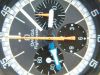
Omega Speedmaster 9300
The story ends here. Even those who have been patient enough to have read this far will surely be relieved.

Omega’s introduction of the cal. 8500 some years ago managed to penetrate the fog of horological indifference in which I was happily ensconced. The presentation of the chronograph caliber 9300 threatened to drag me out, kicking and screaming. But with dive watches being the universal darling segment – it seemed that almost all the attention was focussed upon the Planet Ocean Chrono. An extremely impressive sports chrono, to be sure – but as I’ve already said, a massively huge, massively water resistant and just massively massive sports dive watch wasn’t in my particular purchase cards. Almost lost in the POC-clamour was this utterly engaging rendition of the timeless Speedmaster design. Handling it in person – well, I was feeling the love all right. It made the GO-response feel more like lust. I’m not knocking lust. Lust is fun. This was different. Understated. Functional. Purposeful beauty. These were the elements appealing to head and heart alike.

Though housing the same movement as the colossal POC, this watch seemed to sit FAR lower and occupy MUCH less wrist space. Part of the trick – and for me, a significant part of the visual delight of this piece – is the double-domed sapphire bubble that brackets the working bits of this piece.

The dial seems to visually rise up into the domed front crystal. The movement seems to correspondingly descend into the deeply domed sapphire undercarriage. The result comparatively less of the profile thickness being rendered in steel, and comparatively more rendered in transparent sapphire is to create a watch more visually slender than the actual dimensions suggest. And that extruded sapphire case back also creates a somewhat unique and very pleasing on-the-wrist feeling.
The movement itself impresses with both technical and aesthetic merit.

The three-registers-in-two design really floats my boat. I have long preferred two-register chronographs for their clean, balanced look – but bemoaned the inevitable functional sacrifice of either the constant subseconds or hour totalizer. The combination of elapsed minute and hour registers here is absolutely brilliant. Much easier to read at a glance not only because the eye need not travel between separate subdials, but because the display is essentially a small clock –which we’ve all been able to read since we were about 4 years old. Big hand hours, small hand minutes. Brilliantly simple.

I could go on quite a bit more, but a) I’d like to spend some time with the piece before giving a comprehensive account (the observant will note the recent date of purchase rendered in the photos), and b) have surely now exhausted the patience of the readers who have endured to this point. To both of you, you have my sincere thanks.
Roger


GO / IWC / Omega / Rolex Purchase Journey
The Speedy is the nicest...

It's obvious you know the answer....

What a superb post Roger!

Enjoyed the read!

Thanks, Roger, for sharing . . .

firstly welcome to the forum Roger.
Thanks for the comments...

great post...great read..

Welcome and thanks for this post!
Hi Gary,
Thanks for the further impressions

Hi Roger