TonyL
5

I bought the Blue.. here’s why
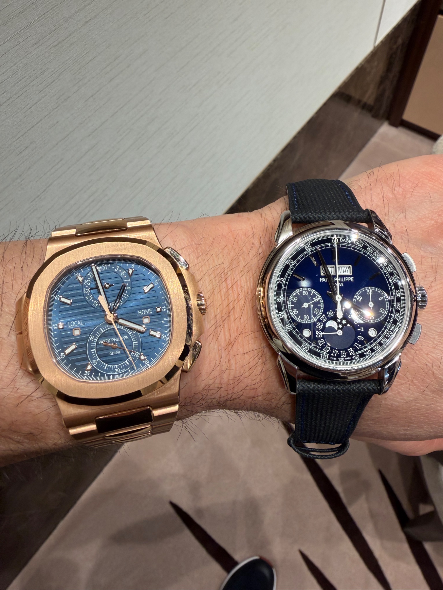
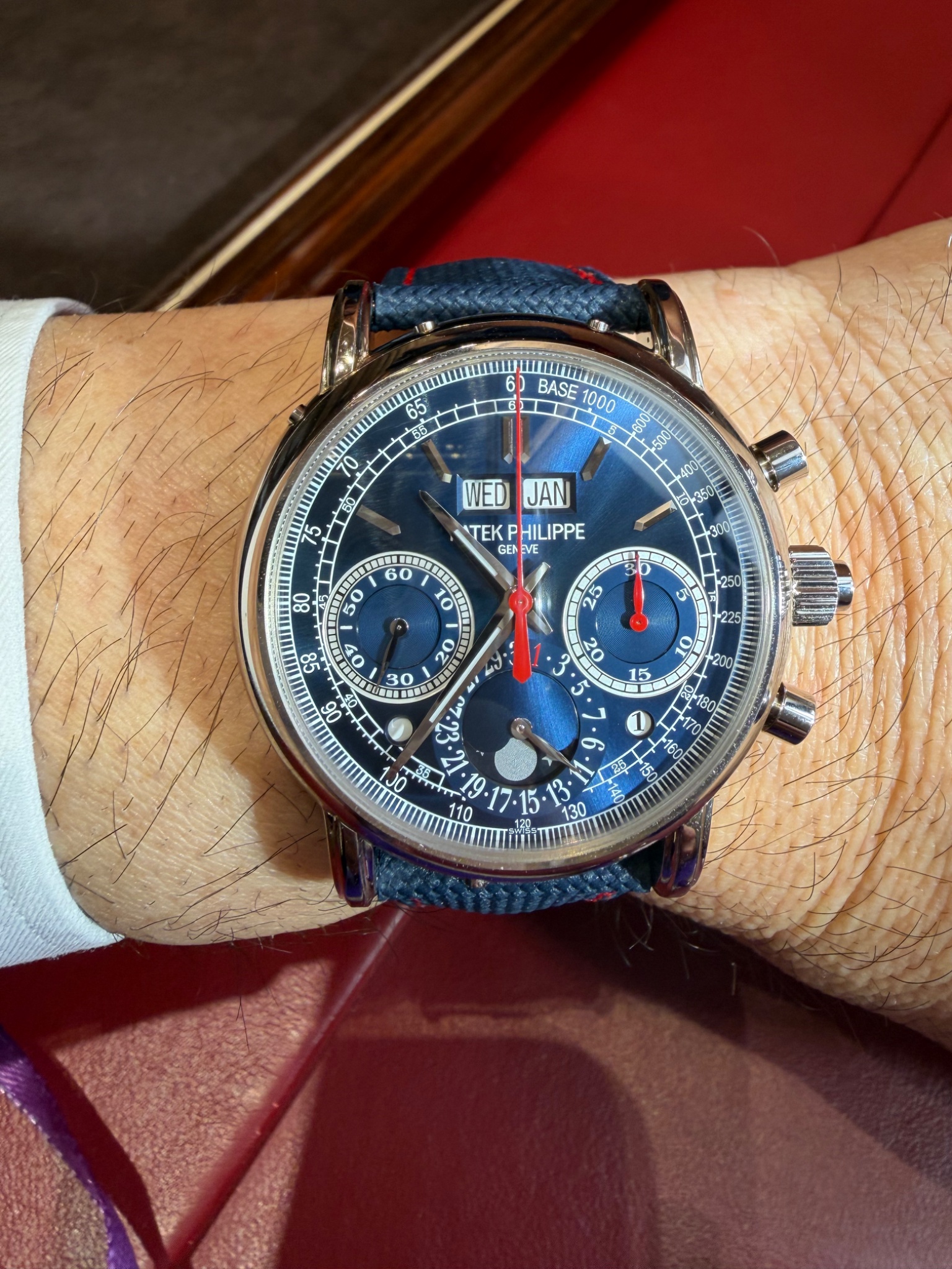
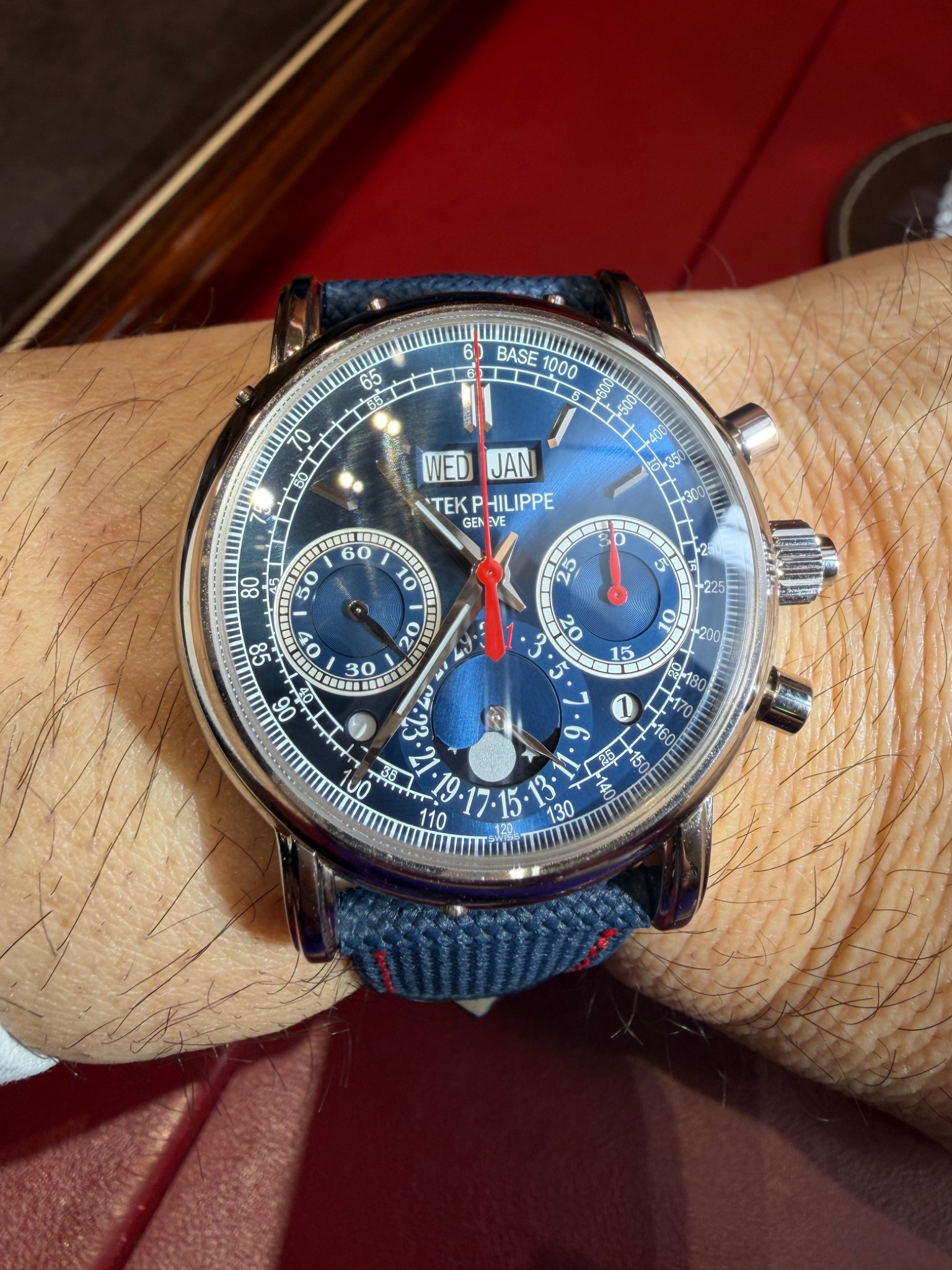
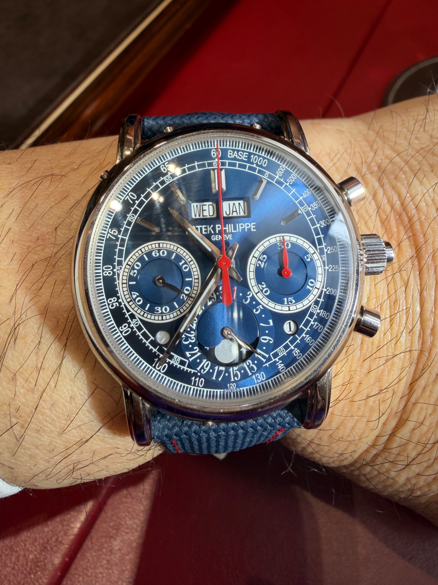
I visited the salon and spent some time trying on all three new 5270P variants, along with the new 5204, to make a proper side-by-side comparison rather than relying on press photos.
The red dial photographs exceptionally well and initially caught my attention the most. However, in person it wasn’t quite as compelling as I expected. I was wearing a suit during the visit and quickly realised that, despite its striking appearance, it would be difficult to pair with most of my wardrobe.
The grey dial is absolutely outstanding. It has tremendous depth and elegance, and for me it was arguably the most sophisticated of the three. That said, the dial colour feels more at home on a classical reference. With the tachymeter scale giving this iteration a slightly sportier character, I felt there was a small disconnect between the dial’s personality and the overall design.
In the end, I settled on the blue. The dial is a deep navy with a subtle black gradient that changes beautifully depending on the light. It strikes the perfect balance between elegance and versatility. Whether worn with a suit, sport coat, or more casual attire, it simply works. On the wrist it feels modern, refined, and unmistakably Patek Philippe.
Photos can be deceiving, but after seeing all three in person, the blue was the clear winner for me.
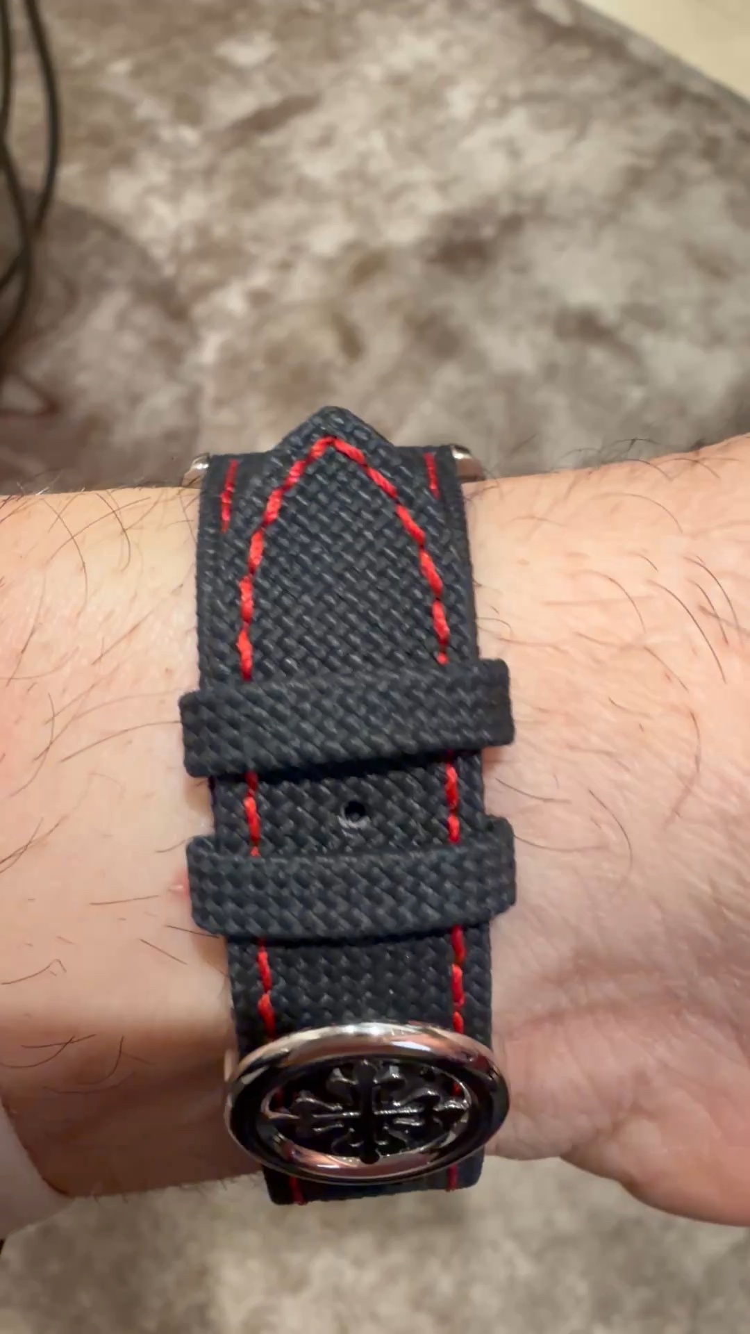
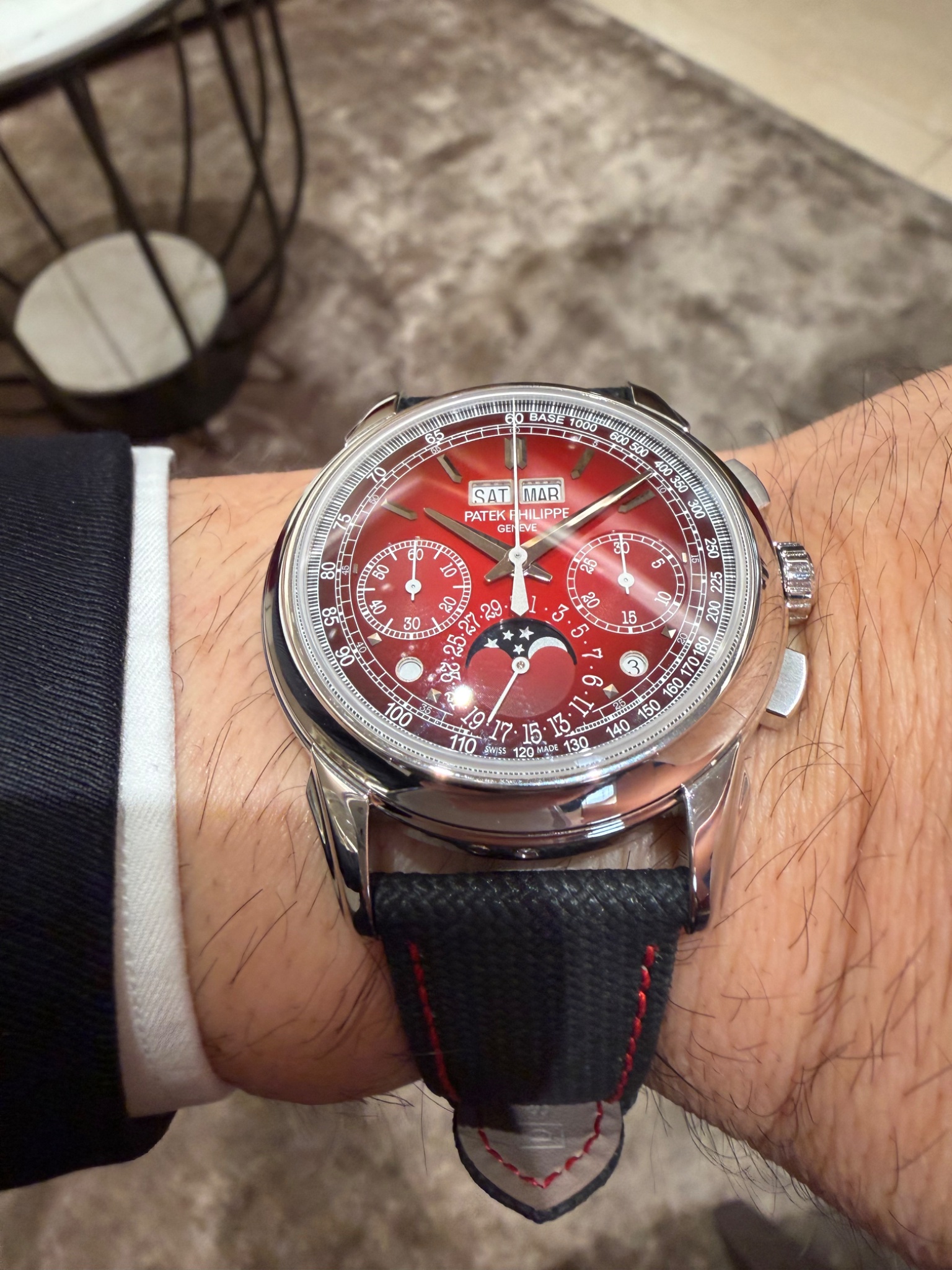
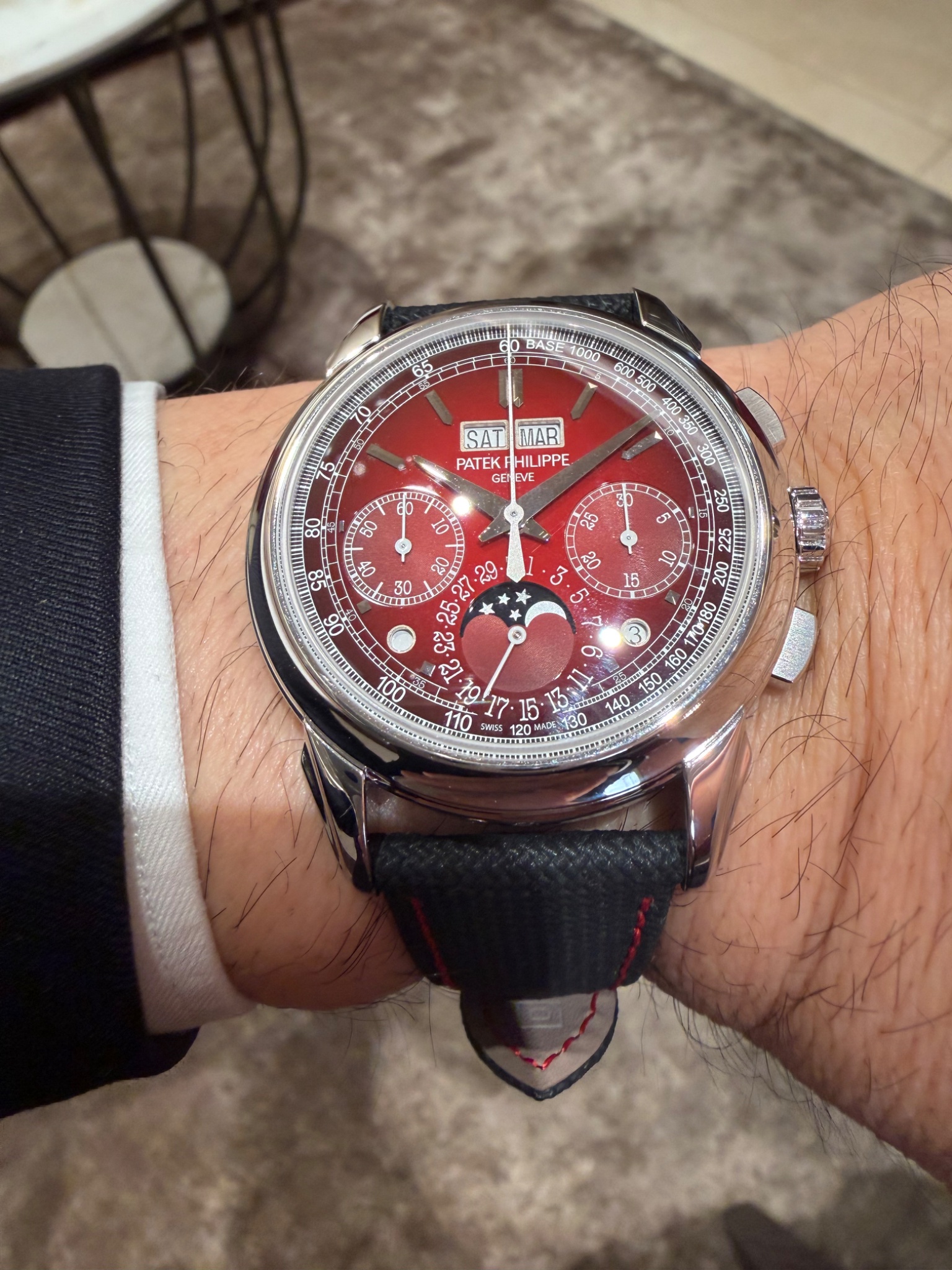

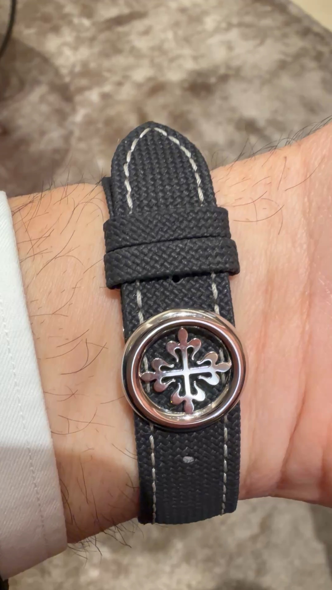
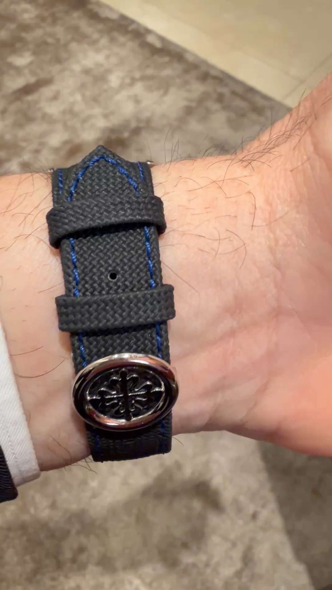
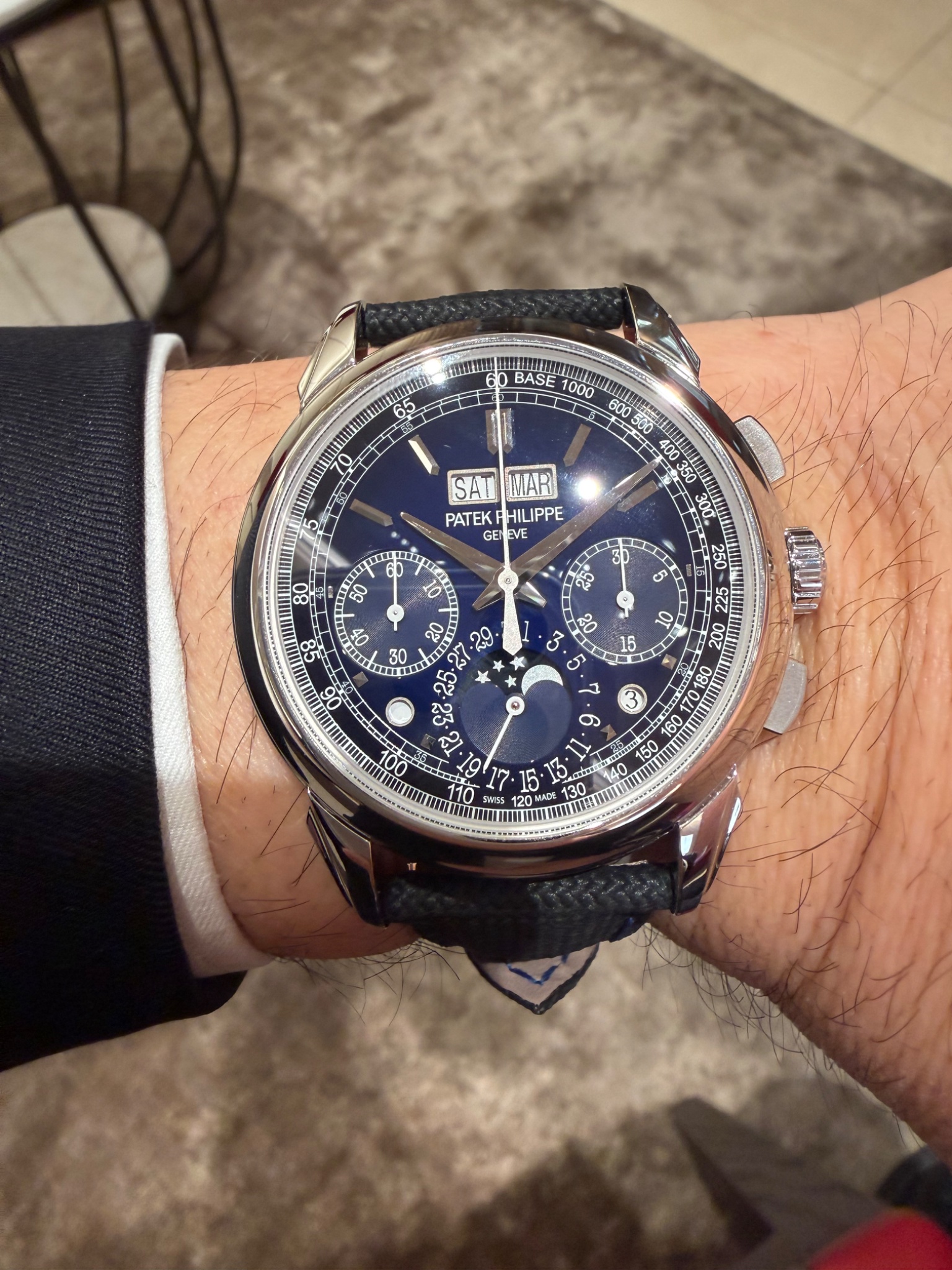

The new 5270s

The charcoal looks fantastic.
I agree that the charcoal looks great.


Great pics thanks for sharing

Of these 3 I like the red dial but….

Both charcoal and blue look good to me.

Grey for me..

Thanks Emmanuel for collecting and sharing so many great pictures 🙌🏻
My pleasure. I agree that the grey is the probably the most appealing.
To me the most appealing might be the red one...
If I had to decide where to put my money, it would be a tough decision

I had the opportunity to try on the platinum blue. I have seen in person and/or tried on many 5270 variants. I particularly like lacquered dials. This one is very appealing , likely my favorite
I hope you’ll get to see the gray and red soon.
I like the green lacquered dial also. Strictly a matter of taste, but I prefer the inclusion of the tachometer track on the new variants.

Good photos Emmanuel ! Even with great shots, these photos cannot
I have no trouble believing you: watches are always so much more beautiful in real life!
I bought the Blue.. here’s why
Thank you so much for sharing your experience and detailed thoughts!
Thank you and Yes I watched the same interview
Hi Tony, A warm welcome to our Patek forum ! Your thought process in selecting the blue
Thank you…
You must have a lovely collection with 13 Pateks ! Please