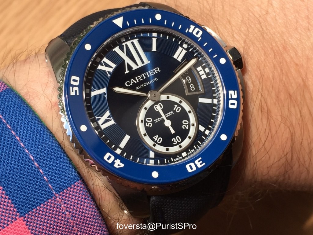
Hands on review of the Cartier Calibre Diver Blue
foversta


The Cartier Calibre Diver was unveiled at the SIHH 2014. It is first real diving watch from Cartier and despite this premiere, it is distinguished by the respect for the codes of the brand in an unusual context. Hardly thicker than the basic Calibre Automatic (11mm vs 10mm), the Calibre Diver offers a slender (thanks to the 42mm diameter) and rather elegant style allowing it to be at ease in all circumstances even far from... an aquatic environment.
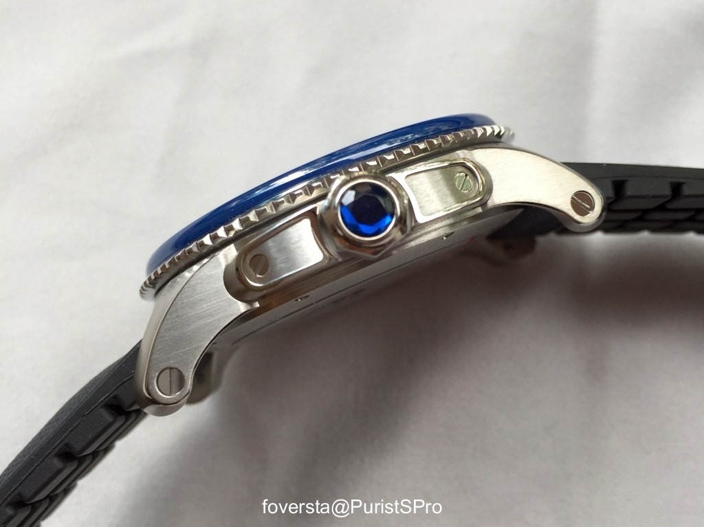
From the point of view of performance, it complies with the ISO 6425 standards and provides a water-resistance to 300 meters. Even if for a diver, I tend to prefer a central second hand, the Superluminova treatment is effective and brings into focus the key indicators. The spirit of the brand is reflected in the imposing XII at the top of the dial, in the shape of the case and in the octagonal crown set with a synthetic faceted spinel.
The first version of the Calibre Diver uses the traditional color codes of the diving watches with a black dial offering a strong contrast with the hands and the other luminous elements. I also like very much the design of this watch that I find more convincing in this "diver" evolution than in the basic version. It is at the same time more daring and its versatility allows it to be worn with a suit without any problem. The rubber strap which comes with the watch is comfortable and aesthetically blends well with the watch elements. However, I would have preferred a less smooth texture in contact with the skin. In other words, the pins of the above would have been also welcome under the strap to make the skin better breathe and avoid an excessive sweat.
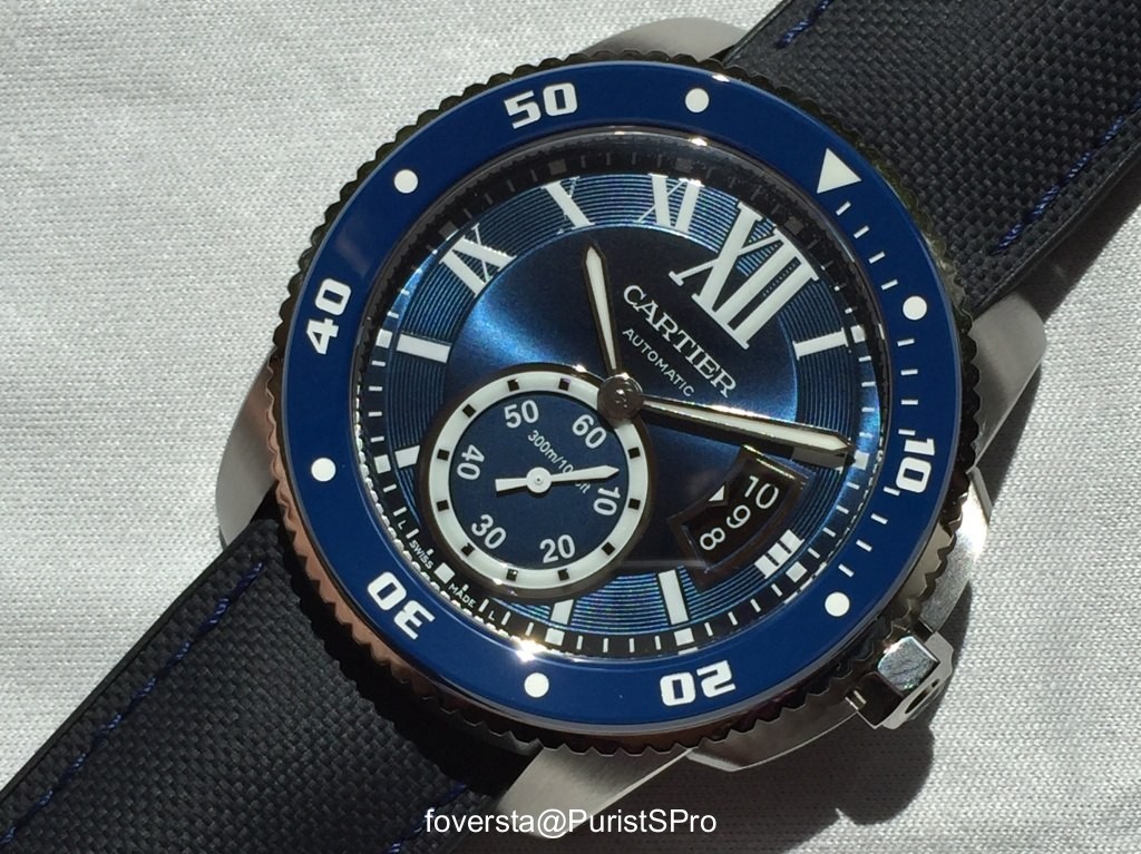
The SIHH 2016 was marked by the presentation of the Calibre Diver with blue dial and bezel. Blue is perhaps the trendiest color in the watch industry and therefore it is not surprising to discover that this version which is available with all available cases: steel, pink gold and two-tone.
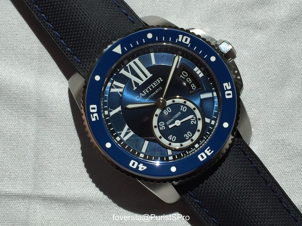
However, there are two major differences between the blue and the black versions that go beyond the pure chromatic change. The first difference is that the blue bezel is made of ceramic, which is a first for Cartier. I remind you that the bezel of the first version of the Calibre Diver is made of steel coated with ADLC. The ceramic bezel has different features than the steel one: it is obviously much more stable since it doesn't have any coating. However, in theory, it has a higher risk of breakage.
The second difference is related to the bracelet. The black rubber strap is replaced (in the version I tested) by a blue calfskin strap with a rubber lining manufactured by Hirsch. I love this bracelet, very flexible and very pleasant both from the aesthetic and comfort points of view. The shape of the rubber elements makes the air circulate better and the skin sweats less than with the rubber bracelet of the Calibre Diver black.
The lovely combination between the color of the bezel and the spinel one. You will also notice the shape of the rubber elements that contributes to the comfort and allows the skin to better breathe:
When I discovered the Calibre Diver Blue at the SIHH, I was not totally seduced by the rendering of the blue, both on the dial and on the bezel. Was it due to the prototype? The lights conditions? In any case, the final version which has just reached the boutiques convinces me more on this point thanks to a more intense and deeper blue. Surprisingly, the blue matches well the pink gold case and gives a more original side to the watch. The steel version is less surprising because the combination between blue dial and neutral case material is relatively common in the world of diving watches.
The movement that powers the Calibre Diver Blue is obviously still the in-house caliber 1904-PS MC. This double barrel movement is efficient and has an excellent winding efficiency. The double barrel aims to increase the torque but not the power reserve (48 hours) which however remains long enough.

The Calibre Diver Blue is for me a successful evolution of the first version even if its presentation is not surprising. The new color scheme makes it more casual than its predecessor. It appeared to me more fun but at the same time less versatile from the pure style perspective than the black version. The choice between the two versions is in my opinion based on the expected use of the watch. If the aim of the watch is to become the basic of the collection, I have a preference for the black version. If its aim is to be a complement in the same collection, the blue becomes very attractive and impresses me with its less formal side ... not to mention the beautiful combination between the color of the bezel and the spinel one.
The pink gold version offers a more surprising contrast of colors:

Thanks to the team of the Cartier boutique of Paris Capucines.
Pros:
+ The new color scheme that makes the watch less formal
+ The finishes of the bezel and of the dial
+ The efficient movement 1904-PS MC
+ The comfort of the bracelet
Cons:
- The power reserve is large enough but a little short by today's standards (48 hours)
- The blue version is less aesthetically versatile than the black version
This message has been edited by foversta on 2016-06-27 13:56:40
From the point of view of performance, it complies with the ISO 6425 standards and provides a water-resistance to 300 meters. Even if for a diver, I tend to prefer a central second hand, the Superluminova treatment is effective and brings into focus the key indicators. The spirit of the brand is reflected in the imposing XII at the top of the dial, in the shape of the case and in the octagonal crown set with a synthetic faceted spinel.

The first version of the Calibre Diver uses the traditional color codes of the diving watches with a black dial offering a strong contrast with the hands and the other luminous elements. I also like very much the design of this watch that I find more convincing in this "diver" evolution than in the basic version. It is at the same time more daring and its versatility allows it to be worn with a suit without any problem. The rubber strap which comes with the watch is comfortable and aesthetically blends well with the watch elements. However, I would have preferred a less smooth texture in contact with the skin. In other words, the pins of the above would have been also welcome under the strap to make the skin better breathe and avoid an excessive sweat.
The SIHH 2016 was marked by the presentation of the Calibre Diver with blue dial and bezel. Blue is perhaps the trendiest color in the watch industry and therefore it is not surprising to discover that this version which is available with all available cases: steel, pink gold and two-tone.

However, there are two major differences between the blue and the black versions that go beyond the pure chromatic change. The first difference is that the blue bezel is made of ceramic, which is a first for Cartier. I remind you that the bezel of the first version of the Calibre Diver is made of steel coated with ADLC. The ceramic bezel has different features than the steel one: it is obviously much more stable since it doesn't have any coating. However, in theory, it has a higher risk of breakage.
The second difference is related to the bracelet. The black rubber strap is replaced (in the version I tested) by a blue calfskin strap with a rubber lining manufactured by Hirsch. I love this bracelet, very flexible and very pleasant both from the aesthetic and comfort points of view. The shape of the rubber elements makes the air circulate better and the skin sweats less than with the rubber bracelet of the Calibre Diver black.
The lovely combination between the color of the bezel and the spinel one. You will also notice the shape of the rubber elements that contributes to the comfort and allows the skin to better breathe:

When I discovered the Calibre Diver Blue at the SIHH, I was not totally seduced by the rendering of the blue, both on the dial and on the bezel. Was it due to the prototype? The lights conditions? In any case, the final version which has just reached the boutiques convinces me more on this point thanks to a more intense and deeper blue. Surprisingly, the blue matches well the pink gold case and gives a more original side to the watch. The steel version is less surprising because the combination between blue dial and neutral case material is relatively common in the world of diving watches.
The movement that powers the Calibre Diver Blue is obviously still the in-house caliber 1904-PS MC. This double barrel movement is efficient and has an excellent winding efficiency. The double barrel aims to increase the torque but not the power reserve (48 hours) which however remains long enough.

The Calibre Diver Blue is for me a successful evolution of the first version even if its presentation is not surprising. The new color scheme makes it more casual than its predecessor. It appeared to me more fun but at the same time less versatile from the pure style perspective than the black version. The choice between the two versions is in my opinion based on the expected use of the watch. If the aim of the watch is to become the basic of the collection, I have a preference for the black version. If its aim is to be a complement in the same collection, the blue becomes very attractive and impresses me with its less formal side ... not to mention the beautiful combination between the color of the bezel and the spinel one.
The pink gold version offers a more surprising contrast of colors:

Thanks to the team of the Cartier boutique of Paris Capucines.
Pros:
+ The new color scheme that makes the watch less formal
+ The finishes of the bezel and of the dial
+ The efficient movement 1904-PS MC
+ The comfort of the bracelet
Cons:
- The power reserve is large enough but a little short by today's standards (48 hours)
- The blue version is less aesthetically versatile than the black version
This message has been edited by foversta on 2016-06-27 13:56:40
Comments:


foversta June 28th, 2016-13:46
Yes... and for elegant people who like to wear all-around watches. ;-)

Alkiro1 June 28th, 2016-22:41
I know that the blue" cabochon" is fully part of the Cartier DNA but in that specific case I am not sure it was essential no?

foversta June 29th, 2016-14:35
It is the little detail that makes the watch attractive It gives a kind of precious side what makes it different from other diver watches. Well, it is my point of view. Fx

mpg13 June 27th, 2016-16:07
It is an attractive watch However I don't care for the trend of date apertures showing more than the current date. Best, Martin

MTF June 27th, 2016-18:02
I don't like the extra dates shown but UNDERSTAND the reason why... mpg13, I am also irritated by the date before/after current date shown. Piaget also do this for some of their watches. I asked the watch designers why. It seems it has to do with "charging" the Superluminova so the date can glow immediately when clicking ...

foversta June 28th, 2016-13:45
My explanation is to be able to read the date even if there is an overlaping hand.

foversta June 28th, 2016-13:46
I understand your comment Martin. The single window works well on the Calibre 38mm. Maybe it would be too small on the 42mm Diver. Question of balance. Fx

jrwong23 (aka watchthebin) June 28th, 2016-00:31
The blue is a very nice blue! Thanks for the review Fx. I hope to see this in the metal soon myself. The use of a blue ceramic bezel is also a nice change imho as the bezel won't get scratched. Cheers robin

foversta June 28th, 2016-13:44
Thanks Robin! But believe me, the black bezel is resistant too! Well, I take care of my watches... Fx
0-10-10
Load More Comments
Next Article
foversta


Hands on review of the Cartier Tortue XL Day & Night (CPCP)
foversta


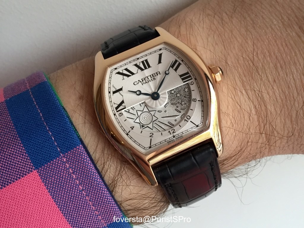
It is for me the big privilege to live close to the Cartier boutique of Paris - Capucines. Don't ask me why but on a regular basis, some watches from the former Collection Privée - Cartier Paris (CPCP) become available at the boutique. It is a great news for the Cartier fans and collectors because these watches represent for me the perfect demonstration of the Cartier style: a solid horological content combined with a refined style and, from time to time, some poetic complications. So this kind of opportunity shall not be missed because they don't usually stay very long in the displays! It is the reason why I was very happy to handle today the Tortue XL Day & Night which was introduced, if i'm not wrong, at the SIHH 2008.
© 2017 - WatchProZine