The Calibre Grande Complication: a superlative watch by Cartier
foversta

For several years, Cartier has given a new dynamic to its watchmaking pole by deploying considerable human and financial resources. This ambition can be felt in all segments of the collection from a simple 3 hands watch up to a watch with high horological contents gathering 3 major complications. The Calibre Grande Complication symbolizes in this regard the most accomplished dimension of the Cartier approach because showing at the same time a mastery of the complications and an ability to decorate delicately the movement developed by Renaud & Papi.
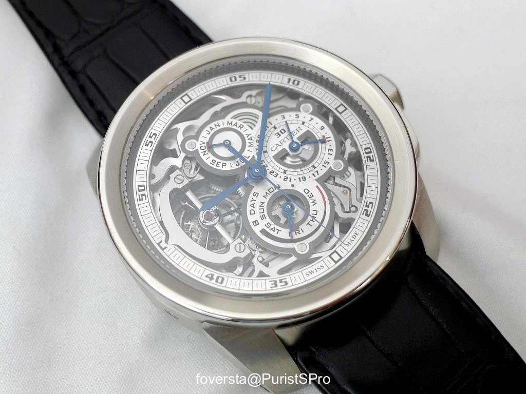
The main point of interest of the Calibre Grande Complication is obviously this 9436 MC movement that animates the watch as much as it decorates it. It is also used by Cartier in the Rotonde version of the Grande Complication and more recently in the Pocket Watch. In the latter case, the positioning of the movement has changed so that the crown is located at 12 o'clock, close to the hook. The consequence of this change is that the Tourbillon takes a more traditional location at 6 o'clock. Because we are touching one of features of the calibre 9436 MC in the context of the Calibre or the Rotonde: the Tourbillon occupies all the left side of the dial to free space in order that the opposite part is fully dedicated to display the calendar information and the chronograph data.
I find this dial lay-out a welcome idea for those who wear the watch on the left wrist. The most useful information, which are daily used (calendar and the minute counter of the chronograph) can be read by discreetly lifting the shirt. The top sub dial is dedicated to the display of the month while the bottom sub-dial combines the display of the power reserve and of the days of the week. The sector that connects the two top sub-dials gives the indication of the year leap through curves whose apparent number, such a spiral, informed on the rank of the year in the 4 years period. I must confess that I love this dial organisation, at the same time very original, rational and exuding a very contemporary style. Despite the presence of the chronograph, everything remains very readable. The counter that can lead to confusion is the one which gathers the minutes of the chronograph and the date but fortunately the date hand can be distinguished by its shape and the red colour of its ending. Moreover, the three hands of the calendar (date, months and days) are similar to facilitate reading.

The fonts of the figures and letters are fully compliant with the Cartier style: in a few years, Cartier managed to forge a distinct visual identity what is never an easy task. It is sufficient to observe a part of the scale or of a word to recognize the origin of the watch. But without a doubt, the element that anchors the Grande Complication in the Cartier universe is the Tourbillon bridge which is both "logo" and element of the movement. This impressive bridge suspends the Tourbillon and creates a nice feeling of depth. Certainly, in the context of this very busy watch dial, the Tourbillon seems a bit "squeezed". However, the view is sufficiently clear to enjoy.
The Grande Complication doesn't have strictly speaking any dial: the Sub-dials and the peripheral scale are positioned just above the movement but are not open. This approach midway between the full dial and total transparency preserves a good readability while unveiling the delicacy of movement and its openworking finish.

The show which is proposed when turning over the watch is simply amazing. The hand finishings, which are extremely neat, remain discreet and highlight the beauty of the architecture of the movement. It is composed of 457 pieces which is reasonable given the number of complications. The movement appears almost like lace, only a very discrete bridge in the foreground allows to display its reference and its number. Its frequency is 3 Hz. The 8 days power reserve is very significant in the context of a QP Watch: it can thus be left a week without having to adjust it again. For a handwound QP, a long power reserve is almost indispensable.

On the other hand, this impressive visual achievement is somewhat blemished by the gap between the movement diameter (33, 8 mm) and the Platinum case one (45 mm). This difference is little perceptible front side thanks to the inclined flange and the scale around the dial. Unfortunately, it becomes clearer by turning over the watch and the contrast between the delicate side of the movement and the width of the bezel is not so pleasant to observe. The Calibre case, that I find generally very successful seems more suitable in my point of view with less sophisticated watches in which its very masculine character can express itself without the risk of being out of context with a more subtle complication. The case is very thick (18, 7 mm) and finally I consider more this height as a concern than the diameter. Fortunately, the Chrono is operated through a single pusher which aesthetically "lights" the right side of the watch. The faceted Platinum crown, decorated with a Sapphire brings the touch of elegance. At the end, this bulky character is a pity because I am convinced that a more reasonable approach was possible. In this respect, the Rotonde case is better suited to the refinement of the 9436 MC movement thanks to its smaller thickness (still 16, 25 mm) and its more limited diameter (43, 5 mm). However, I prefer the dial lay-out of the Calibre version.

It seems very obvious to say that the Calibre Grande Complication has a strong presence on the wrist. The watch impresses by its thickness and the complexity of the dial. However, it avoids the trap of the ostentatious details. The harmony of the colours softens its character and as mentioned above, all the information remain very readable. The comfort is preserved thanks to the shape of the horns and their curved shape. The crown can be handled very easily for any of its functions.
The Calibre Grande Complication, which is sold a limited edition of 25 pieces, impressed me strongly by the quality of its finishing, by the subtle decorative approach of the movement and the intelligent and original information display. However, perfection is not achieved since Cartier has unfortunately fallen in one of its traps: the very large case size. This is the main reason why I prefer the Rotonde version because it allows to better reconcile the delicacy of movement with the case that hosts it.
Thanks to the Cartier UK team.
Fr.Xavier
The main point of interest of the Calibre Grande Complication is obviously this 9436 MC movement that animates the watch as much as it decorates it. It is also used by Cartier in the Rotonde version of the Grande Complication and more recently in the Pocket Watch. In the latter case, the positioning of the movement has changed so that the crown is located at 12 o'clock, close to the hook. The consequence of this change is that the Tourbillon takes a more traditional location at 6 o'clock. Because we are touching one of features of the calibre 9436 MC in the context of the Calibre or the Rotonde: the Tourbillon occupies all the left side of the dial to free space in order that the opposite part is fully dedicated to display the calendar information and the chronograph data.
I find this dial lay-out a welcome idea for those who wear the watch on the left wrist. The most useful information, which are daily used (calendar and the minute counter of the chronograph) can be read by discreetly lifting the shirt. The top sub dial is dedicated to the display of the month while the bottom sub-dial combines the display of the power reserve and of the days of the week. The sector that connects the two top sub-dials gives the indication of the year leap through curves whose apparent number, such a spiral, informed on the rank of the year in the 4 years period. I must confess that I love this dial organisation, at the same time very original, rational and exuding a very contemporary style. Despite the presence of the chronograph, everything remains very readable. The counter that can lead to confusion is the one which gathers the minutes of the chronograph and the date but fortunately the date hand can be distinguished by its shape and the red colour of its ending. Moreover, the three hands of the calendar (date, months and days) are similar to facilitate reading.
The fonts of the figures and letters are fully compliant with the Cartier style: in a few years, Cartier managed to forge a distinct visual identity what is never an easy task. It is sufficient to observe a part of the scale or of a word to recognize the origin of the watch. But without a doubt, the element that anchors the Grande Complication in the Cartier universe is the Tourbillon bridge which is both "logo" and element of the movement. This impressive bridge suspends the Tourbillon and creates a nice feeling of depth. Certainly, in the context of this very busy watch dial, the Tourbillon seems a bit "squeezed". However, the view is sufficiently clear to enjoy.
The Grande Complication doesn't have strictly speaking any dial: the Sub-dials and the peripheral scale are positioned just above the movement but are not open. This approach midway between the full dial and total transparency preserves a good readability while unveiling the delicacy of movement and its openworking finish.
The show which is proposed when turning over the watch is simply amazing. The hand finishings, which are extremely neat, remain discreet and highlight the beauty of the architecture of the movement. It is composed of 457 pieces which is reasonable given the number of complications. The movement appears almost like lace, only a very discrete bridge in the foreground allows to display its reference and its number. Its frequency is 3 Hz. The 8 days power reserve is very significant in the context of a QP Watch: it can thus be left a week without having to adjust it again. For a handwound QP, a long power reserve is almost indispensable.
On the other hand, this impressive visual achievement is somewhat blemished by the gap between the movement diameter (33, 8 mm) and the Platinum case one (45 mm). This difference is little perceptible front side thanks to the inclined flange and the scale around the dial. Unfortunately, it becomes clearer by turning over the watch and the contrast between the delicate side of the movement and the width of the bezel is not so pleasant to observe. The Calibre case, that I find generally very successful seems more suitable in my point of view with less sophisticated watches in which its very masculine character can express itself without the risk of being out of context with a more subtle complication. The case is very thick (18, 7 mm) and finally I consider more this height as a concern than the diameter. Fortunately, the Chrono is operated through a single pusher which aesthetically "lights" the right side of the watch. The faceted Platinum crown, decorated with a Sapphire brings the touch of elegance. At the end, this bulky character is a pity because I am convinced that a more reasonable approach was possible. In this respect, the Rotonde case is better suited to the refinement of the 9436 MC movement thanks to its smaller thickness (still 16, 25 mm) and its more limited diameter (43, 5 mm). However, I prefer the dial lay-out of the Calibre version.
It seems very obvious to say that the Calibre Grande Complication has a strong presence on the wrist. The watch impresses by its thickness and the complexity of the dial. However, it avoids the trap of the ostentatious details. The harmony of the colours softens its character and as mentioned above, all the information remain very readable. The comfort is preserved thanks to the shape of the horns and their curved shape. The crown can be handled very easily for any of its functions.
The Calibre Grande Complication, which is sold a limited edition of 25 pieces, impressed me strongly by the quality of its finishing, by the subtle decorative approach of the movement and the intelligent and original information display. However, perfection is not achieved since Cartier has unfortunately fallen in one of its traps: the very large case size. This is the main reason why I prefer the Rotonde version because it allows to better reconcile the delicacy of movement with the case that hosts it.
Thanks to the Cartier UK team.
Fr.Xavier
Comments:

dxboon October 12th, 2012-18:00
Love the movement; hate the case. I really like the movement design on this piece. It's delicate and visually interesting. The 8 day power reserve is fantastic also. I greatly dislike the case however. It's so large and from the verso practically looks like a Panerai (nothing wrong with P...

dxboon October 13th, 2012-11:24
It's a nice watch, and tempting in many ways... ...but there are competitive pieces that I would prefer. Cheers, Daos

foversta October 14th, 2012-02:45
Sure that in these prices... Competition is not that big but very fierce! But this watch contributes positively IMHO to the legitimity of Cartier in this very elitist segment. Fx
foversta October 14th, 2012-02:50
Calibre case... As I wrote in the review, I feel the Calibre case more "suitable" for simple watches like this one: It has a quite powerful design so for a daily watch, it is perfect IMHO. For a complex and superlative watch, the story is different. Again, it is just my ...
foversta October 14th, 2012-02:47
Thanks Daos for your comments! Please find below the pic of the Rotonde with the similar movement: I much prefer the slender and more refined Rotonde case. But I prefer the Dial of the calibre. Why life is so complicated? ;) Fx ...
dxboon October 14th, 2012-09:08
Life is hard for a WIS! I agree with you that the dial on the Calibre is more inspired, and that this case is better suited to the watch. Life is hard for us, indeed! LOL! :-) Daos

KIH October 12th, 2012-18:44
Oh, Papi? How nice. Wonderful movement finish and overall design. Nice shots, Fx, as always. Thanks for letting us know about this model. Very tempting.... Ken
foversta October 14th, 2012-02:42
Thanks Ken! Yes very tempting but unrechable for my wallet! ;) Fx
0-10-10
Load More Comments
Next Article
SJX

Tank Solo XL vs Tank Louis Cartier XL
SJX
After receiving many PMs and emails on the Tank Solo XL which I covered below, here is a comparison of that and the Tank Louis Cartier XL. Basically the Tank Louis Cartier XL is the next level up from the Tank Solo XL - the LC retails for almost exactly double the Tank Solo in rose gold. If the Collection Privee Cartier Paris were still in production, the Tank LC XL would be part of that line. It uses an ultra-slim Piaget cal.
© 2017 - WatchProZine