New Resonance
Sean

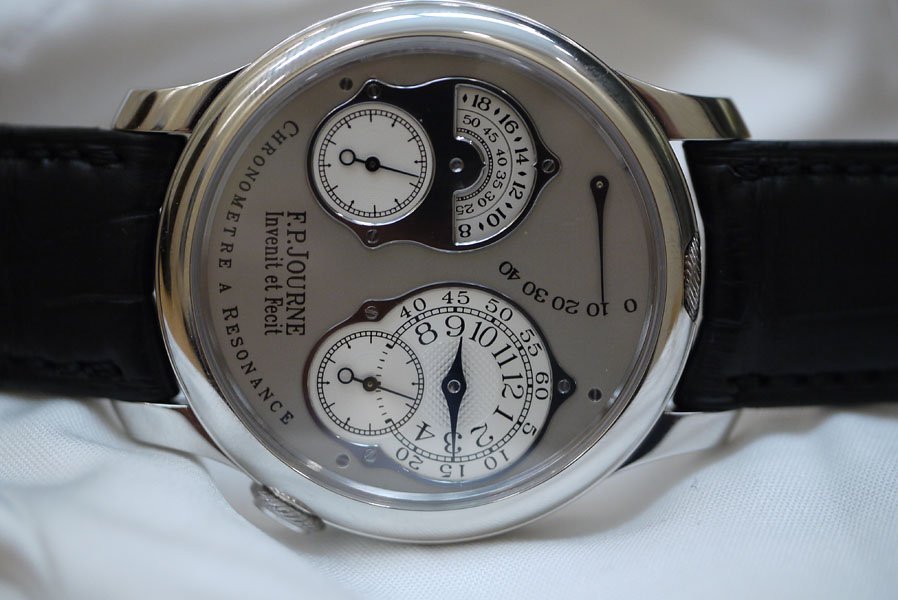
Here are a few quick photos of the new Resonance, with the 24 hour indicator on the left. It's available in platinum and rose gold. Note that FPJ drew this 8 years ago, but kept it in his drawer until the 10th anniversary of the Resonance; he feels it's a good time to update it.
The reason for the dials being asymmetrical now is that the discs for the 24 hour display are limited by the location of the seconds hand (otherwise they wouldn't fit).


Comments:

bs22fly January 23rd, 2010-08:25
Face Lift Too early for me to give a firm opinion as too many thoughts racing through my mind. One thing for sure is that I never question Journe's design aesthetics. I initially questioned the Centigraphe only to fall in love with it later on. This one may take so...

patrick_y January 23rd, 2010-08:26
Very interesting... I wonder, which dial should have home time, and which dial should have travel time?
bs22fly January 23rd, 2010-08:29
The right should be the local time. I'd think you would want to keep the right subdial on local time since one of the the subtle joys of the watch is the ability to view the subdial without pulling your cuff back entirely.

Douglas January 23rd, 2010-08:57
Thanks for Posting, Sean I think I need to see this before I rush to anything other than a single sentiment: This is not the Resonance. It may have a parallel look, dual mechanisms, etc. but this piece is certainly a very different watch and will not compete for collectors who fo...

Sean January 23rd, 2010-12:50
It's still a Resonance IMO While the look may be different, the principle behind how the watch works is still the same, so IMO it's "still" a Resonance. I think the new face is quite inventive, and is probably meant to spark some discussion as well.
bs22fly January 23rd, 2010-16:08
I'm beginning to share the same view - It's just about the name! When the old remontoir was renamed the Dead Seconds the view of the remontoir shifted to the back and the dial design when from asymmetrical to symmetrical. The new Resonance has the same movement (which still relies on the principals of resonance) yet th...


donizetti January 23rd, 2010-10:07
wow, thanks not what I expected at all. I thought he would have added a subtle day/night indicator to both dials, keeping the idea and appeal of the original, but clearly he has "broken the symmetry" and created a completely different thing. To me this cannot replace...
0-10-10
Load More Comments
Next Article
SALMANPK

Chronometre Souverain "Tricolore"
SALMANPK
For the past year I've been falling slowly but surely in love with FP Journe watches, I'm not one of those collectors who is too hung up about the technical aspects of a timepiece but am driven by the aesthetics and the play of light on the dial and case, maybe its my inner child who knows but when I saw the yellow dialled Resonance for the first time I know my heart skipped a beat and as I delved deeper and deeper I began to truly appreciate the design and colors of the various timepieces of FP Journe, I am a fan of the steampunk genre and the original Dead Seconds Tourbillon was a perfect example of a steampunk mood in design which I truly love. So it was only a matter of time before I acquired my first FP Journe piece and I want to share it with ....
© 2017 - WatchProZine