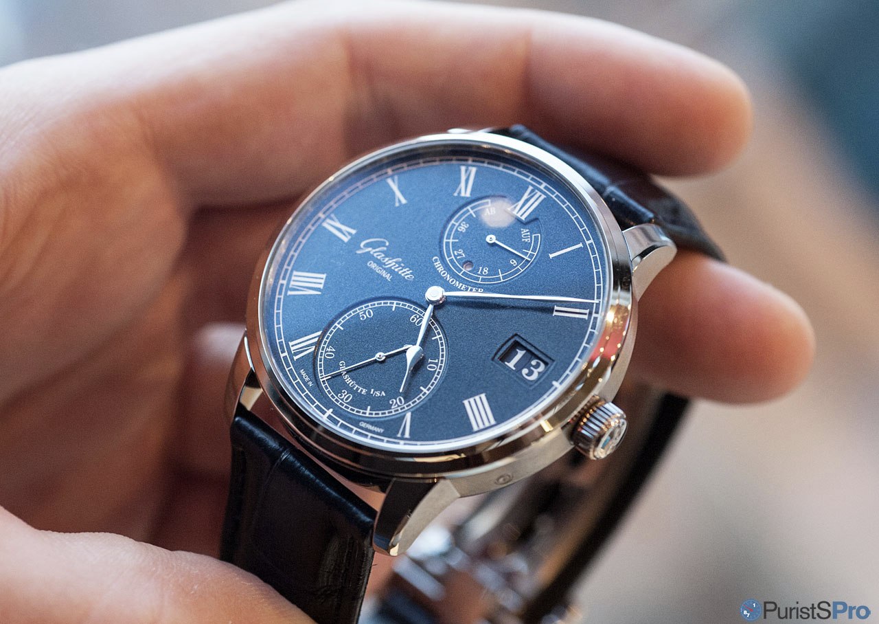
Pre-Basel 2016: Hands-on with the GO Senator Chronometer in White Gold / Blue Dial
Ornatus-Mundi

This year's pre-BaselWorld teaser is a particularly attractive timepiece, built on a thoroughbred timekeeping machine of universal repute: The Glashütte Original Senator Chronometer comes now in a marvellous combination of a blue dial with a white gold case. I am glad now to be able to share with you my hands-on impressions:
The GO Senator Chronometer is at first sight a rather unassuming timekeeper, and in fact this is what it primarily is - a timekeeper (but not an unassuming one).

There is another aspect which I find worth mentioning: the way the indices are applied. They are not simply printed. All indices as well as the railroad tracks are finely laser-engraved and subsequently galvanised with silver. Only through this rather time-consuming practice was it possible to create the depth necessary to produce indices with maximum contrast to the dial plate.

An important, identity-forming aspect for GO is the large date realised with two date disks on a common layer. Instantly jumping, of course. I cannot help but find this the (sole) disturbing aspect of the dial layout. I would personally rather it be totally vertical and integrated into the seconds subdial, or left out completely.
All hands are crafted in white gold as well, and they are all hand-polished which creates a very likeable 3D impression (see below).

Naturally, there is no luminous material on this piece. Nevertheless, the stark contrast in colour and surface structure ensure sufficient legibility even in low light. Below is what I would call the equivalent to a lume-shot:

On the generous display back we admire the Calibre 58-01, carrying altogether 58 rubies. It presents itself as GO's interpretation of a Glashütte-styled manual-wound movement, with a large 3/4 plate, screwed chatonised jewel bearings, a classical screwed balance as well as the archetypical hand-engraved balance cock:

Here are the elements in all their beauty: the ratched wheel with its characteristic Glashütte-style sunburst pattern as well as the adjacent click wheel:

Directly driven from the ratchet wheel we find two intermediate wheels which drive the power reserve indication. Those are functionally simple, but aesthetically very nicely done parts. Note the sunburst finish on their slim flanks, and compare to the polished teeth. This is fantastic attention to the detail combined with great craftsmanship!

The former two wheels interact with the planetary gears that determine the up and down movement of the power reserve display. Also here, top class polishing work!

The escapement part represents traditional Glashütte-style watchmaking language. A large screwed balance, mounted on a massive, hand-engraved balance cock and regulated through a swan-neck regulator. The pallet wheel is set in place with a black-polished cap.

The following two detailed views illustrate the balance cock and the pallet wheel cap, respectively. Notice also the hand-blued screws holding the movement plates as well as the screwed chatons.


Glashütte stripes are as precisely applied as the engraving.

And now the moment of truth has arrived ...

The blue grained dial makes a lot of difference compared to its siblings with a silver dial. First, the constrast between dial plate and indices/hands is inversed, and second, it is astonishing how much more depth is in this new combination.

That depth-effect makes the lowered subdials stand out even more (or put another way, perhaps the colour scheme heightens the distinction of the dial's different levels), and also emphasises the sexiness of the large seconds subdial.

So, taken together, the new dial variant is - for me at least - the most attractive of them all. I personally would prefer a steel version (chronometers are for performance, not luxury), and probably a version without date. The latter would be difficult - conceptionally - as a double date is a defining detail at GO.
The movement is beautiful, with generous proportions which are all reflected on the dial as well. GO has made significant advances in dial technology; not just the blue dials, obviously, but also the so-called 'Anreibeversilberung' (silver plating by friction; a time-honoured manual technique. Please read Oliver's report here ). For the astute observer, it is pretty obvious that having "in-house" dial-making capabilities offers opportunities which otherwise are difficult to realise. I shall shed some more light into the fantastic dials made for and by GO in due time.
In the meantime I worth noting that GO has set its path firmly toward a refreshed, at the same time classical as well as modern, very 'teutonic' design language which obliterates one old criticism: being 'inspired' by the competitor down the road...
We will see much more of this (pretty soon ). At this time just so much: the depth of thinking as well as the holistic approach towards watchmaking as exercised at GO is astounding!

Thank you for reading,
Magnus
P.S.: This report was made possible thanks to the generous support of Swatch Group Austria as well as the manufacture Glashütte Original themselves. This message has been edited by Ornatus-Mundi on 2016-02-25 06:01:17
The GO Senator Chronometer is at first sight a rather unassuming timekeeper, and in fact this is what it primarily is - a timekeeper (but not an unassuming one).
The Senator Chronometer is the first officially certified chronometer from Glashütte Original, and it carries a very special certificate of precision: In Germany, official wristwatch chronometer certification is administered by the State offices for weights and measurements of Thuringia (LMET) and Saxony (SLME) and officially certfied by the German Calibration Service (DKD). Unlike the similar tests performed by the COSC in accordance with the Swiss testing standard, which specifies that each movement (without its final case) must be tested in five positions, the entire watch (with the movement encased!) is tested throughout 15 days in Glashütte.
The focus on chronometry has another, very tangible, benefit for the user: GO invented a combined time setting and sychronisation mechanism which allows the wearer to set the precise time with ease. Thanks to this novel stop-seconds/reset mechanism second and minute hands can be easily synchronized: Pulling the crown out stops the time display and causes the second hand to jump to the 12 o'clock position, where it remains; the minute hand moves simultaneously to the next full minute. If the user now turns the crown to set the time, the minute hand jumps precisely from one to the next full minute index, thus always guaranteeing the correct relationship between the minutes and seconds displayed.
The focus on chronometry has another, very tangible, benefit for the user: GO invented a combined time setting and sychronisation mechanism which allows the wearer to set the precise time with ease. Thanks to this novel stop-seconds/reset mechanism second and minute hands can be easily synchronized: Pulling the crown out stops the time display and causes the second hand to jump to the 12 o'clock position, where it remains; the minute hand moves simultaneously to the next full minute. If the user now turns the crown to set the time, the minute hand jumps precisely from one to the next full minute index, thus always guaranteeing the correct relationship between the minutes and seconds displayed.
In terms of the mechanism, this results in control and complexity comparable to a split-second chronograph movement.

The layout of the dial recalls that of a pocket chronometer, with subsidiary seconds and power reserve (with integrated day/night indicator window) displays along the central axis and the characteristic Glashütte Original panorama date positioned at 3 o’clock.
The blue dial is certainly a major attractor of this watch. It provides a rich contrast for the polished sweep minute and pear-shaped hour hands. Note also the hand polished hand axis arbor. A railroad chapter ring encircles the central time display, and Roman numerals add to the classic appearance of this impressive timepiece.
BTW, the image below represents the dial colour as close as I could get (I was shooting in natural light, albeit around sunset...):

Like its white-dialled sister, this mystically-blue dial also comes with a fantastic grainy structure. In watchmaking French this is called l’argenture grainée . The blue varnish really brings out the velvet structure of the dial. Speaking of which, the dial is made in GO's own dial manufactory in Pforzheim. Several layers of hand-applied lacquer are necessary to produce this fine result in colour and texture. A blue dial, just to recall, is much more difficult to achieve in a reproducible way than any other colour.
The layout of the dial recalls that of a pocket chronometer, with subsidiary seconds and power reserve (with integrated day/night indicator window) displays along the central axis and the characteristic Glashütte Original panorama date positioned at 3 o’clock.
The blue dial is certainly a major attractor of this watch. It provides a rich contrast for the polished sweep minute and pear-shaped hour hands. Note also the hand polished hand axis arbor. A railroad chapter ring encircles the central time display, and Roman numerals add to the classic appearance of this impressive timepiece.
BTW, the image below represents the dial colour as close as I could get (I was shooting in natural light, albeit around sunset...):
Like its white-dialled sister, this mystically-blue dial also comes with a fantastic grainy structure. In watchmaking French this is called l’argenture grainée . The blue varnish really brings out the velvet structure of the dial. Speaking of which, the dial is made in GO's own dial manufactory in Pforzheim. Several layers of hand-applied lacquer are necessary to produce this fine result in colour and texture. A blue dial, just to recall, is much more difficult to achieve in a reproducible way than any other colour.
There is another aspect which I find worth mentioning: the way the indices are applied. They are not simply printed. All indices as well as the railroad tracks are finely laser-engraved and subsequently galvanised with silver. Only through this rather time-consuming practice was it possible to create the depth necessary to produce indices with maximum contrast to the dial plate.
An important, identity-forming aspect for GO is the large date realised with two date disks on a common layer. Instantly jumping, of course. I cannot help but find this the (sole) disturbing aspect of the dial layout. I would personally rather it be totally vertical and integrated into the seconds subdial, or left out completely.
All hands are crafted in white gold as well, and they are all hand-polished which creates a very likeable 3D impression (see below).
Naturally, there is no luminous material on this piece. Nevertheless, the stark contrast in colour and surface structure ensure sufficient legibility even in low light. Below is what I would call the equivalent to a lume-shot:
On the generous display back we admire the Calibre 58-01, carrying altogether 58 rubies. It presents itself as GO's interpretation of a Glashütte-styled manual-wound movement, with a large 3/4 plate, screwed chatonised jewel bearings, a classical screwed balance as well as the archetypical hand-engraved balance cock:
Here are the elements in all their beauty: the ratched wheel with its characteristic Glashütte-style sunburst pattern as well as the adjacent click wheel:
Directly driven from the ratchet wheel we find two intermediate wheels which drive the power reserve indication. Those are functionally simple, but aesthetically very nicely done parts. Note the sunburst finish on their slim flanks, and compare to the polished teeth. This is fantastic attention to the detail combined with great craftsmanship!
The former two wheels interact with the planetary gears that determine the up and down movement of the power reserve display. Also here, top class polishing work!
The escapement part represents traditional Glashütte-style watchmaking language. A large screwed balance, mounted on a massive, hand-engraved balance cock and regulated through a swan-neck regulator. The pallet wheel is set in place with a black-polished cap.
The following two detailed views illustrate the balance cock and the pallet wheel cap, respectively. Notice also the hand-blued screws holding the movement plates as well as the screwed chatons.
Glashütte stripes are as precisely applied as the engraving.
And now the moment of truth has arrived ...
The blue grained dial makes a lot of difference compared to its siblings with a silver dial. First, the constrast between dial plate and indices/hands is inversed, and second, it is astonishing how much more depth is in this new combination.
That depth-effect makes the lowered subdials stand out even more (or put another way, perhaps the colour scheme heightens the distinction of the dial's different levels), and also emphasises the sexiness of the large seconds subdial.
So, taken together, the new dial variant is - for me at least - the most attractive of them all. I personally would prefer a steel version (chronometers are for performance, not luxury), and probably a version without date. The latter would be difficult - conceptionally - as a double date is a defining detail at GO.
The movement is beautiful, with generous proportions which are all reflected on the dial as well. GO has made significant advances in dial technology; not just the blue dials, obviously, but also the so-called 'Anreibeversilberung' (silver plating by friction; a time-honoured manual technique. Please read Oliver's report here ). For the astute observer, it is pretty obvious that having "in-house" dial-making capabilities offers opportunities which otherwise are difficult to realise. I shall shed some more light into the fantastic dials made for and by GO in due time.
In the meantime I worth noting that GO has set its path firmly toward a refreshed, at the same time classical as well as modern, very 'teutonic' design language which obliterates one old criticism: being 'inspired' by the competitor down the road...
We will see much more of this (pretty soon
). At this time just so much: the depth of thinking as well as the holistic approach towards watchmaking as exercised at GO is astounding!Thank you for reading,
Magnus
P.S.: This report was made possible thanks to the generous support of Swatch Group Austria as well as the manufacture Glashütte Original themselves.
Comments:

amanico February 25th, 2016-06:07
Your live pictures are much more convincing than the press release photos. Now I can really see the blue nuance of the dial. Still not totally convinced by the white roman numbers. Which I find a tad too flat. For the rest, superb watch. Thanks, Magnus. Nicolas

Ornatus-Mundi February 25th, 2016-06:10
Nico, in Berlin I heard the GO press people discuss how difficult it was to properly represent the blue hue. Even in images, its not consistent!
amanico February 25th, 2016-06:19
True that blue dials are very hard to take in picture...

COUNT DE MONET February 25th, 2016-06:28
The hands could have been (really) twirled and the hour hand could be a little longer too I know I am being very fussy now but maybe it would have given the dial more the three dimensional look that is also Nicolas missing if the hands would have been twirled? It is only a very small missing detail in a watch that is instantly captivating. Tha...

ik2000 February 25th, 2016-07:20
This has so many things going right for it.... 1. I love the white numerals, and white everything on the blue background. 2. The blue that has come through as best as possible in your photos looks sublime. 3. Brushed case sides. 4. The GO time setting function - for me, this is a very important featur...
Ornatus-Mundi February 25th, 2016-12:03
YES, - I feel you - this watch in steel (and with a black dial...) - I would be difficult to stop!

Dr No February 26th, 2016-12:34
There was a one-off black SC . . . . . . in rose gold produced five years ago, Magnus. Hard to conceive of it in steel as there would be little contrast with matching hands - not a convincing proposition for a chronometer. A steel version with a blue dial, same as the latest model cased in...
Dr No February 25th, 2016-17:49
" . . . and now, for something . . . . . . slightly different.*" [* with apologies to Monty Python] The Senator chronometer as we've known it until now (save for the rare black dial model); formal and elegant. By way of contrast, the latest version is surprisingly approachable. Lees and a wh...

MichaelC February 26th, 2016-08:10
Thanks Magnus. I notice a few different details on this model. 1. The caseband is brushed. I like it a lot more this way. 2. The strap attachment is more conventional. The older version has the strap fully meet the case. 3. I see the markers at 15 and 30 now pierce the minute track and stick into the dial. Subtle, bu...
0-10-10
Load More Comments
Next Article

Dr No

The Glashütte Original Master Exam . . .
Dr No
. . . is on now! Jocke, Tony, and yours truly have put together a test to assess your knowledge of the Manufacture.
© 2017 - WatchProZine