A review on the Jaeger Lecoultre Reverso Tribute Duoface Calendar: The Reverso Tribute Calendar revisited.
amanico


Yes, we cannot really say it is a novelty, as the Reverso Tribute Calendar was issued in 2016, in rose gold, only.
The new one:
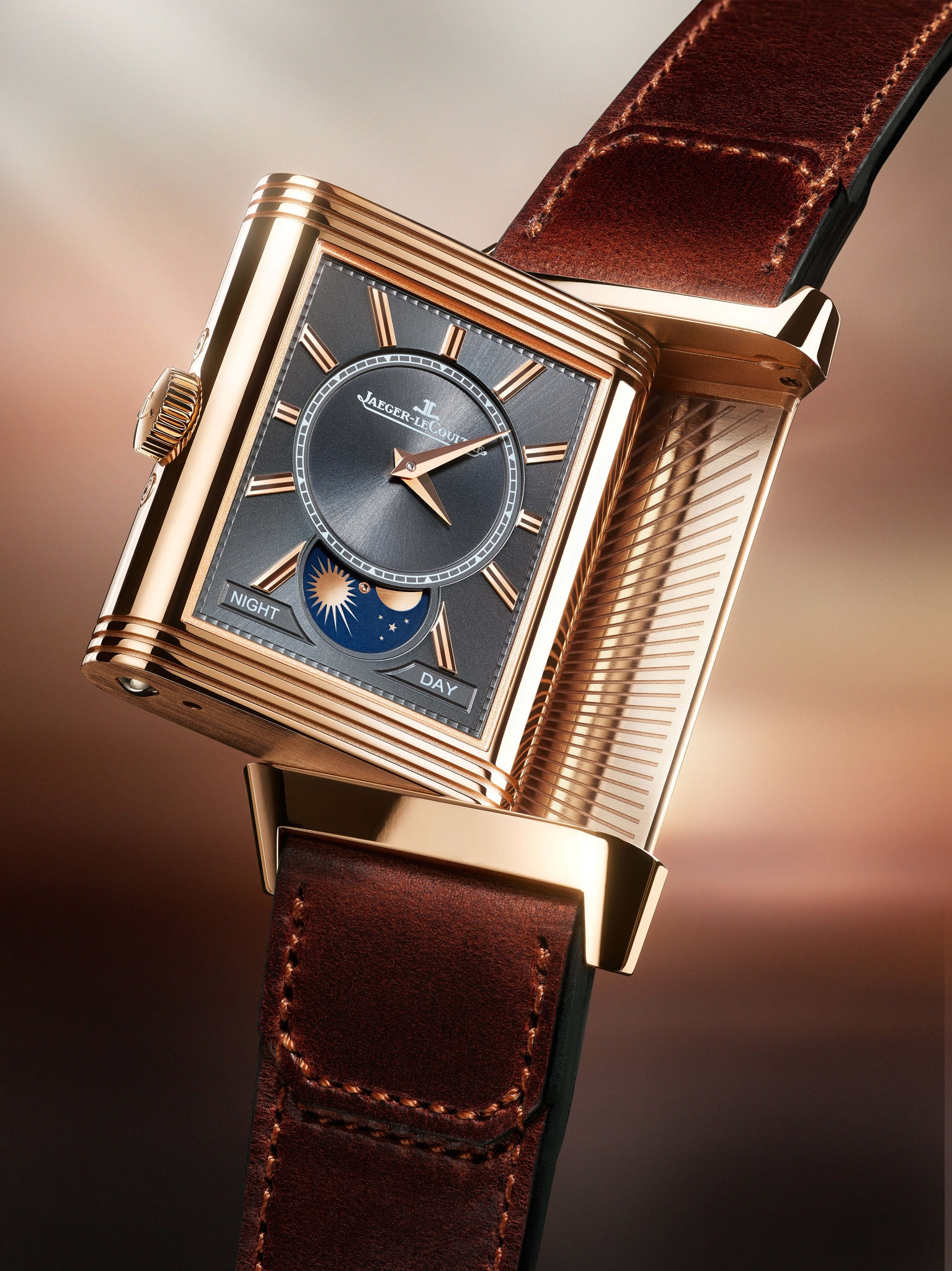

But, to enhance the changes brought to this watch, Jaeger Lecoultre decided to change the name and to add the mention Duoface. To avoid any confusion, the 2016 Reverso Tribute Calendar also had the dual time complication, but here, there are some subtle but important cosmetic changes.
What doesn't change:
- The case proportions: 49, 4 mm x 29, 9 mm and it is 12, 06 mm high.
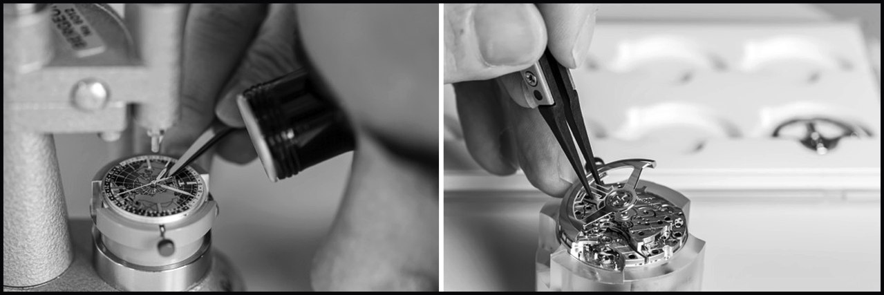
- The movement, which is the Cal 853, manual winding, beating at 21, 600 alterances per hour and whose power reserve is around 42 hours.
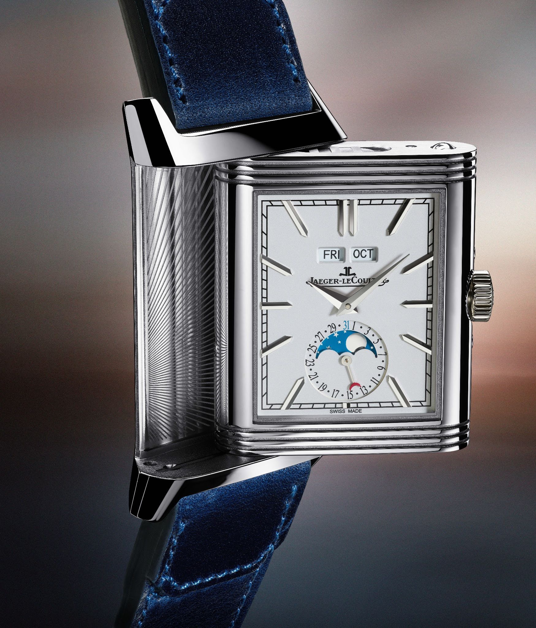
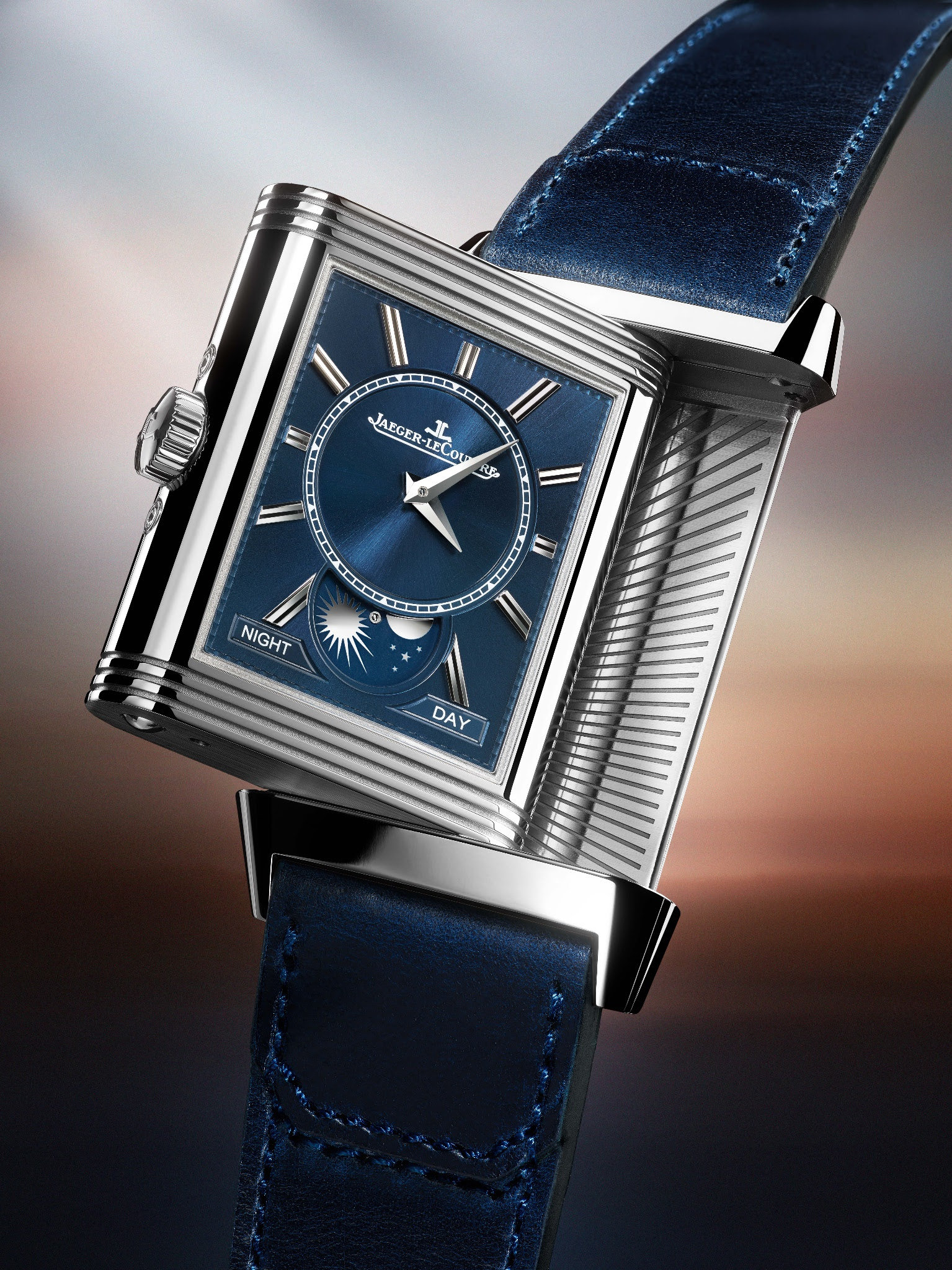
- The concept: The Recto displays the time, the day and the month, the moon phase and the date all around the moon phase, while the verso shows the night and the day indicator, as well as the second time zone.
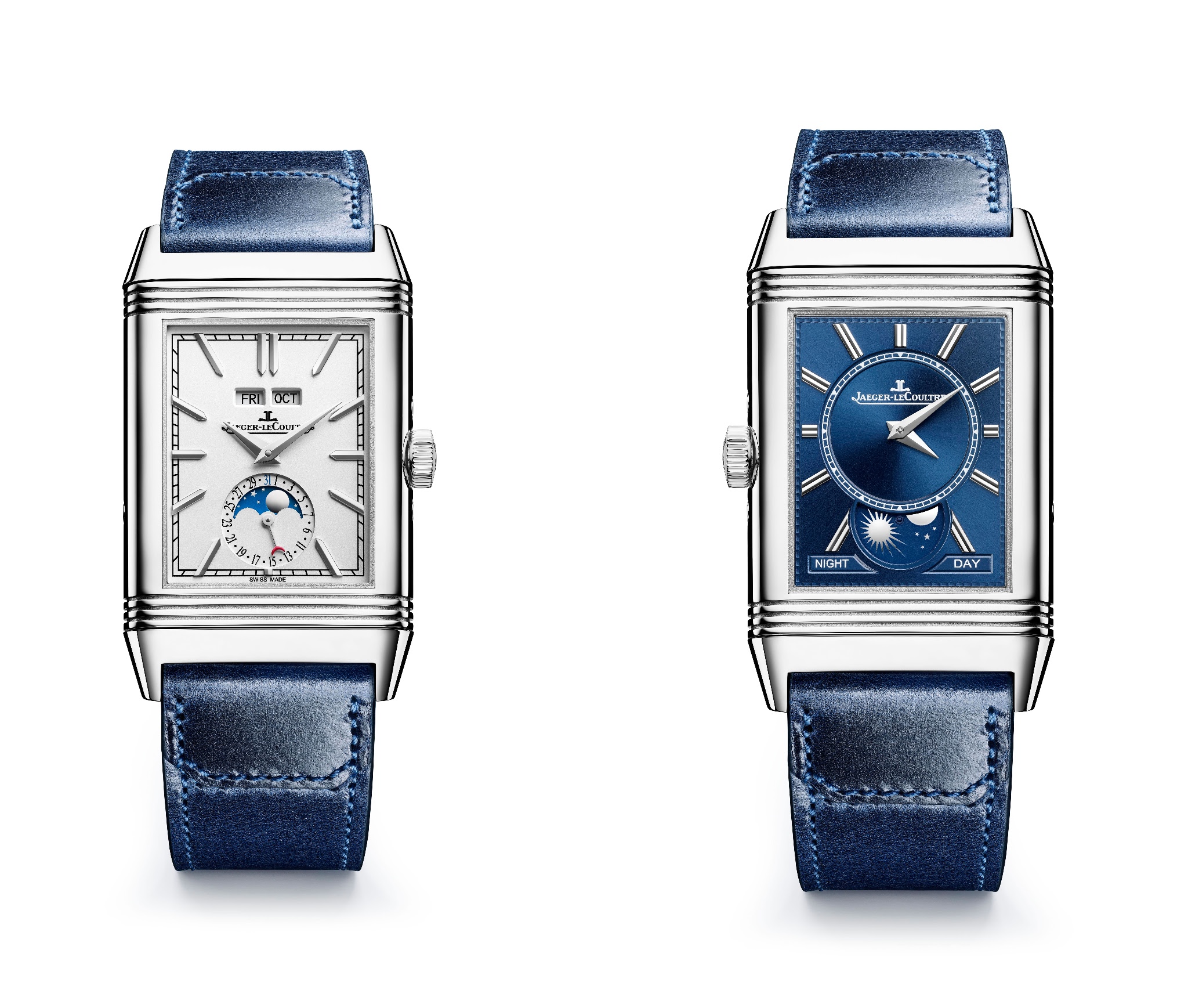
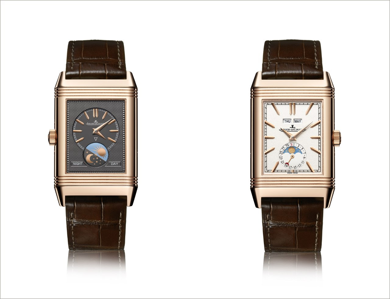
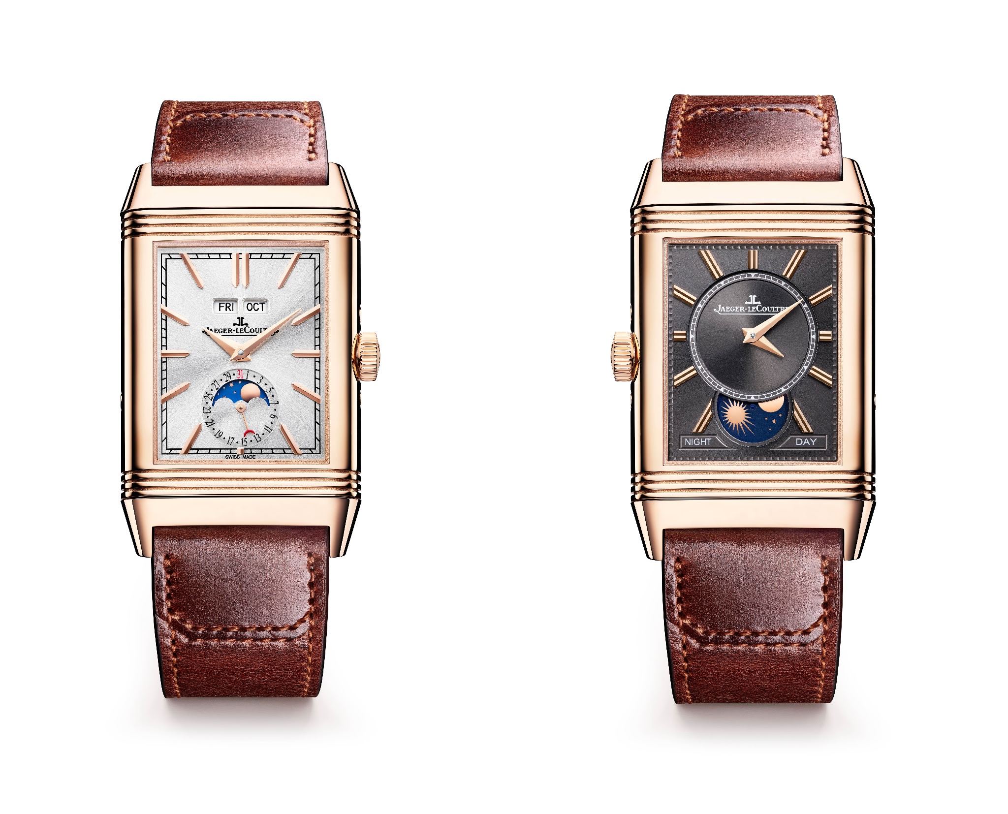
What really changes is the choice of the straps, the dials design, and the fact that there is also a steel version now. Indeed, in 2016, the Reverso Tribute Calendar was only available in rose gold.
As for the design of the dials, here is the 2016 version:
You can better see the grained decoration of the main dial and how it depicts the moon phase.
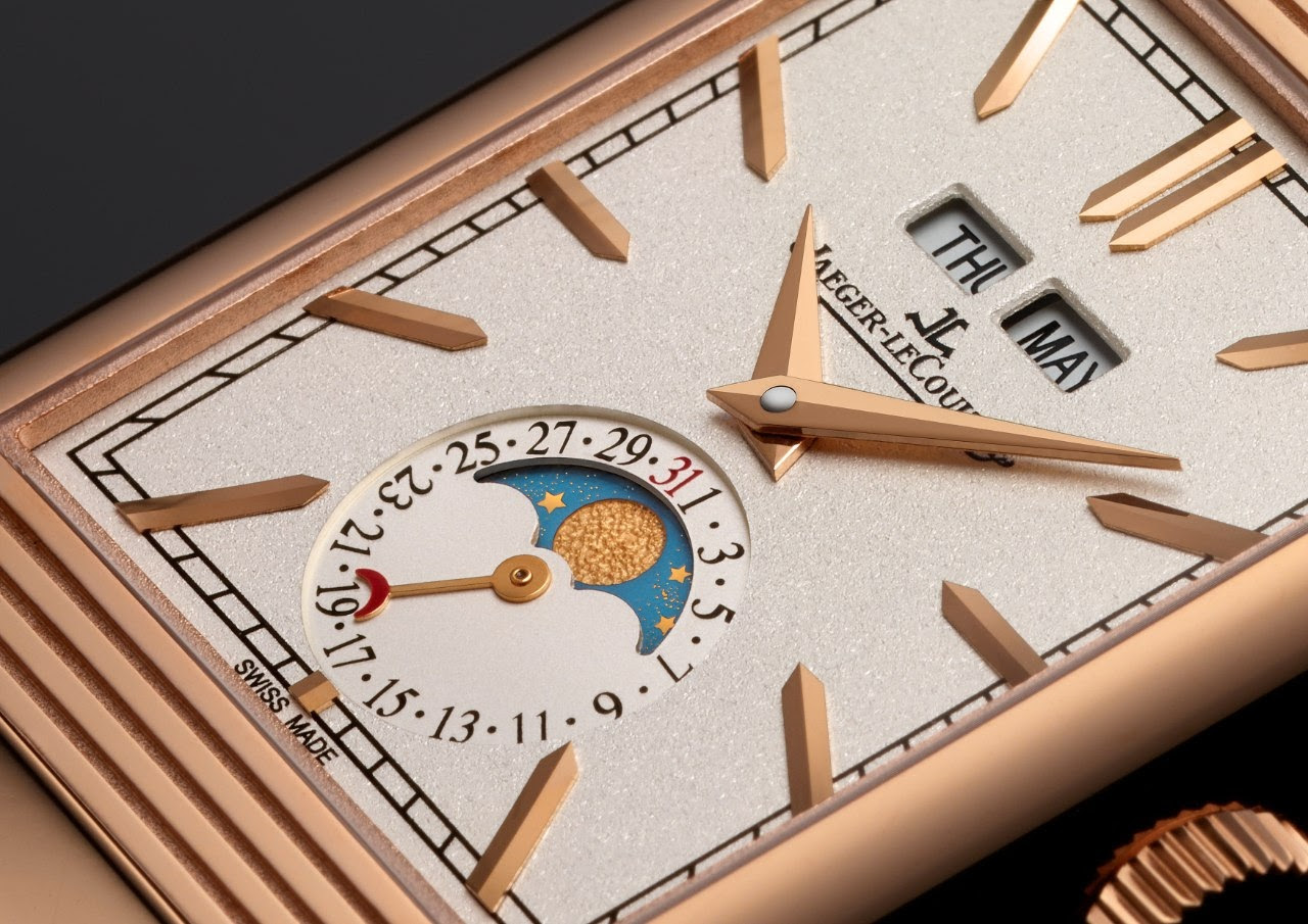
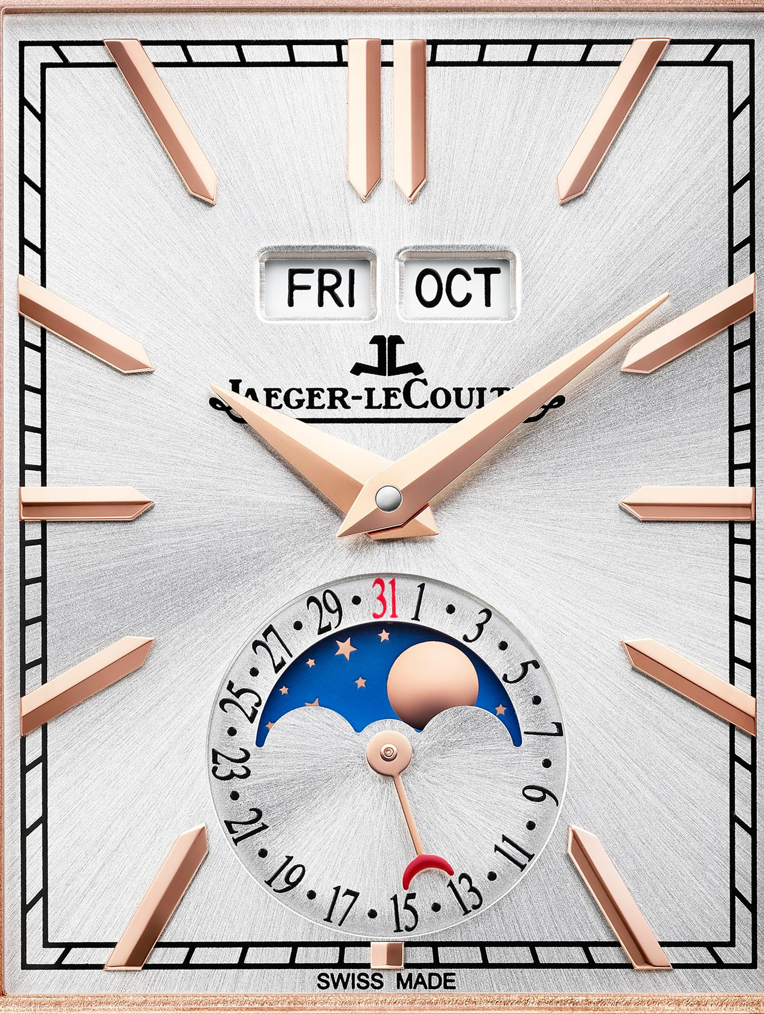
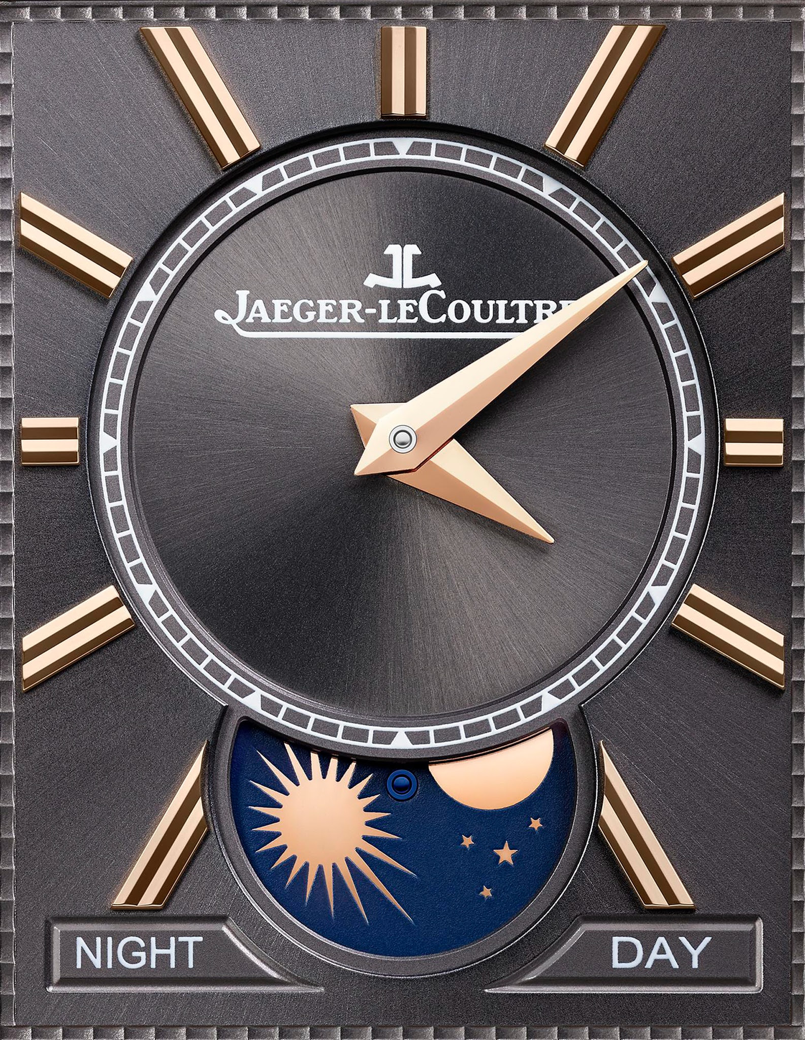
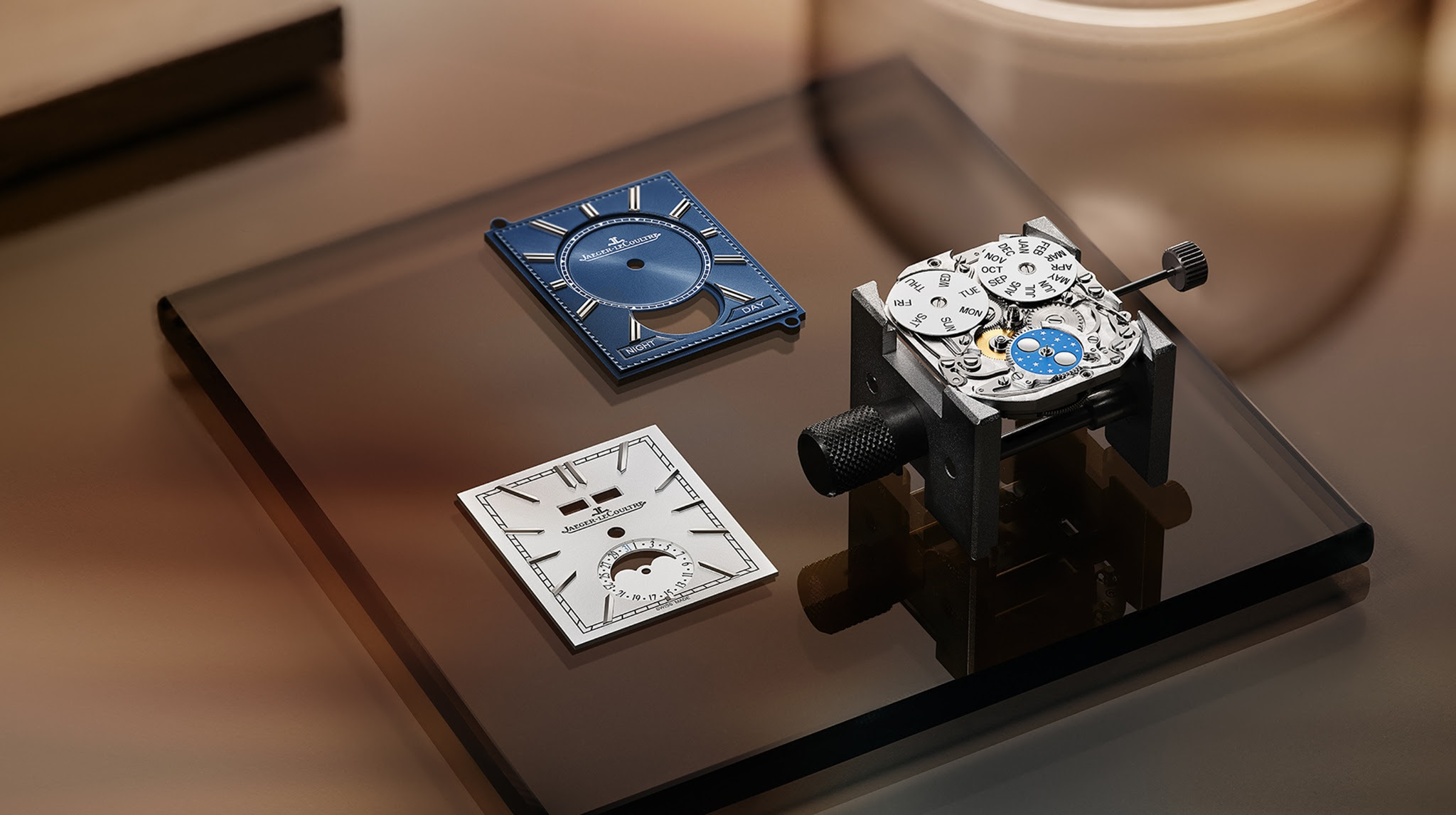
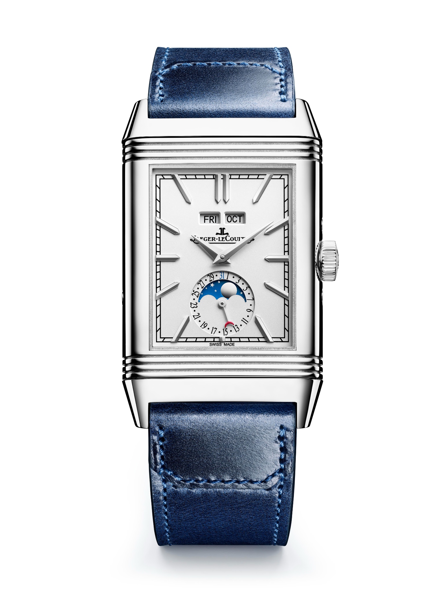
Now we have a sunray decoration for the new Reverso Tribute Duoface Calendar, and the moon phase style changes, too:
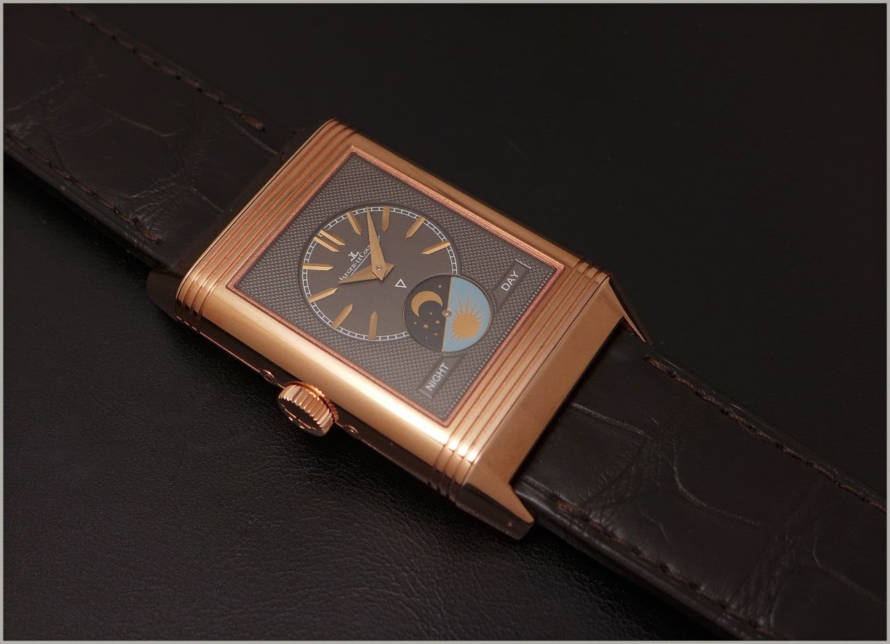
On the verso, the changes are more spectacular.
The 2016 version:
The new one:
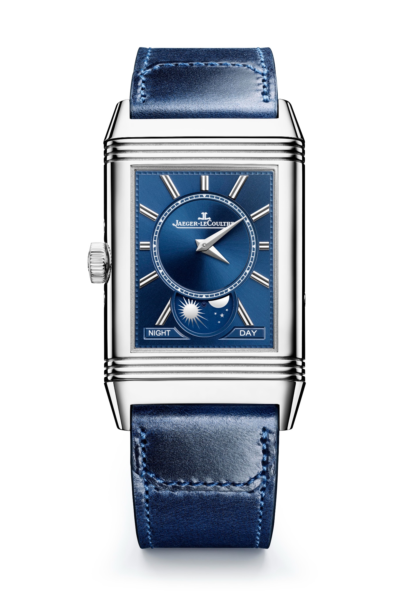
No more clous de Paris ( hobnail ) on the outer part of the dial, the indices are surrounding the inner dial, they are differently shaped, as well as the night and day indicator.
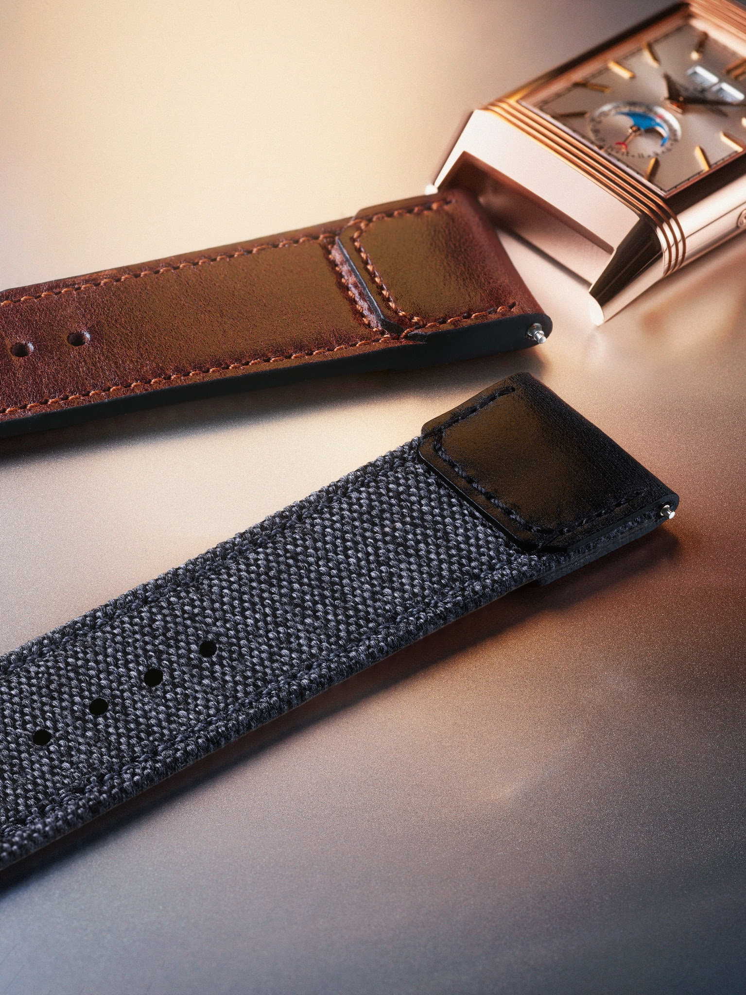
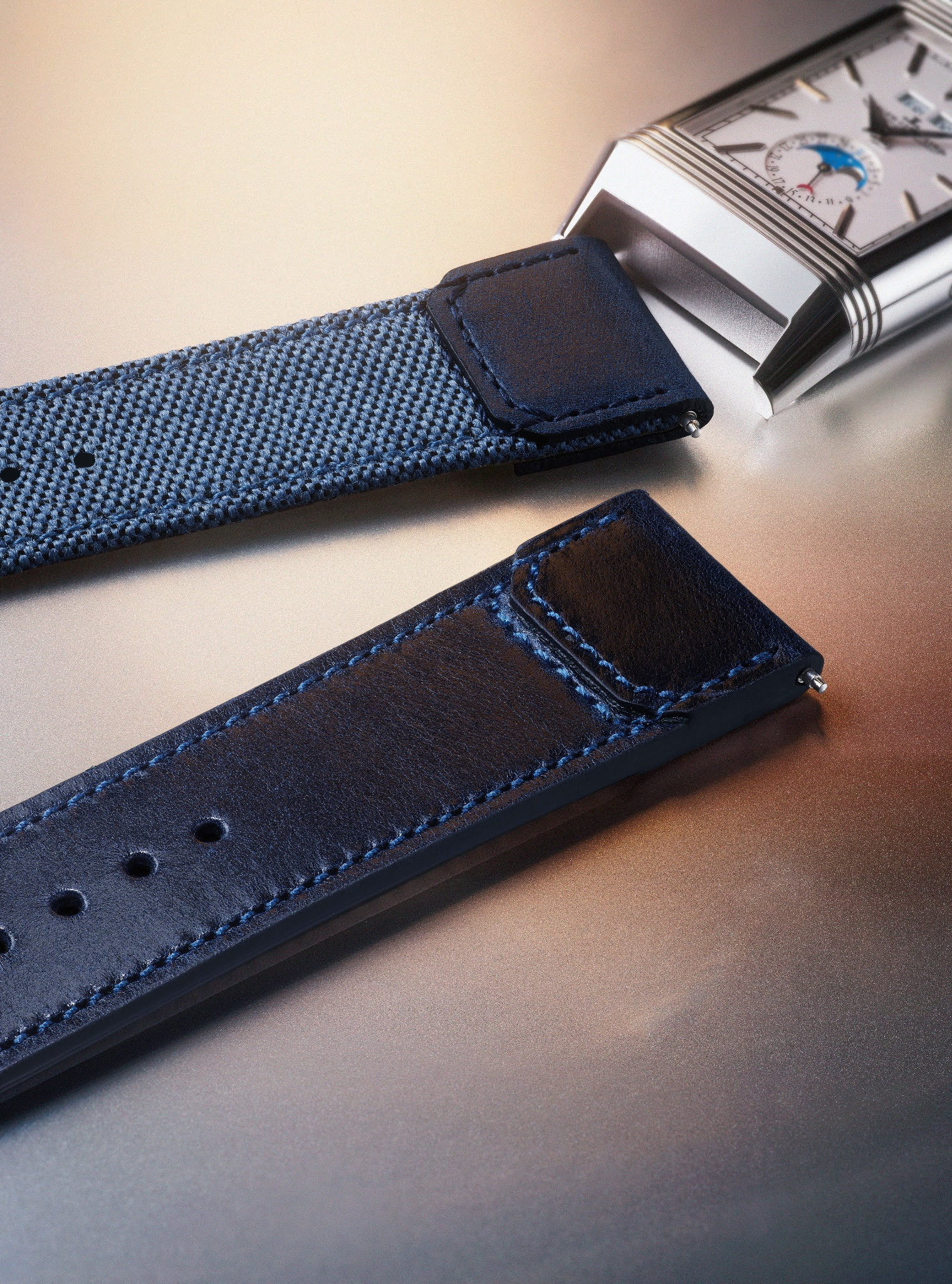
The straps change, too. From the alligator straps we go now for two Fagliano: One which is a blend of calf and Cordura, and the other full calf.
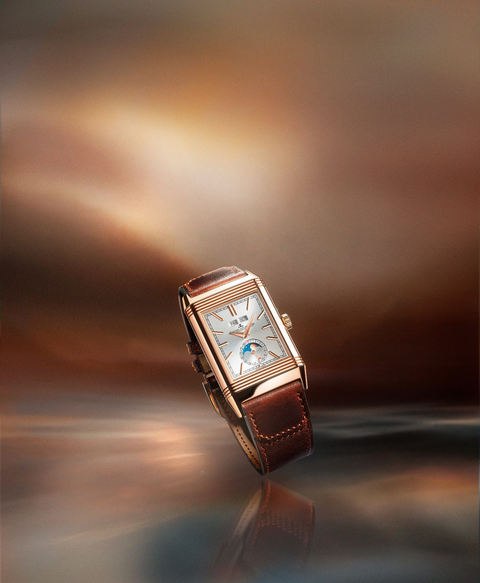
The rose gold version is playing the card of nostalgia, adds some warmth, and gives a nice retro touch.
I find it even more elegant, and maybe a bit more qualitative than the former version.
But I am more attracted to the steel version. Of course, it is colder than the rose gold, it is monochromatic, at least on the recto, but I like its contemporary look a lot, as well as its blue verso dial.
And as there was no steel version before it adds some novelty to this reference.
The decoration of the dials are the same ( sunray rather than grained or hobnail ) for the steel and the rose gold. I find the verso blue dial quite cool and eye-catching.
Another detail, the straps. One is a blend of canvas and calf, the other is full calf, both Fagliano and blue.
A wrist shot ( Nicholas Hoult ) to give you an idea of rhe proportions of the watch:
Which one do you like ( more )?
The rose gold:
Or the steel:
Any thoughts?
Best,
Nicolas
Comments:

andrea~ December 5th, 2022-10:51
The steel for me I don't like the size though. Too big for a reverso.

amanico December 5th, 2022-10:52
As for the size, you should really see it in the flesh. I thought exactly the same when I read he size from the press files, and then, in real, I was pleasantly surprised.
andrea~ December 5th, 2022-15:37
I tried it on a while ago, but it feels too big on my wrist I can handle reversos that are up to 47mm lug to lug, anything more looks odd


orahu December 5th, 2022-11:30
What a nice review! Thank you! My first choice would be SS/Blue, but, the rose gold is certainly very nice!

0-10-10
Load More Comments
Next Article
amanico
Jaeger Lecoultre Geophysic True Second and Universal Time: The review.
amanico
How to start? With the launch of the Tribute, Jaeger-Lecoultre had the secret idea to build a whole new family with the Geophysic. The Tribute was the first member, playing the card of the past, clearly, with one concession, the movement, which is not manual, like in the original, but automatic, with a fine setting of the balance wheel. The Tributes ( 2014 ) : In 2015, Jaeger-Lecoultre unveils two new Geophysics, the True Second, and the Universal Time, both sharing a new movement, the Cal 770, which offers ... .
© 2017 - WatchProZine