
Master 8 Days Perpetual skeleton: Rose Gold or Platinum?
amanico

 g
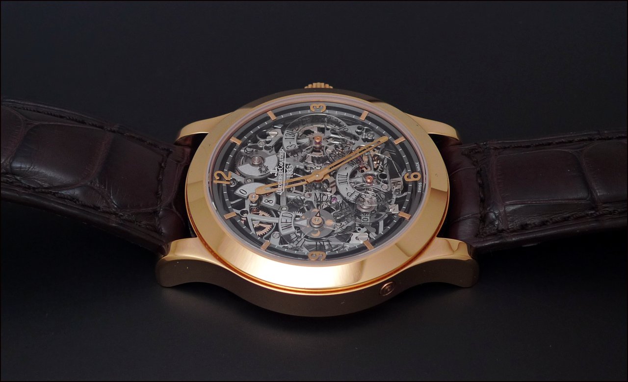
gSome here wanted to see more pictures of the 8 Days Perpetual skeleton, as to be able to fully appreciate the combination of the ruthenium dial with the white or the colored case.
I won't denounce anyone, he will perfectly do it by himslef...

As an introduction to this marvel, here is a brief summary of the characteristics of this watch:
- Comfortable yet harmonious proportions of the case which is 41, 5 mm big and 11, 8 mm thick.
- Complete, not to say exhaustive perpetual calendar informations: Day, Date, Month, Year, Moonphase, " danger zone " and day night indication, power reserve indicator ( 8 Days ).
- Easy setting of the perpetual calendar datas, by pushing one corrector located at 8'o clock, which synchronizes all the informations.
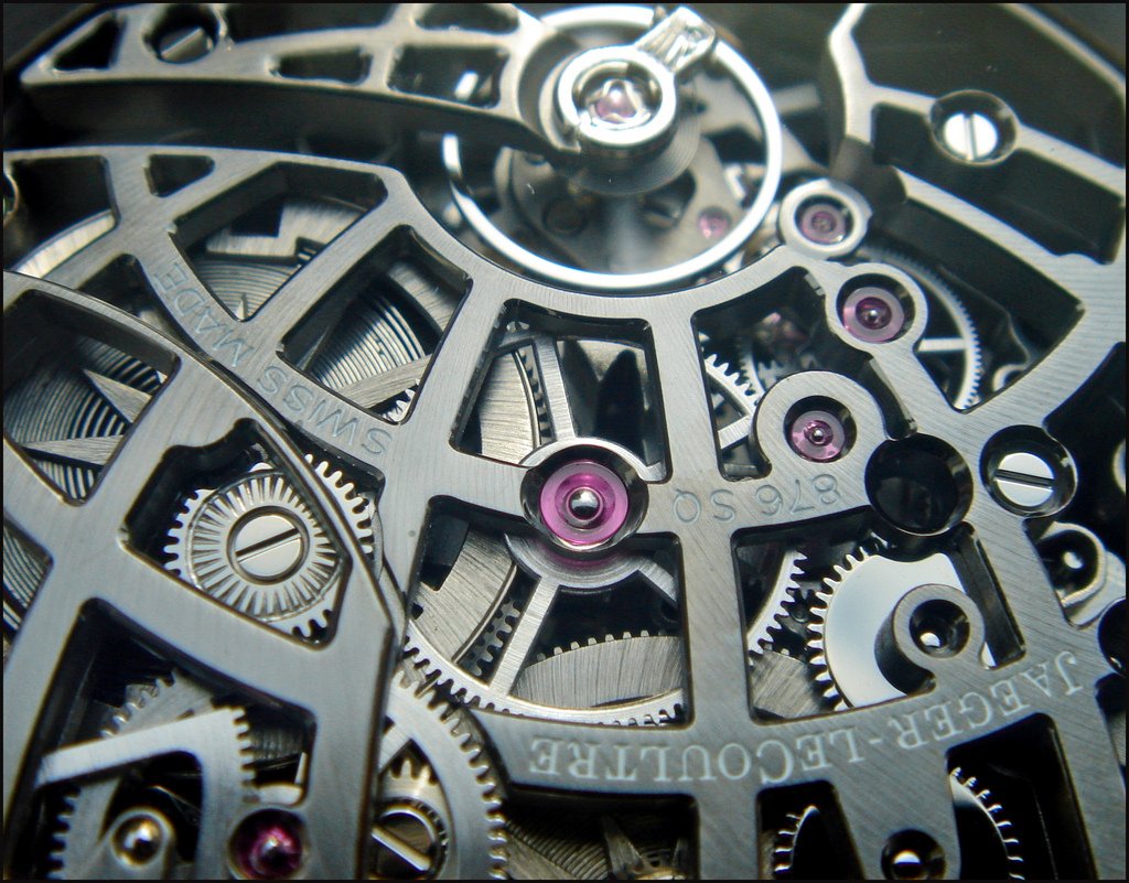
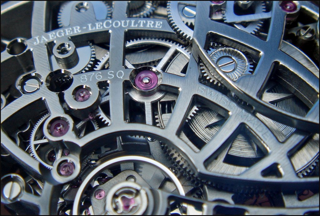
- A movement, the Cal 876 SQ, which receives an original and very appealing decoration and finishing.
- An aesthetical and functional defy: offering a correct legibility of all the perpetual calendar informations on a skeleted dial.
2 versions saw the light: The Platinum ( 100 pieces ), in 2007, and, for the 175th Anniversary of the brand, in 2008, the Rose Gold ( 175 pieces ).
Both are sharing the same degree of sophisitcation, as they receive the same treatment for their movement, but, due to the different metal and color of the case, each of them offers a different perspective, and shows their own character.
Let's focus on the Rose Gold version, as I already posted many pictures of the Platinum one:
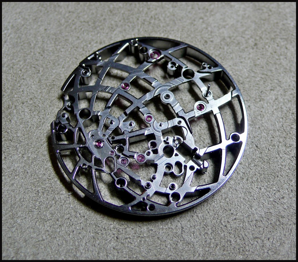
The dial side and the back side are built upon an " aesthetical " concept, the Planisphere.
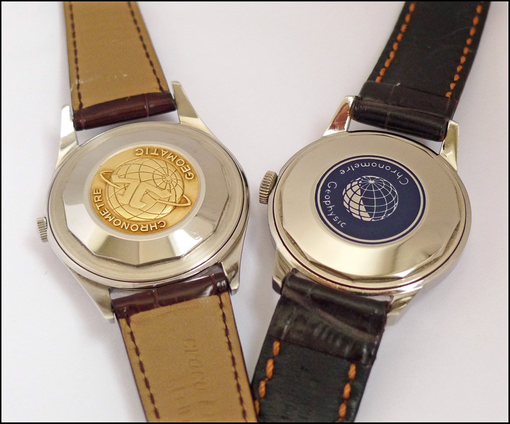
As you know, the planisphere is an important symbol of JLC History, which inspired the Grande Maison for some important clocks and watches.
What is on the case back of the Géomatic and / or the Geophysic?
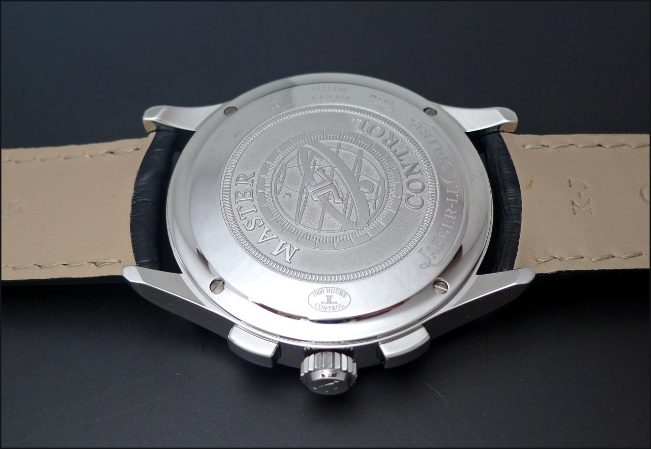
What do we have on the latest Master Memovox and Chronograph case back?
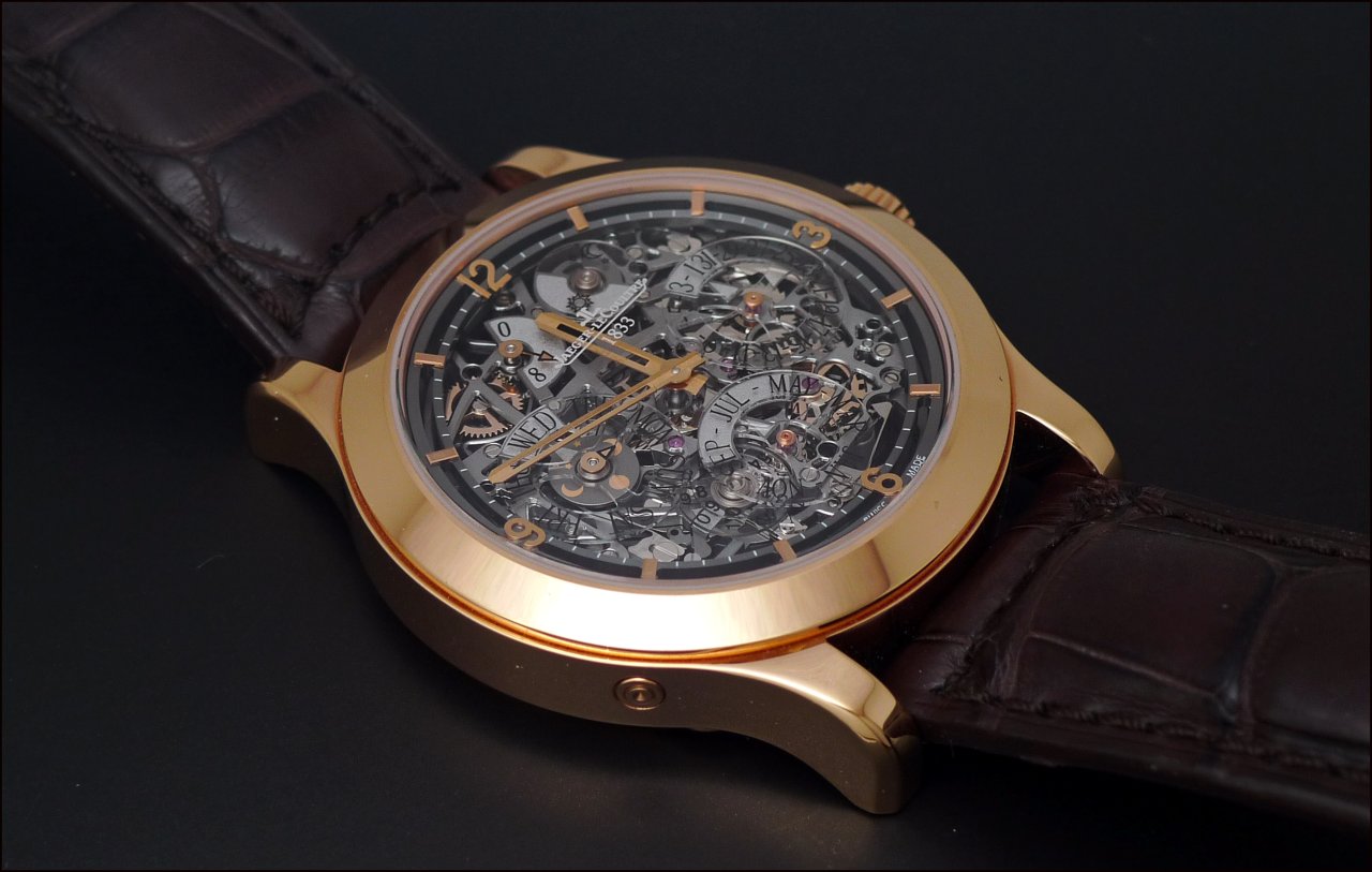
A powerful symbol of Universality, Trips, Adventures, Discoveries.
Here, the symbol is also the support, the base of the movement.
All the longitude and latitude lines of the planisphere are converging to the balance wheel, offering some harmony to this complex design.
This is an endless play of light, shapes, levels, angles, transparency.
This is not a movement anymore, this is a Masterpiece.
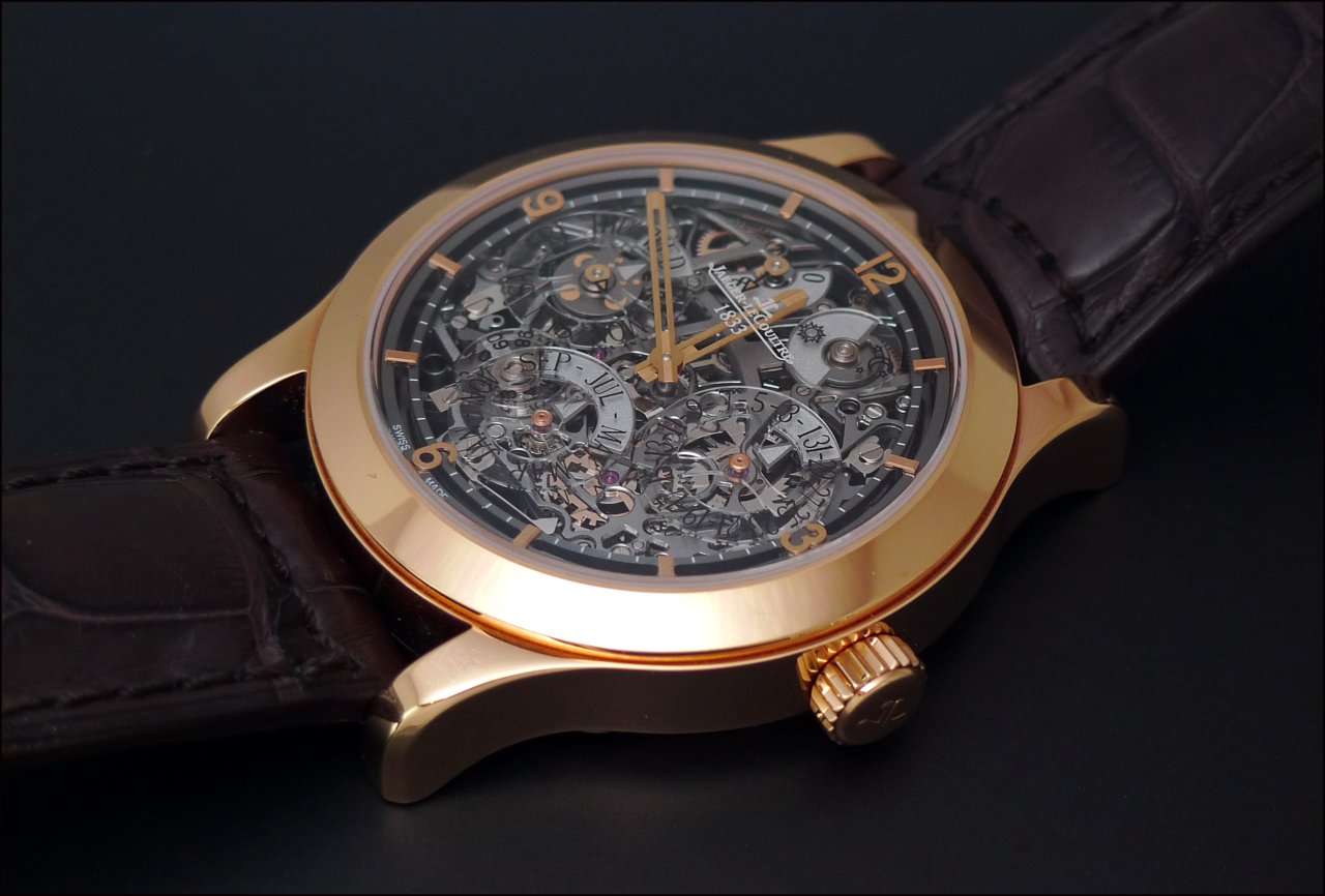
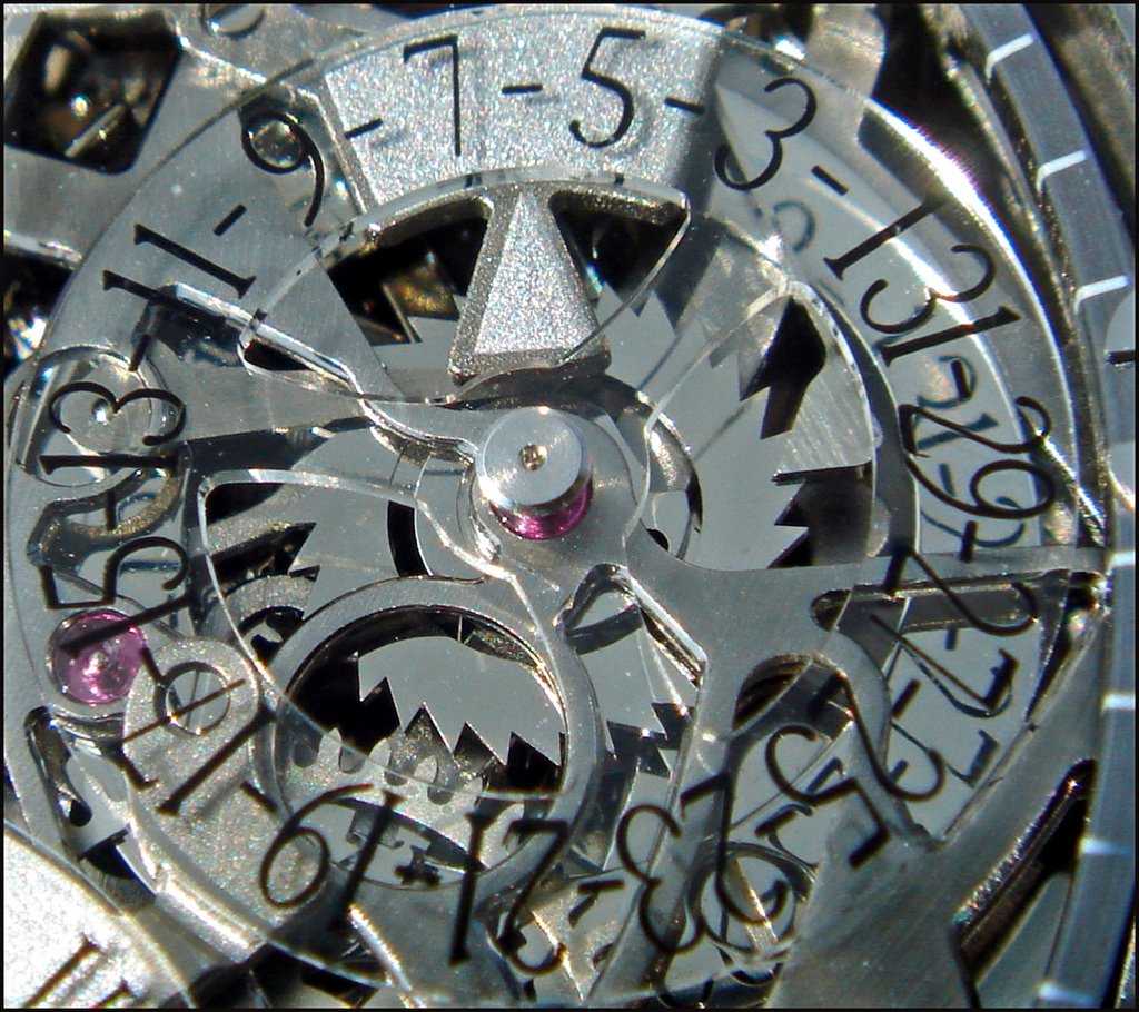
Not only the mainplate, but also all the bridges are taking benefit of this concept, as you can see on these photos.
More, all the parts of the movement are decorated with great care.
The planisphere is naturally suggesting Earth,
But, if you have a deeper look at the dial, you will see some celestial details.
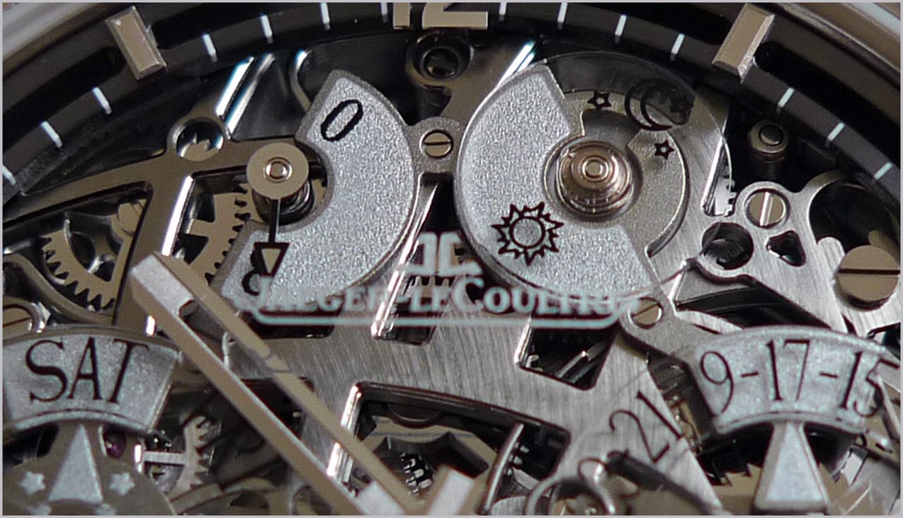
The sun, moon and stars are featuring, of course, on the day / night and moonphase indicators, but not only there.
Look at the wheel just under the transparent Date disk...Isn't it shaped as a sun?
Here, the platinum version:
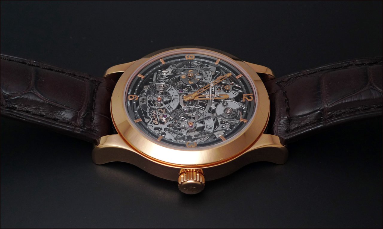
Aren't the transparent disks looking like satellites?
Some of these celestial details also appear on the case back side, as we'll see a bit further.
Back to the dial, the outer part is like detached, almost floating with the golden applied indexes and numbers which reinforce this feeling.
As the rest of the dial, this " ring " is ruthenium finished.
The hand finish is important on this watch:
The bevelling, the sunburst on some pieces like the ratchet wheel, the nickel plated and rodhium gear wheels are a few examples.
Another nice chromatic detail is the finish of the screws, which, in this case aren't heated blue, but nickel plated ( on the platinum ) or golden ( on the rose gold version ) , and contrast with the dark ruthenium skeleted dial in a very elegant way, bringing some sparks of Life in this beautiful but dark universe.
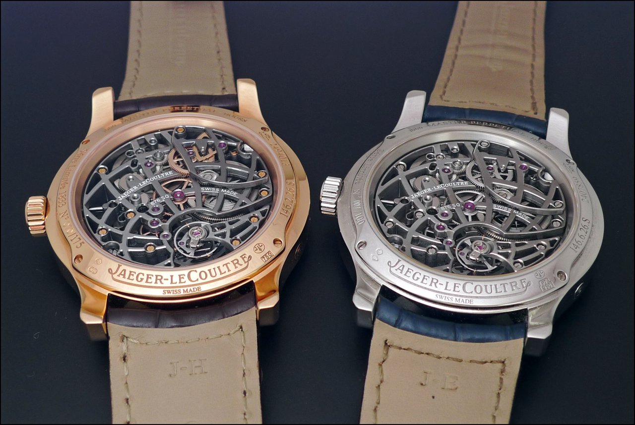
The back of the watch is simpler, dare I say...Calmer, at first sight, compared to the ton of details on the dial side.
A star, with its 12 " arms " on the top of the 2 barrels... And the hour wheel, ratchet wheel and winding wheel are like some small suns, with their dedicated finish!
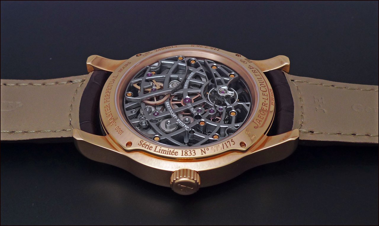
The Planisphere, here, explodes in all its beauty and simplicity.
There is nothing else to do than to contemplate, and admire it, any information being futile.
A pure work of Art, which requires 2 months for each movement!
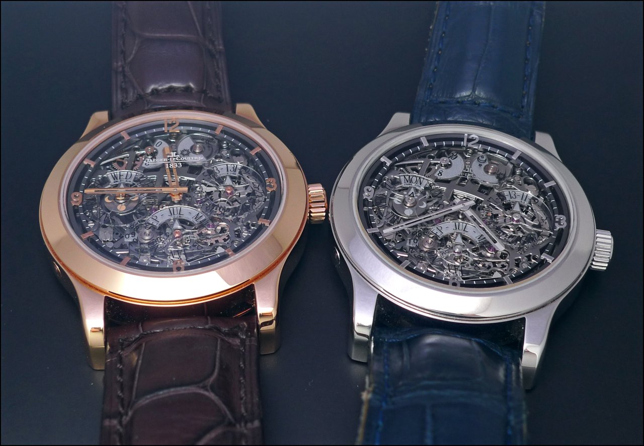
That being said, we didn't answer to the original question: Rose Gold or Platinum?
As always, both are very tempting, and it really be a matter of taste.
Let's just say that each of them has its own character.
The Rose Gold is certainly warmer than the more understated ( if I can say that... ) Platinum.
The contrast between the dial and the case is more pronounced on the Rose Gold, obvioulsy, when we play a more discrete chromatic partition with the Platinum.
May I say that the Rose Gold looks more Classic while the Platinum is more modern?
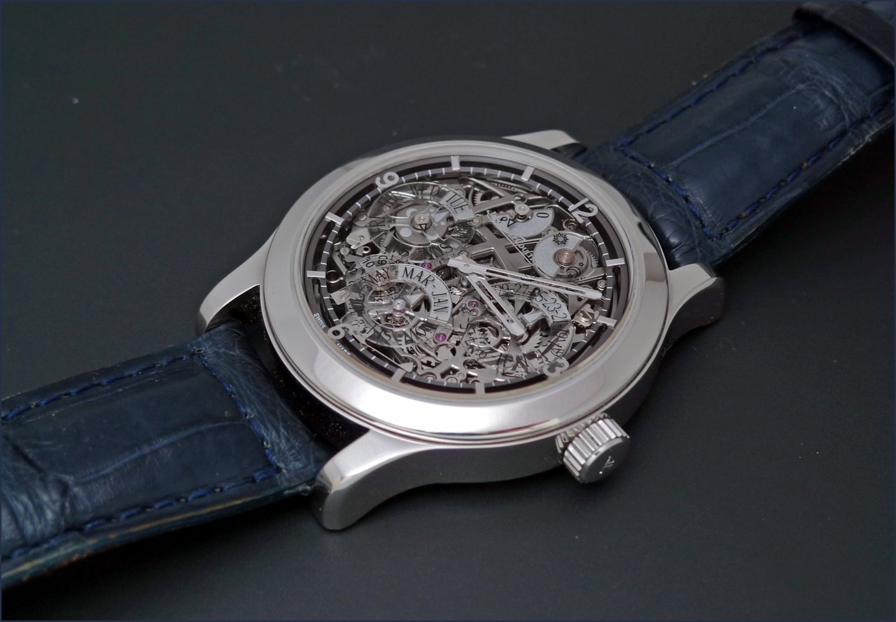
Is a version more legible than another?
To read the time is maybe easier on the rose gold perpetual calendar, due to the bigger contrast between the ruthenium dial and the rose gold minute and hour hands.
But when we compare the reading of all the perpetual calendar informations, at the exception of the moonphase which is golden, I don't see any valuable difference, personally.
Now another question is about the legibility of this perpetual calendar...
I'd say that it is not more nor less legible than another perpetual calendar.
It may be more legible due to the larger, bigger discs / subdials than on all the other perpetual calendars, and also because JLC used a clear zone to enhance the day, date and month, as shown here:
It may also be less legible due to the fact that the informations are .... let's say ..." sunk " in the skeleton dial, so the eye is a bit lost in front of so many beautiful details, compared to other much simpler dials.
But once you get used to read the calendar, things are much easier.
Therefore, is that so important on such a watch?
I mean, does Art need to be functionnal?
Food for thought, and for some interesting discussions...
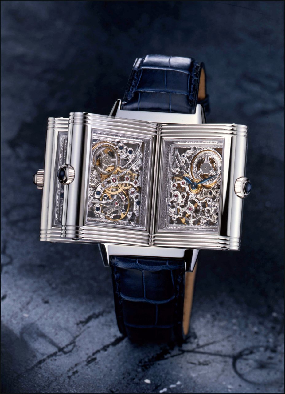
Anyway, I love a lot this modern skeletonisation, maybe more than the traditional, which is more mannered, baroque, like on the Reverso platinum Nr 1, for example:
Don't you want to see more JLC pieces with this level of finish?
I, for one, say YES!

Looking forward to reading your thoughts and comments,
Best.
Nicolas.
This message has been edited by amanico on 2010-09-20 07:27:02 This message has been edited by amanico on 2010-09-20 07:36:20 This message has been edited by amanico on 2010-09-22 23:15:41
Comments:

foullis September 19th, 2010-01:22
Platinum. The movement is wonderful, one of the best in JLC range (for me) No message body

amanico September 22nd, 2010-22:21
Thanks, Milan. Well, the Gyro I is a bit above, though... :))) No message body

foversta September 19th, 2010-01:48
Thanks a lot for the review. My fav is the Platinum one. I think that the platinum color works better here with the see-through dial. A classic watch... with a very original presentation. Thanks for the gorgeous pics. Fr.Xavier
amanico September 22nd, 2010-22:28
Tend do agree. Somewhat, I feel the platinum version is maybe more " aerian "... Love the discrete contrast between the light color of the squeletted dial and the case. But I'm a bit biased, as I'm a non colored metal adept. Best, Nicolas
respo September 19th, 2010-06:44
Platinum I say platinum only because I think it gives the watch a very contemporary or concept feel to it, which I think is rare for a perpetual calendar, especially a skeletonized one such as this. Legibility is a funny issue when we discuss perpetuals, skeletoni...
amanico September 22nd, 2010-22:31
Indeed, Respo, this PC has a lot of assets. A kind of " Modern Art' " vision of a traditional complication, ala MMR Titanium, but here, JLC went deeper. A captivating piece, for sure. Thanks for your very valuable input, my friend. Nicolas

maikeru September 19th, 2010-14:30
Platinum Having seen both versions in the metal, I prefer the platinum as well. Seem more 'of a piece' and coherent (the movement blends, rather than contrasts, with the casing). This is actually one of my grail pieces (I'm of the school that allows more than one!...
amanico September 22nd, 2010-22:38
Well, Maikeru The size and thickness are the same than on the A. Lecoultre 8 Days Perpetual, my friend. The special work on the dial and on the movement makes it loo slimmer. Quite unique, in this category. Best, Nicolas

nwp627 September 19th, 2010-15:17
You are so right... ..."This is not a movement anymore, this is a Masterpiece." Thank you Nicolas for those beautiful photos. N
amanico September 22nd, 2010-22:39
Thanks for your answer, Neil. A modern piece of Art, for sure! No message body
0-10-10
Load More Comments
Next Article

amanico
" Diving is Beautiful ", an in depth view on JLC Diving Watches and others.
amanico
Revisiting all the History of JLC Diving watches is a passionate Dive into the Beauty. Even if I'm a Polaris Lover, there is not only the Polaris to consider, as some other very interesting watches existed, before and after this Cult Watch. For those interested by the Polaris, I will brievely speak of it, here, as I did a Review you can read here: The main purpose of this post is to : 1/ Give some justice to these models which lived and still live in the shadow of the Polaris. 2/ To enhance the fact that ...
© 2017 - WatchProZine