Patek Philippe 5296R: Comparison of Standard or Sector dial versions

Hi,
I have inspected the two Patek Philippe Ref. 5296R dial versions in rose gold cases and can now share some thoughts that are illustrated with photographs.

While the standard version is very elegant and already a classic Calatrava design, the sector dial variant is inspired from much older references and is less “dressy”. Indeed, I wouldn't even say that the sector dial is more ‘modern’ or ‘sportier’ etc. – you know – all the terms that we use when a watch has a more casual look. I can't really define it or give it a name. To me, it has a sector dial and thus it is a unique model with its own spirit.
I'm fond of the sector dials in vintage Patek Philippe timepieces and especially, as I already posted in the past, when it is available in chronographs. It gathers the engineering world of planes with the watches used as navigation instruments. There is an atmosphere in this dial orientation that I like a lot.

The case is 38mm wide which corresponds to the spirit of a classical and discreet Calatrava piece. The design of the case is a purer version from the array available from the Collection of 3-handers and thus a little more contemporary than a rounder model (viz. ref. 5227 or 5127 for instance, or even ref. 5153).
From the profile, the style is quite different and less geometric than the front side may lead you to think; especially in the lug sections where we can admire very soft curves giving a welcomed warmth to the watch. The long side-band going uncut from north to south is polished like the rest of the case and is not brushed.

The sector dial model is 2-toned silvery-gray with blue transfer-prints. The sector printing is a little thicker and has a very different look from the vintage versions. I must say that I prefer the latter more. In fact, I think it looks nice on the ref. 5296 but suffers a little compared to the original sketches. This is may be due to the fact that I like thinner printings, although it may look more cluttered to other people.

An interesting detail is that the 2 tones of the metallic dial are spread like rings. It is not only a tone difference but also a difference in texture because light does not reflect the same way from them.
The dial
decoration as well as the colour and shapes of the hands are what make these
two references very different. In the sector dial version, we observe the dark
blue hour and minute leaf-shaped hands together with a blued stick central sweep
seconds hand.

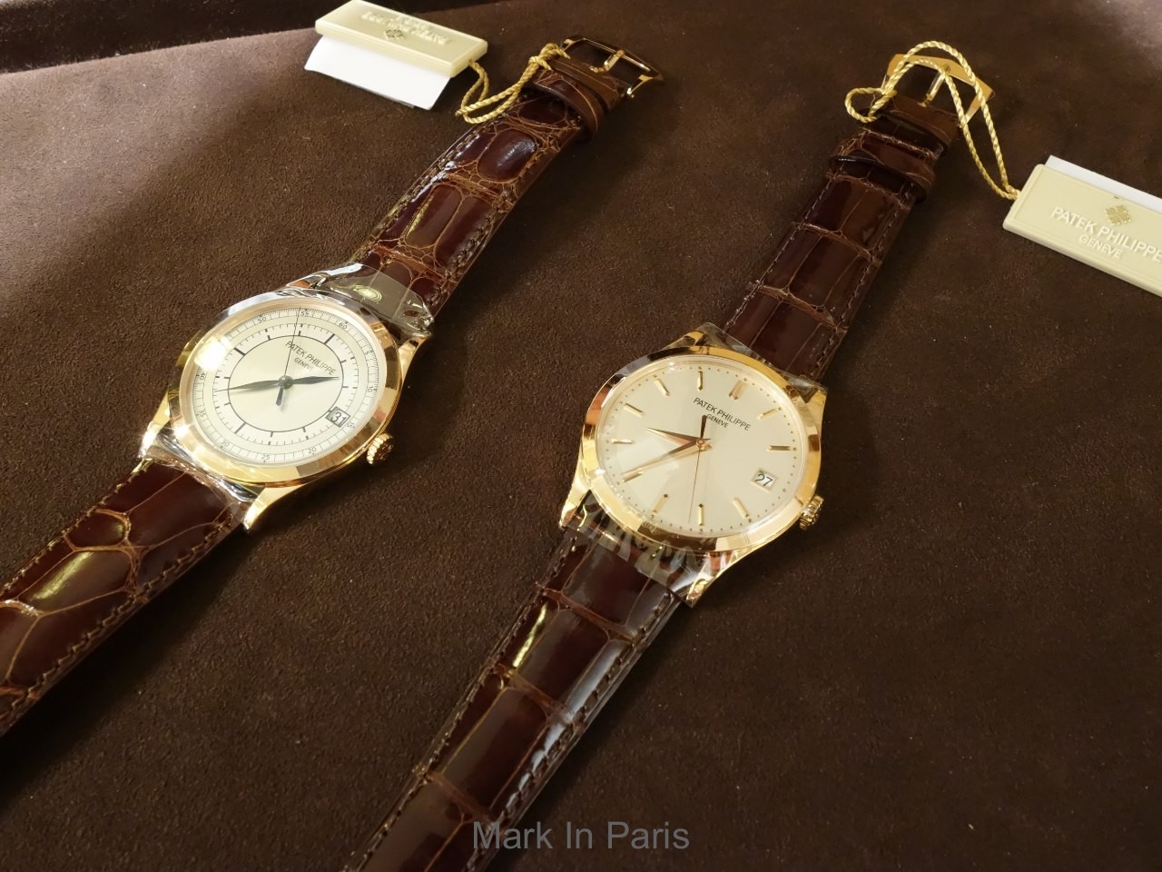
On the classical version, the choice is totally the opposite and much dressier: no printings but rose gold applied markers and Dauphine-shaped hands. The latter is very elegant and can sometimes be mistaken for vintage references.

The date window at 3 o'clock is integrated into the sector dial scales and does not interfere with the whole picture. On the cleaner dial version, it is like the ref. 5227: a feature that people may find very useful as well as suitably integrated for a 3-hander.
Here are the official pictures of the white gold versions for info:


And a couple of wristshots from our members:

Credit: TonyR

Credit: NT931
The movement is the well-known 324SC caliber that, as usual, you can see through the sapphire caseback.
In the end, these two interpretations from the Calatrava line-up originate from two different worlds and are not meant to communicate the same message. I think the sector dial version brings a different and distinct identity than the usual classicism of elegant and dressy 3-hands watches.
Which is your favorite?
Do you have a preference for the traditional version or for the more original but still old-school sector dial interpretation?
I know some of our members are proud owners of these models, so please feel free to share some pictures!
Cheers,
Mark
This message has been edited by Mark in Paris on 2016-06-22 14:37:09 This message has been edited by MTF on 2016-06-22 15:00:13


Next Article

Patek Philippe 5070 : An In Depth Review.
© 2017 - WatchProZine