
TeutonicCarFan
8332

Old for sure
Don't like the sub seconds numerals and change in size on the day date

New for 2022, a New Dial for the 7337! Plus Interchangeable Straps Coming to Breguet???
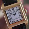
What do YOU think of the new dial? Here it is and the following pictures are last years dial and the previous, older dial as well. The final picture is a new dial for a ladies' model which now has a quick change strap system--probably a trial of the syste...

I think
The ladies 3 hand is nice. The new format feels bottom heavy to me. The gold with colored moon is best but I think they look like a CVDK but not as well balanced
The ladies MOP guilloché is nice!
Agreed on the older dial as that is my choice as well. I like the that oldest hews closer to the work of the original AL Breguet himself. I hadn't thought of a comparison with CVDK, but his watches are always a pleasant thought!

The guillioche for the sub second is gone. A big shame!
Yes, is is better to read day and date but missing a trademark Breguet detail.


For those interested, here is a wrist shot of the oldest dial 7337
I do think the interchangeable strap idea is actually a bigger deal for Breguet. ...

A beauty
This one is, to me, the perfect one. Beautiful guilloché that aids in legibility, visual balance despite the asymmetrical design, and a moon with a face! I like how the moon phase window curves, unlike the Roth era design.
Old Is Gold!
Agreed on the changes. I see what they are trying to do to refresh the line without investing in a new line of watches. So, dial changes make sense.

No comparison : the old one is more classy!
With the newer version the small seconds looks lost in the dial.


The guilloche patterns ...
between the outer and the inner regions look quite similar on the new ones. There is some difference but it is minimal. On the older ones, the difference was substantial. And, also as already mentioned, second subdial had its own unique pattern on the old...

The lady Breguet is good
While i do not get used to off center shaft. Hopping to RG L1, this is also off shaft. The only off center shaft watch i will buy is the Bovet 19thirty. Than i will consider the RG L1 and the Breguet 7337. It is a matter of time i go to went off center sh...
That's very reasonable, each person's taste is unique. And tastes can change as well.
However, off-center chapter rings go way back. 200 years at least. ...
I never saw an old pocket watch with an off center dial
What i saw was a key wound system. Yes, taste can change throughout the years. Not long ago i was not aware of the tourbillon. Almost six years ago i did not know a balance exist. From it it was a question why the quartz is more known and why the mechanic...

What are they thinking!?!
Nope. The lack of guilloche on the sub seconds is a huge mistake. The numerical font is off IMHO. too small or something. I agree with the bottom-heavy comment. This all feels very ALS to me - perhaps this is the tack the company is taking to position the...
Yes, very good points! I get the feeling that the heads of Breguet don't really understand what made the Roth designs special.
But, waiting to see in person is a good idea, as always.
The ALS comparison is apt
Part of what draws me to Breguet is the warmth and character. I look at an austere ALS (or JLC) moonphase and I’m left feeling cold. Sadly, I feel the same way with this update.

Nope
The old style is clearly better-looking. The seconds sub-dial is much less prominent in the new version and the font size in the apertures for day and date is too large.
Not a fan of this one…
…the placement of ‘Breguet’ looks awkward to me. Also the blue spots of color.

I think they did this to modernize Breguet's design language
But I do agree with the comments: the dial feels too bottom heavy compared to the older version. What I would do to most Breguet cases is downturn the lugs to make them wrap around the wrist and make the watches more wearable.
Yes, I think you have good insight into the situation.
It does seem like an attempt to modernize the design language that misses the mark a bit. The lugs are not for everyone. The current Marine line has a new lug set up, maybe the classique line needs one as well.

I saw the press release yesterday, indeed. I wonder if I don't prefer...
This one... Or even better, the 3330 and its smaller case... ...

Ruined!
I don’t know which is worse, the seconds sub dial which no longer looks like it’s from a Breguet…or the date windows which are now too large, the wrong shape and a colour of date ring that overpowers the main dial. A wearer of this watch isn’t looking for...
I saw this earlier today and I am not a fan.
I think the watch loses its charm in this version. More utilitarian and less classic; a bit less Breguet. I’m sure it’s a lovely watch and great in its own right but you asked for an opinion versus the earlier models. I recently acquired on and I specific...
Yes, I appreciate your take on it.
A bit less Breguet is a good way to describe it. I agree with you, the yellow gold one is a delight.

I'm not sure... I like the old dials just fine...
I'm not sure the new one is an improvement.
A solution in search of a problem.
Perhaps a misguided attempt to boost sales by people who don't understand what draws people to Breguet in the first place.
I mean, they did take away the old dials.
They are not being produced. Breguet will keep out-of-production models on their website to help move remaining old stock.

Breguet
Nice but too cluttered for me. My idea of Breguet is simplicity in its purest form with the Grand Feu dial time only. That’s just me.


I don’t know.
It’s hard to really say without seeing them in person. I think as you say, more legible for sure in the new dial. But, I’m not sure about the guilloche. Is it more striking, more of a visual impact in the older reference?
The basketweave of the oldest version is lovely and catches the light actively.
The newer hobnail will be less visually distinct.

IMHO the older dial was probably the most classy of the three versions…
… but maybe in certain ways it could be seen as a bit dated design. The following version was bringing some kind of modernity but still respecting the older design and the DNA of Breguet, probably a good compromise between vintage and modern. The latest v...
I hope you show us what's in store as soon as it makes sense to do so!
I think your take makes sense.
Other than reduced cost, I don’t see the appeal of the new dial.
The original had 4 types of guilloche: main dial, outer dial, seconds, and moonphase. The new dial only has two types of guilloche, with the awkwardly printed seconds markings and no guilloche for the moonphase cutout. It will be interesting to see if the...

The current model has a dial that looks better balanced and more pleasing to the eyes (somehow)
The new dial lay out with bigger side openings and in blue background is glaring. The brand and number placed in the center of the dial affects the dial aesthetics for me.
the new hammered moon is great
It's beautiful in person and solves a pet peeve of mine that the gold moons sometimes don't show up in photographs, even professional ones - I guess because they are flat and if there doesn't happen to be a light source in the perfect location they end up...