
An encounter with the Astronomic Souveraine and a conversation with Francois-Paul Journe.

Last week, during the salon at Montres Journe in Geneva, I was so lucky to finally see the Astronomic Souveraine. I have been wanting to see it for ages, but circumstances have kept me out of reach. This high-end watch, has been building up in my mind with a mixture of anticipation, high expectations and also questions about its concept. And so, it was a great pleasure to finally encounter this watch and form my own impressions. I also got the opportunity to learn a bit more about its conception process, as shared in this post.
For those of you who are not familiar with the watch, here is a link to an old article, from when the watch was first revealed to the world.
The Astronomic Souveraine was then offered to the market in mid November 2019. Here is a link to the press release, brochure and data spec sheet.
In this post, I take the liberty of not explaining all the functions and technical parts again. I assume you already know the watch. If not, I recommend the two links above for background and introduction.
The Astronomic Souveraine had a sort of unusual entry into this world! It has been over a year since the watch appeared before the world and took everybody with storm.
At this point, it was presented as an encased prototype (in a tantalum case and with a mirror blue dial) being offered for sale, in the month of July, at the ONLY WATCH 2019. It then traveled the world with the other watches for ONLY WATCH, too much Accolade by the watch fans and press. The watch finally hammered at the ONLY WATCH auction in November 2019 at a staggering 1.8 million CHF.
A lot of questions have been raised about this watch! Why did FPJ even want to make a watch with so many complications? All his former work has been one movement – one complication!
FPJ has always been vocal against these multiple complications. In their nature, stacking up complications is counterproductive to his overall ideal of making the best possible performing watches in terms of chronometry. Some have asked why exactly did he choose these complications? Why not more, why not less? The presentation did not say much about this, and it has been discussed among enthusiasts.
However, what is essential to understand with this watch, when one assesses it, is its background and conception.
The Astronomic Souverain did not begin its life on a white sheet of paper.
It did not begin as concept to build the most complex, the most complicated, the biggest or whatever one can come up with to draw attention. Rather, it builds more organically from several inspirations. A sketch by his son, his own former work, which again was inspired by other great watchmakers - and probably other sources.
It is more like a redesign or metamorphosis. Similar to when Paul Gaugin's Spirit of the Dead Walking” takes its inspiration by Édouard Manet's “Olympia” or when Akira Kurosawa rewrites Shakespeare’s “Hamlet” that becomes his film classic ”The Bad Sleep Well”. Art history, architecture and the horological world is full of these important metamorphosis or “redesigns”. Or as one of my favorite quotes go:
“Immature poets imitate; mature poets steal; bad poets deface what they take, and good poets make it into something better, or at least something different.”
― T.S. Eliot, The Sacred Wood .
It is a lineage of a kind of metamorphosis of watches that can be traced back to Breguet over George Daniels to early F.P. Journe. Transformed into a contemporary astronomic wristwatch in the interpretation of Francois Paul Journe.
A conversation with Francois-Paul Journe
The story about its conception of the Chronometre Astronomic have been told several times before. However, with some variations.
Here is an extract from a conversation with F.P. taking place last weekend. In this part he is telling about the conception of the Astronomic Souverain:
(His words were spoken in French and then translated live. The translation has been edited for understanding. August 2020)
“….The project for the Astronomic Souverain started somewhere else. In 2006 I was thinking about a small astronomical complication. It was supposed to be with an automatic movement. I worked approximately 6 years trying to design the dial, but I could not come to a satisfying solution.” (As many will know, FPJ always starts by designing the dial.)
“In 2012 or 2013, I still hadn’t found the watch I wanted to make. I decided to change the entire project and build a real Astronomic Watch to take the place of the Grande Sonnerie, which at this time had been in existence for some years.
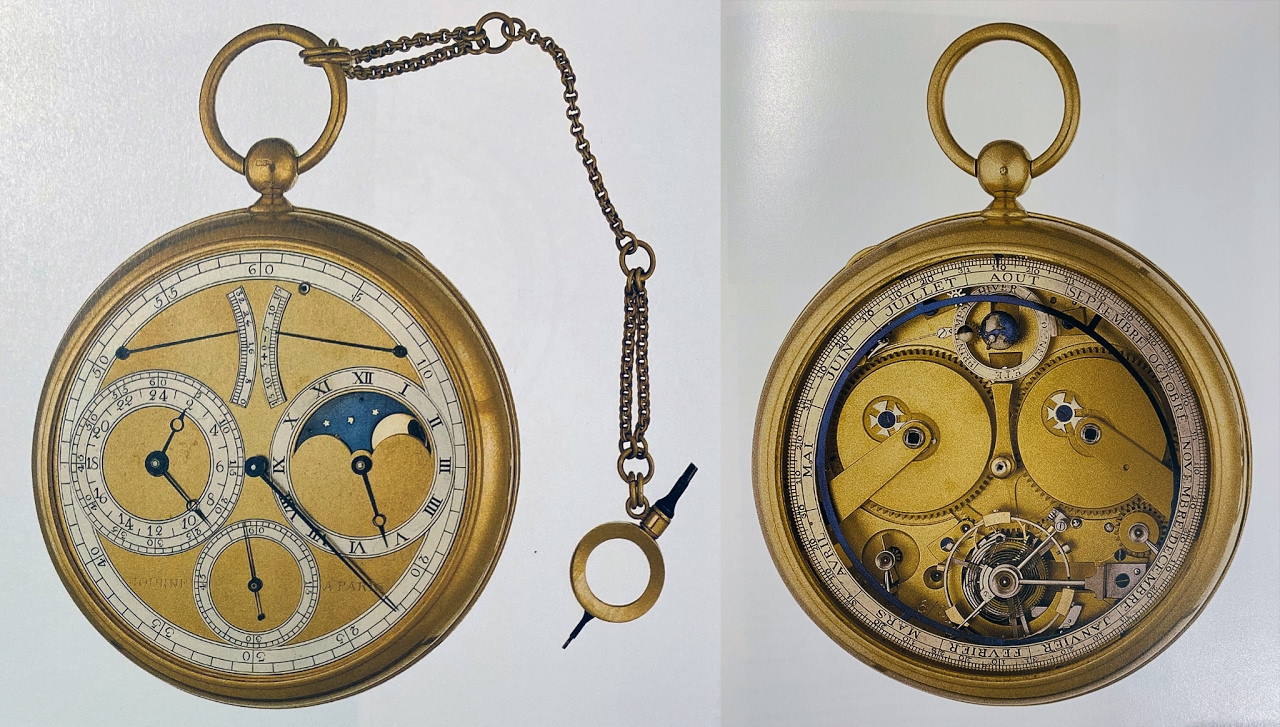
I then thought of an astronomic pocket watch I had made for a client in Paris in 1986 or 1987.”
The watch FPJ is talking about was his 6th pocket watch. An Astronomic Planetary pocket watch, Commissioned by Jean-Pierre Rochefort and completed in 1987. The watch holds a detent and remontoire tourbillion. It displays average and sideral time, equation of time and power reserve. Full calendar with 3 dimensions planetary; earth, moon, sun. This watch was inspired by George Daniels “Space Traveller”. According to watch journalist SJX, if you go back further, the “Space traveller” was developed from and inspired by several pocket watches by Breguet. So, there is a clear lineage back to some of those watch makers FPJ claim as his biggest inspirations.
“It was by then, only a thread of an idea, but I decided this piece would be the starting point to develop the new astronomic watch to take the place of the Grande Sonnerie.
I started by taking the dial with the three subdials, and sidereal time, I decided this would be my starting point. I felt I was on to something and I got it excited about the project.
Then I began to develop the movement. First in sketches and then the technical department tested it in 3d in computer simulations. The first real trial with the prototype and with all its complications was around 2018. Then the prototype was made for only watch and sold at auction .” (in mid 2019)
“There are currently two pieces in existence. This one and one in the States, just to show to costumers, but none have been delivered yet. Now, in the watchmaker’s atelier, two watchmakers have started two pieces and adapting to the new movement. These two are assigned to two clients outside Switzerland who are unable to travel.” (due to Covid-19) “We are working to make these two perfects in terms of regulating, tuning them and adjusting final details. They are set up with working dials, but once the regulation is perfect, and tuned we will fit them with the real dials. Once they receive them – they will get something perfect.”
….
“For me, the mechanics do not have priority over the design. In my approach the mechanical side need to adapt to the design.
I have been asked how many complications, why this one and that one? It is not about of how many complications. It’s not the issue. It is a question of doing the most beautiful one. That is all that matters, and I do not want to destroy my design with something that is not useful. Because in the end it has to be something useful!”
….
I think, FPJ indirectly tell us what he has been aiming for. Beauty and aesthetics have the highest priority, they are the drivers and the aim, but must remain within the frame or border of a watch that is also wearable and legible. What he describes as “..it has to be something useful”. I think this is core to understanding his design ideals. He does not have the ambition of making the most spectacular, technical watch. Record breaking is not his pursuit. Rather he is searching for a kind of equilibrium, between beauty, functionality, technicality and never forget chronometry.
First encounter
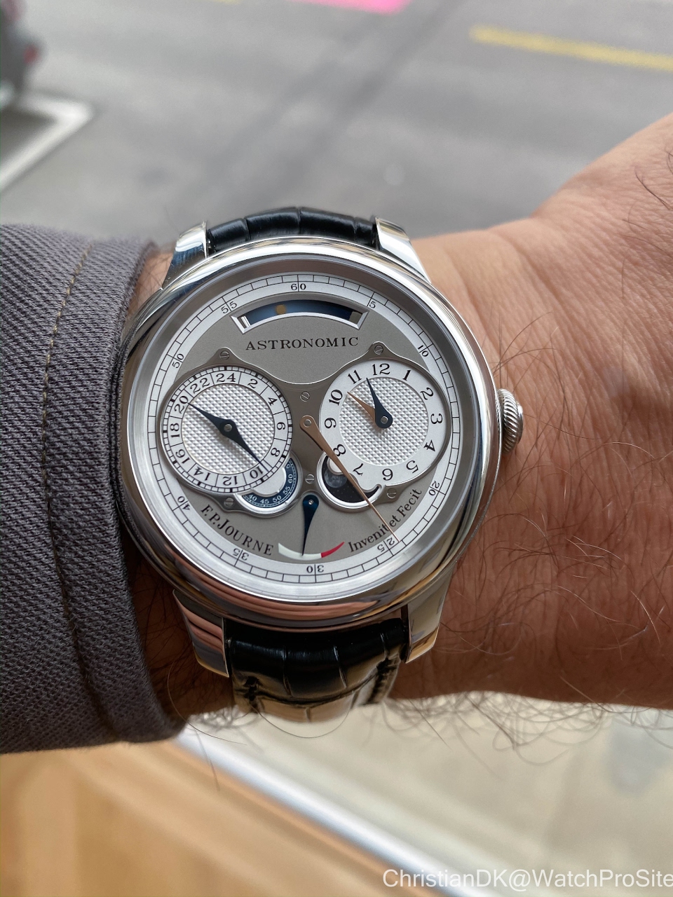
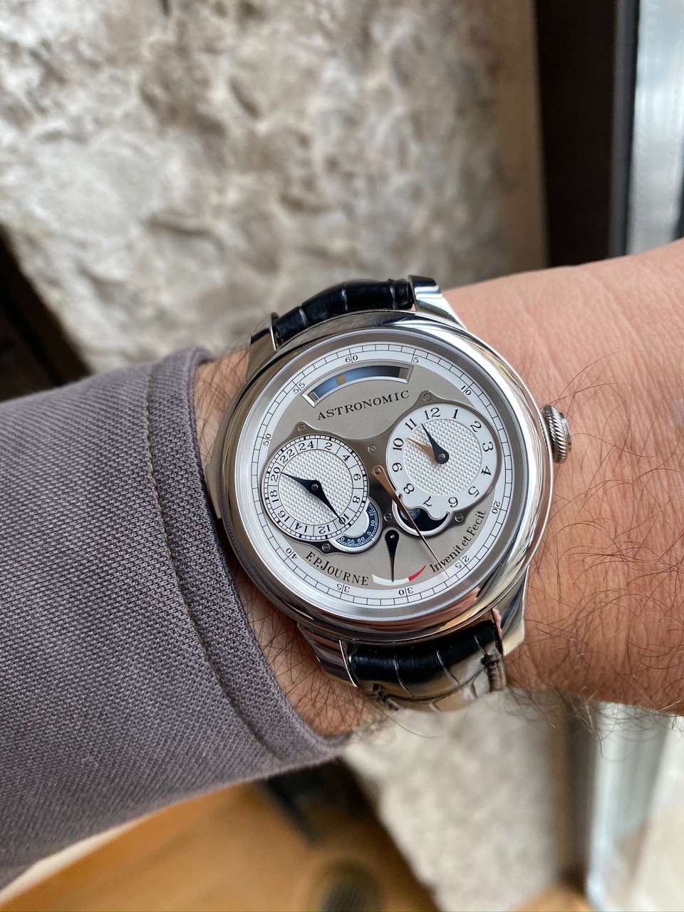
The watch was handed to me and was perhaps smaller that I had imagined (feared) and not as heavy.
By no means is it small, but the “feel” is that it is a very reasonable size for a contemporary wristwatch – especially considering that it boasts 18 complications .
If you are used to modern FPJ watches, you will also be used to some heft from the gold movements and the Pt cases.
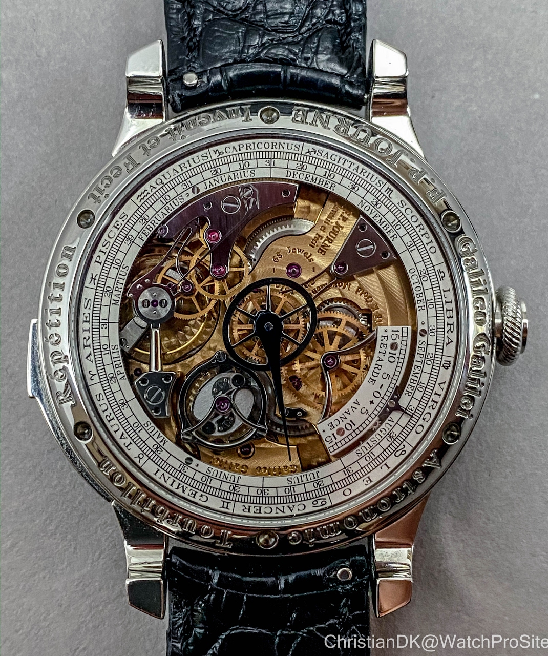
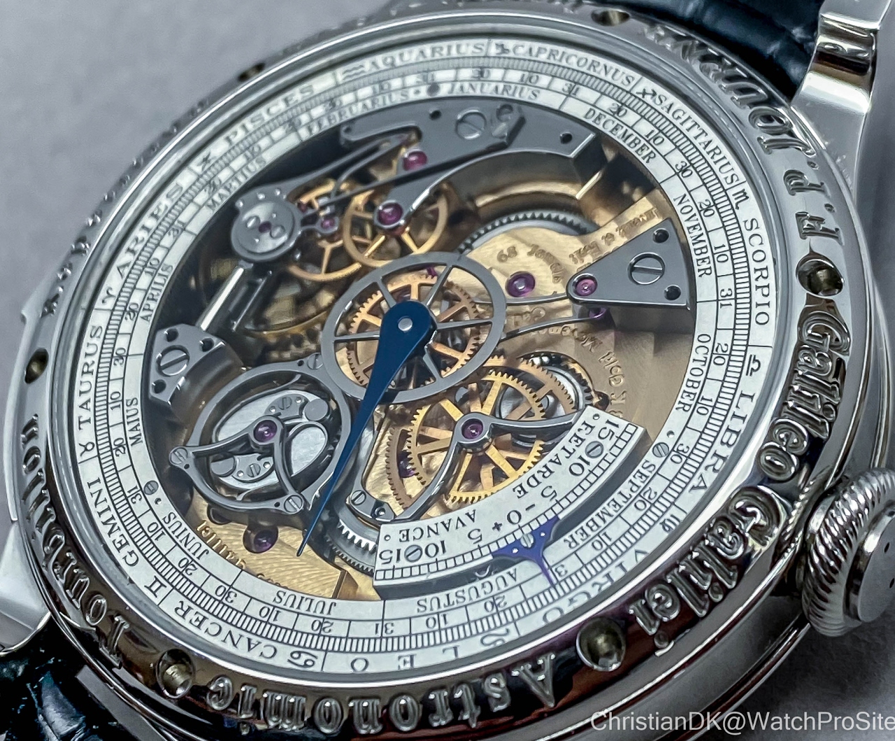
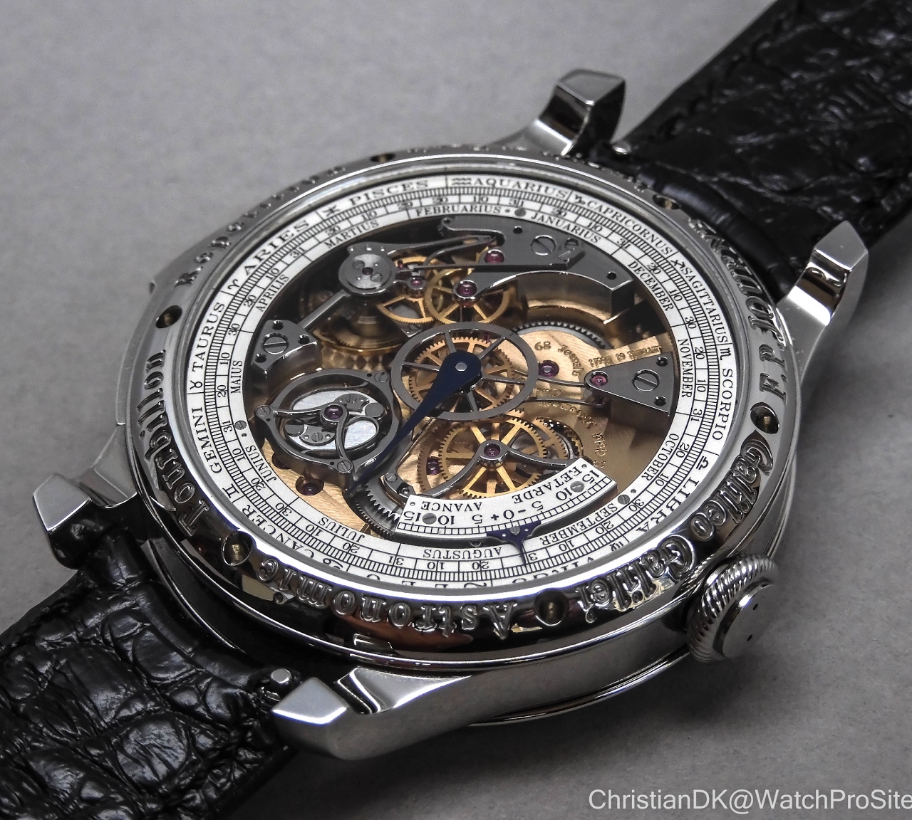
This case dimensions is a 44mm case with a thickness of 13.8 mm. However, this piece has a steel case to help the improve the sound of the minute repeater. When you turn it over you will see it has a lot of void or empty space in the movement. These two factors significantly help reducing the weight and the feel of balance on the wrist.
My primary concern - if the watch was wearable - was put to shame. It is! It is not a “tuna can”, and it is not out of balance.
Its one of those things I come to really appreciate about FPJ. His watches are always wearable,. They are elegant on the wrist. In fact, this quality has changed my taste in watches, so I am now very avert to thick or unbalanced watches.
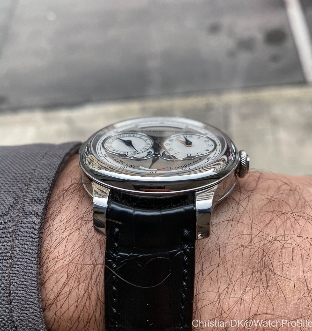
No! - The case is not too thick at 13.8 mm.
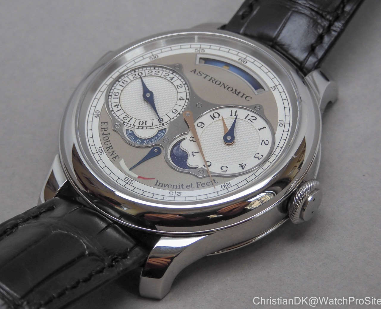
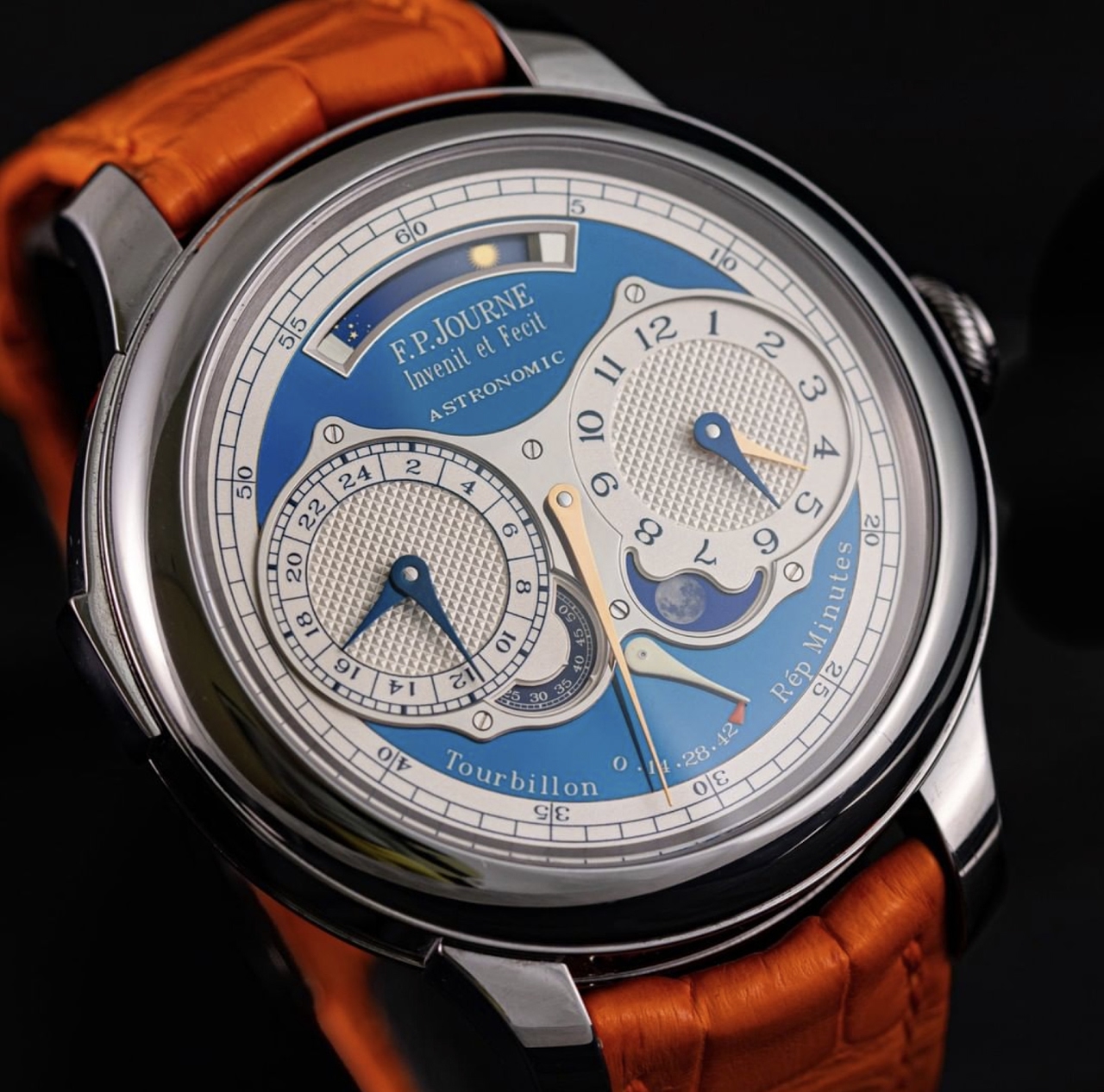
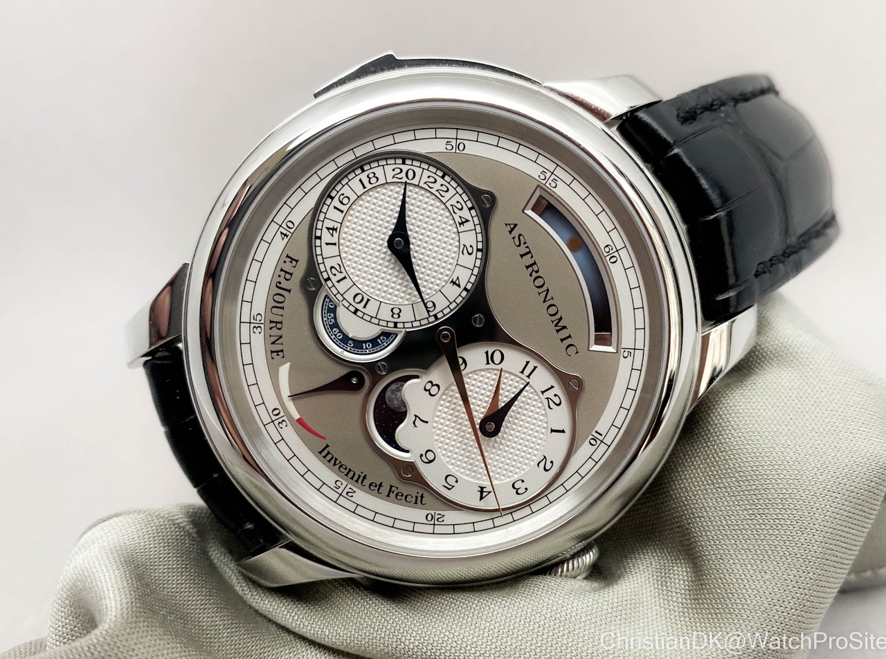
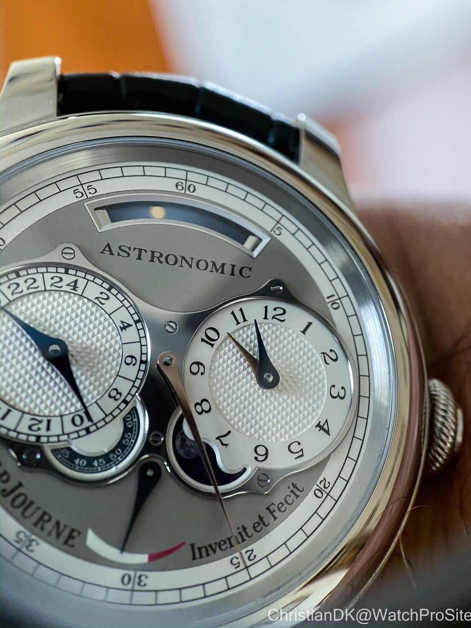
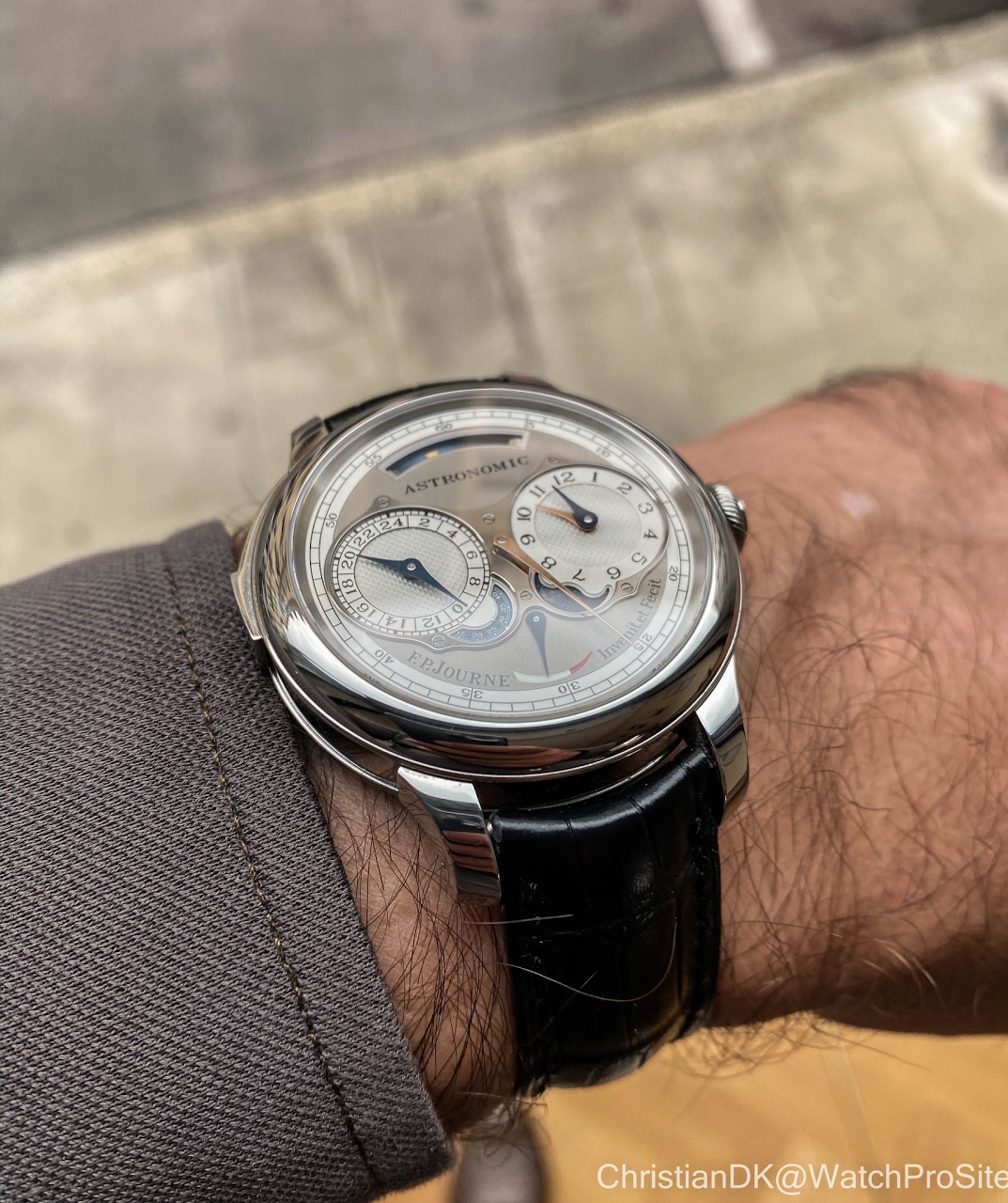
The main dial is a real treat in colors, materials, surfaces coming together.
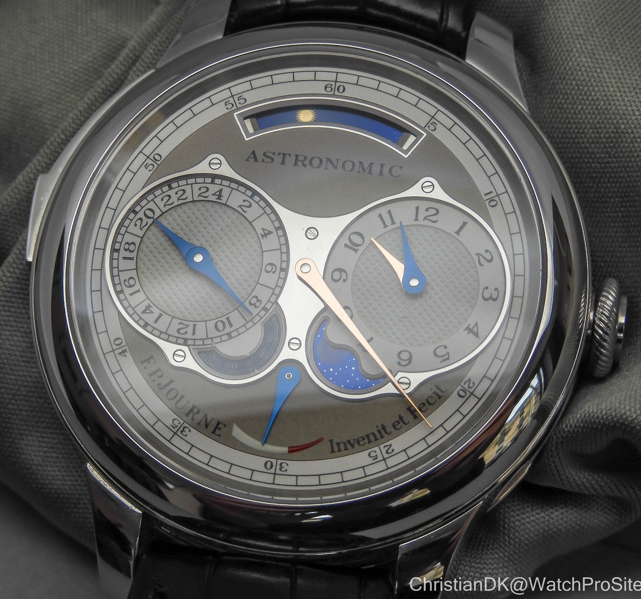
The time display is regulator style. The right dial displays the hour and a second timezone while the minutehand is placed in the center. It takes I a bit to adjust to this regulator style display.
The moon display made from a saphire glass disk with a NASA image of the moon.
When you turn the watch over, you will see the second dial of the watch as a ring inside the edge of the case. This opens a huge aperture to the movement and creates a lovely flat frame for a very deep and 3-dimensional movement.
In writing this, I wanted to try to not only praise the watch, but also mention what I did not like so much. However, that is just very difficult at this point. The impact this watch has emotionally, is massive. It has been a WOW-moment spend time with it.
Honestly, I had expected I would be impressed on an intellectual level, but I would find the watch unwearable and not my taste, as I tend to favor simple watches that are well executed. I have never been a fan of the multiple complication watches that have been considered the epitome for the past 25 years. Most often they are impossible to read and the cases are too thick – in general, that is, However, all that is just put aside in this instance. I AM IN LOVE!
...
Later, the same night as we were having dinner, FPJ was wearing the watch, I couldn’t help notice how the watch also has an ability to just blends in. You don’t necessarily think that the guy over there is wearing a million dollar watch. It looks natural on the wrist. It both has a huge presence and the ability to blend in. I love that quality in a watch. I took that as the final impression of what a great achievement this watch is.


Next Article
Francois-Paul Friday is here :-)
© 2017 - WatchProZine