Watch Review: Zenith Star «Origami» - on your (lady's) wrist!
Ornatus-Mundi

This is the second in line of the Basel 2015 novelties in the cushion-shaped Star collection, exclusively dedicated to ladies' wrists. The first one was the spectacular Zenith Star «Fleur Bleue» (click here for more!).
Now, brand has lifted the embargo the veil on another teasing variant - the Zenith Star «Origami»:
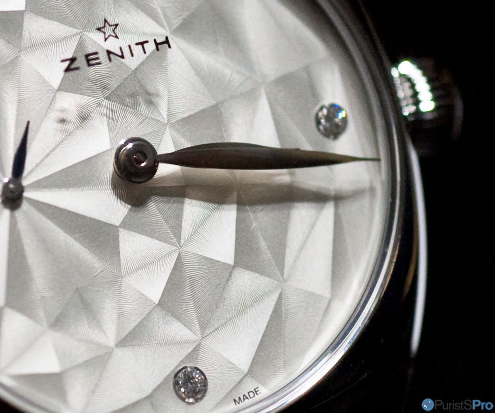
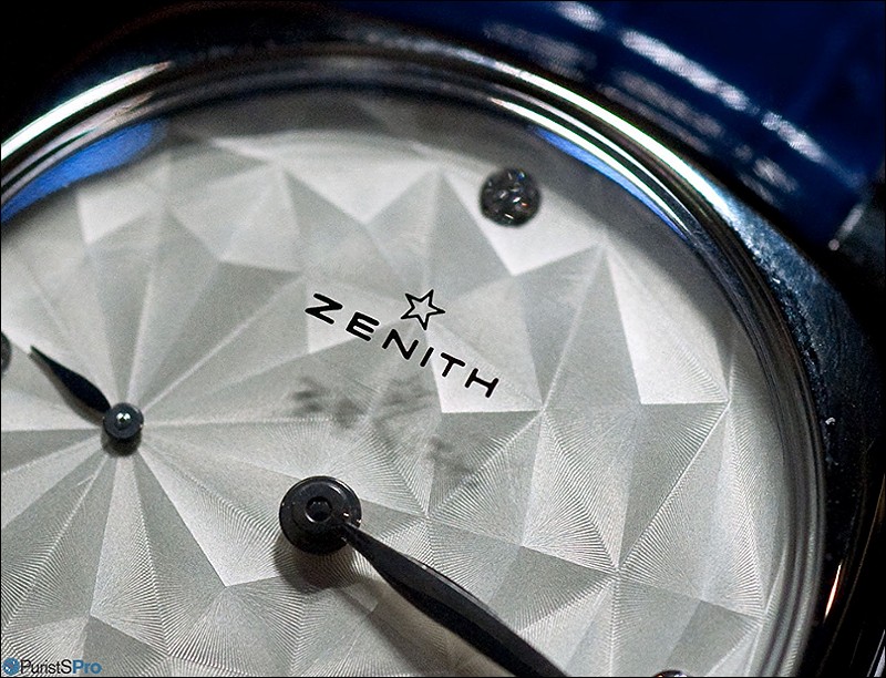
As the name instantly infers the dial is inspired by the (originally) Japanese art of paper folding known as origami (from ori meaning "folding", and kami meaning "paper". The technique btw. is not as vintage as commonly known: its first reference dates back to the late 17th century).
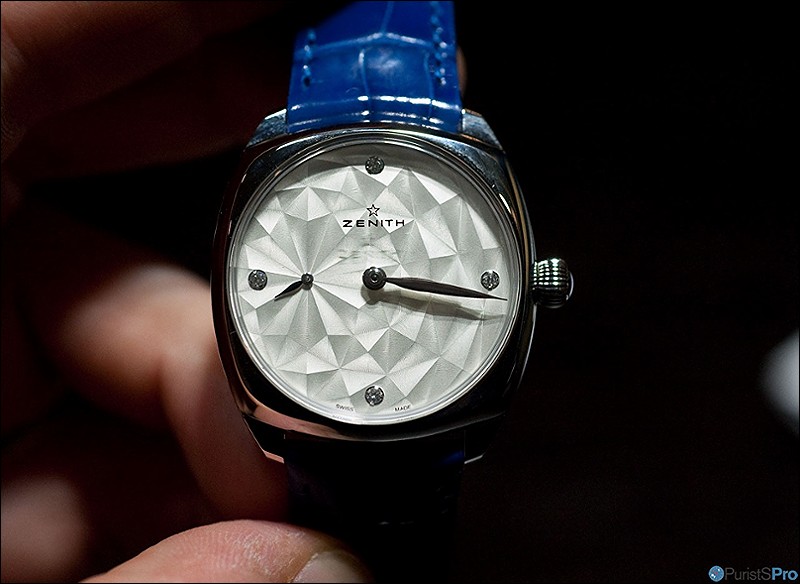
On the Star dial, it appears like a paper-made landscape composed of rhombi and trapezoid shapes. 4 diamonds with a total of ~0.1 cts indicate the four main hours.
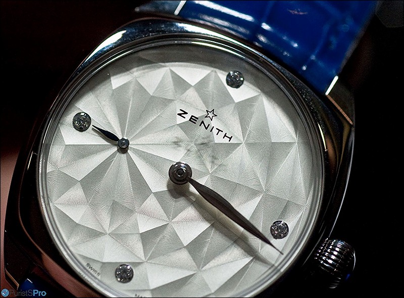
The center is, like all watches of the Star collection, set to the seconds hand dial.
The center is, like all watches of the Star collection, set to the seconds hand dial.
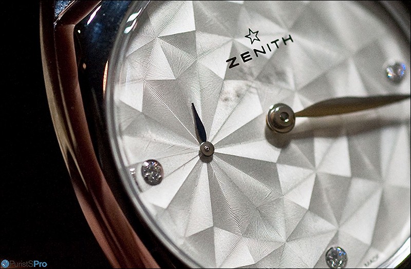
Upon closer inspection its obvious that Zenith went to great lengths to achieve - on the comparatively flat surface of a watch dial - the desired 3D effect. A very fine guillochage is needed to realise the depth intended:

The Zenith logo is applied through vapour coating on the inner surface of the sapphire crystal. It floats thus in mid-air, and casts a fuzzy shadow on the dial.
The effect is a bit like that of a scratched acrylic crystal. I don't know whether this is intended or just a side effect. This is in my book the sole weakness of the chosen design approach worth mentioning. For me, it distracts from the otherwise flawless beauty of the watch.
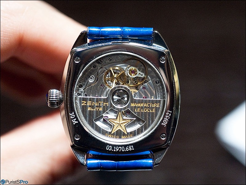
This leaves us with the flip-side: Serious watchmaking here (Zenith Elite 681 automatic movement) as one could expect from an integrated manufacture:
So, in summary Zenith added to the choice in its Star collection with a quite unusual 'paper-light' dial version. The idea is simple, the execution sophisticated and the final effect interesting to say the least. Furthermore, the combination of a slight relief with a dedicated guillochage is quite original and hints to a careful design process - something we here at PuristsPro always appreciate!
That aside, I personally find that the 'scratched plexi' effect of the Zenith logo warrants some extra efforts to address eventual unwanted impressions of imperfection.
This might be only my own very personal pet peeve (and thus being of limited relevance), but it is enough for me to cause a slight irritation.
You mileage might vary!
Thanks for reading,
Magnus
Comments:

AnthonyTsai July 19th, 2015-13:19
Very cool use of guilloche to make a 3d effect! I love it! Is this the first time anyone has done this on the dial? I don't recall ever seeing another watch dial with this same exact guilloche 3D effect. Cheers, Anthony

Ornatus-Mundi July 20th, 2015-06:36
The Dior Grand Soir N°31 Origami comes close... but it uses a M-O-P marquetry technique to achieve a similar effect: Ironically, its 33mm in diameter as well - and it is driven by a Zenith Elite movement... Cheers, Magnus ...
AnthonyTsai July 20th, 2015-08:31
I think I like the guilloche 3D effect better than MOP 3D effect :)
0-10-3
Load More Comments
Next Article
Ornatus-Mundi
Did you know? The origin of the rectangular chronograph hand...
Ornatus-Mundi
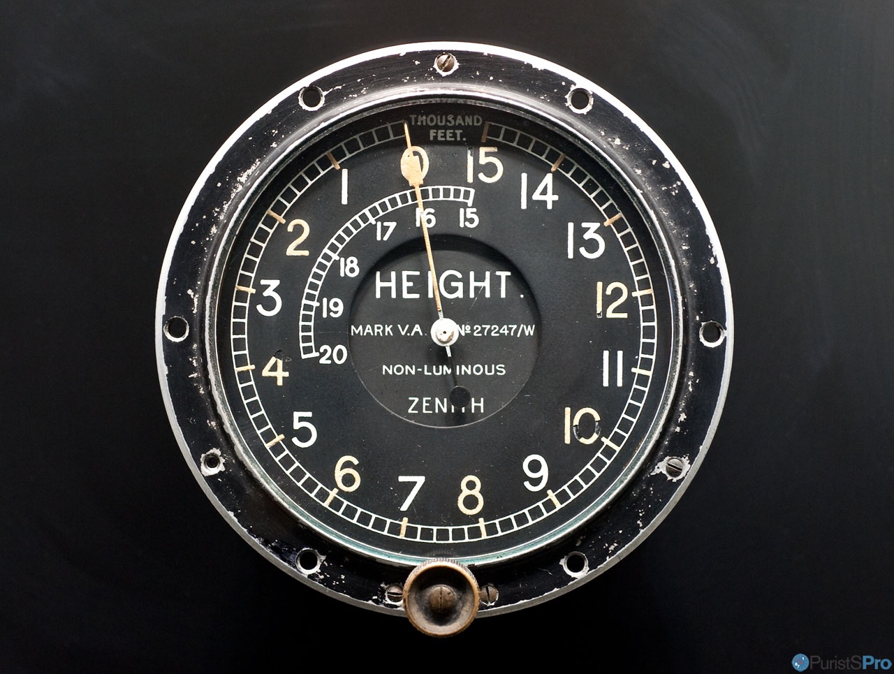
One of the characteristic details of the original 1969 edition of the Zenith El Primero , was its rectangular marker at the tip of its chronograph seconds counter: More closely, one could imagine its was not only a design feature, but had indeed a clear functional designation: It did not only emphasise the chronograph, but also offered a means to apply luminous material (and this enable reading stopped time in the dark). The idea behind could only stem from Zenith's tradition and reputation of producing precision instruments for military, aviation and navigation. Indeed, it actually has its origin in dashboard instruments: Above I show a Zenith aviation altimeter produced around 1910 originally made for British aviation. That is almost 6 decades a.e.p.
© 2017 - WatchProZine